Guidelines
Guidelines
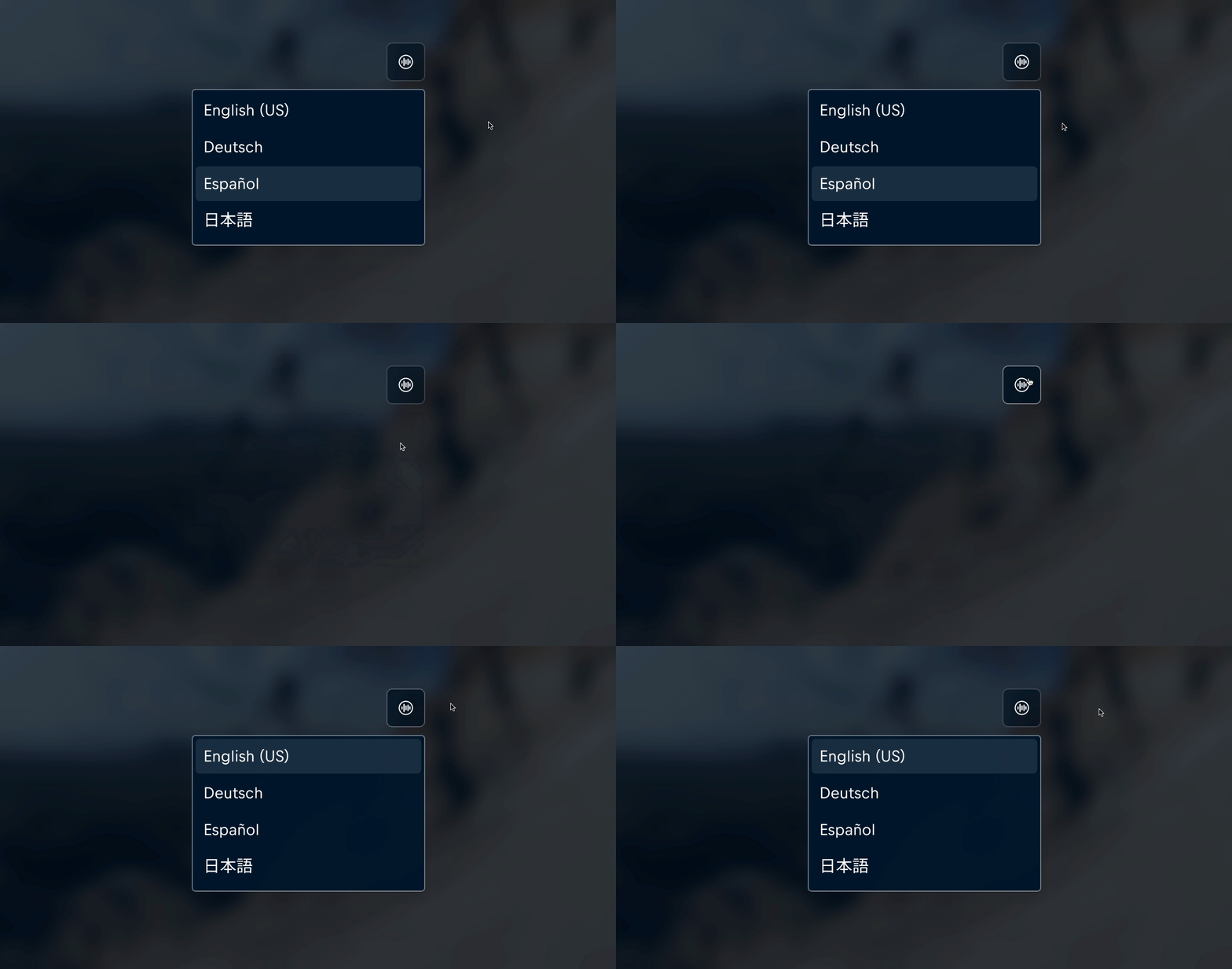
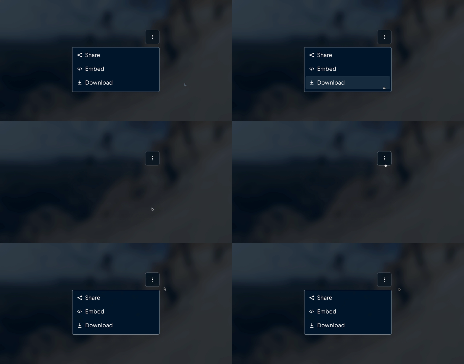
The Action Menu serves as a versatile dropdown interface designed to provide quick access to contextual actions and navigational options. It aims to improve the overall user experience by offering relevant, secondary actions without cluttering the main navigation or distracting from primary tasks.
Usage
An Action Menu should:
- Provide contextual options and information specific to the user’s current context or selection.
- Be used for secondary actions that are relevant but not essential to completing the main task on the page. Please keep core navigation links and high-priority actions separate from this menu.
- Include only necessary options to avoid overwhelming the user, and keep core navigation and high-priority actions in the main navigation bar or side menu instead.
- Use a trigger that clearly communicates its function and purpose, making it intuitive for users to interact with and access the menu options.
- Have a large enough trigger element to be easily clickable on both desktop and mobile devices.
- Have its trigger remain visible after opening the dropdown, especially on mobile viewports.
- Match the appearance of its trigger, where it should be set to 'dark' in light interfaces and 'light' in dark interfaces.
Content
Header
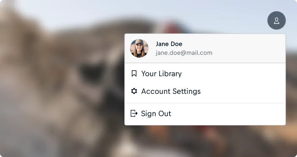
The Action Menu features a dedicated header area at the top for context-specific details or personalized information, providing quick context, guiding navigation, and highlighting key information, making it easier for users to understand actions and act efficiently.
The Header should:
- Display only the most relevant and contextual information, keeping it concise and easy to read.
- Provide quick visual cues or labels to help users understand the current menu's context.
- Use consistent styling to align with the action menu's overall design and enhance visual hierarchy.
Actions
The Action Menu’s actions should:
- Use clear and concise labels to ensure quick comprehension; avoid full sentences and punctuation.
- Refrain from using the same word at the beginning of a set of actions.
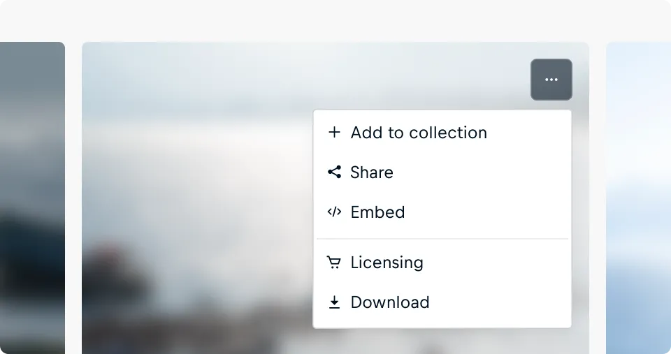
- Include a prefix, like an icon or flag if it adds clarity or context. Use prefixes consistently across your groups of actions. Please avoid using prefixes only on a subset of actions within a group.
- Display meta information, such as additional details, when it enhances the option's relevance.
- Be grouped with other actions when it improves organization and user understanding, optionally using a header label to provide context for the grouped items.
Layout
Position
The Action Menu is positioned below its trigger element by default and automatically adjusts vertically or horizontally to remain visible and avoid being cut off by the edges of the screen. This ensures that the menu is always fully accessible, regardless of the anchor’s placement within the viewport.
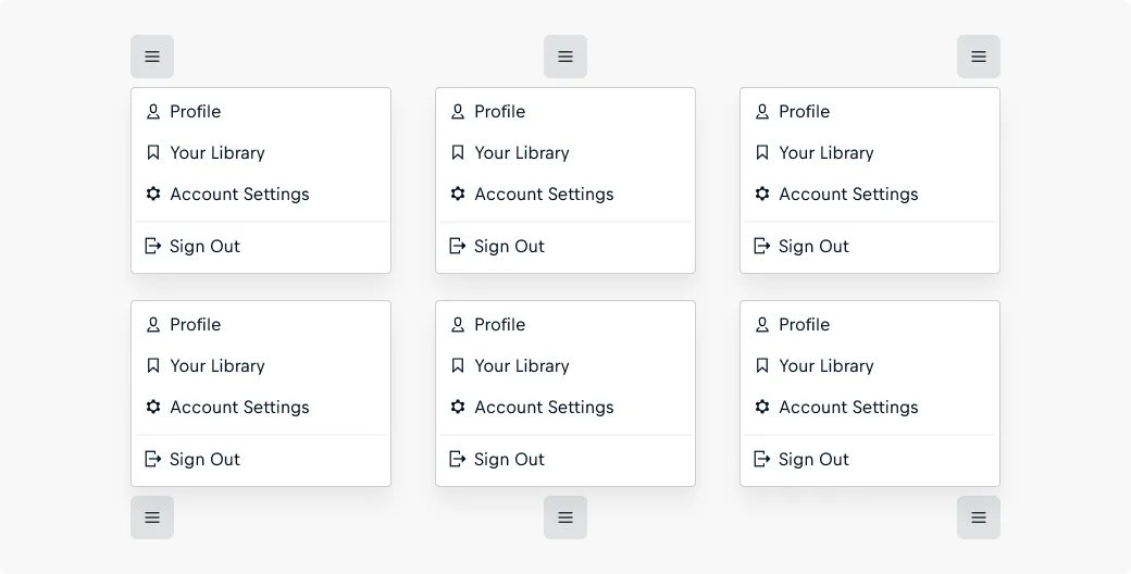
An Action Menu should:
- Have its anchor element specified for positioning and the reference for the click-event to trigger the Action Menu.
- Maintain a consistent spacing ofcosmos-spacing-x-tight (8px) from its anchor element to provide a visually balanced layout.
Width and Height
By default, an Action Menu adjusts its width to match the longest listed item and automatically determines its height based on the contents.
An Action Menu should:
- Specify a fixed or flexible width (e.g., '250px' or '50%') to set a desired size.
- Set a max-height if the list of options is long to prevent the menu from becoming too large and overwhelming. If a max-height is applied, the menu will enable vertical scrolling to ensure all items remain accessible.
Interaction
Trigger Type
Default Behavior
By default, the Action Menu opens when users click on the defined trigger element. This provides a clear and intentional interaction pattern suitable for most use cases.
Open on hover
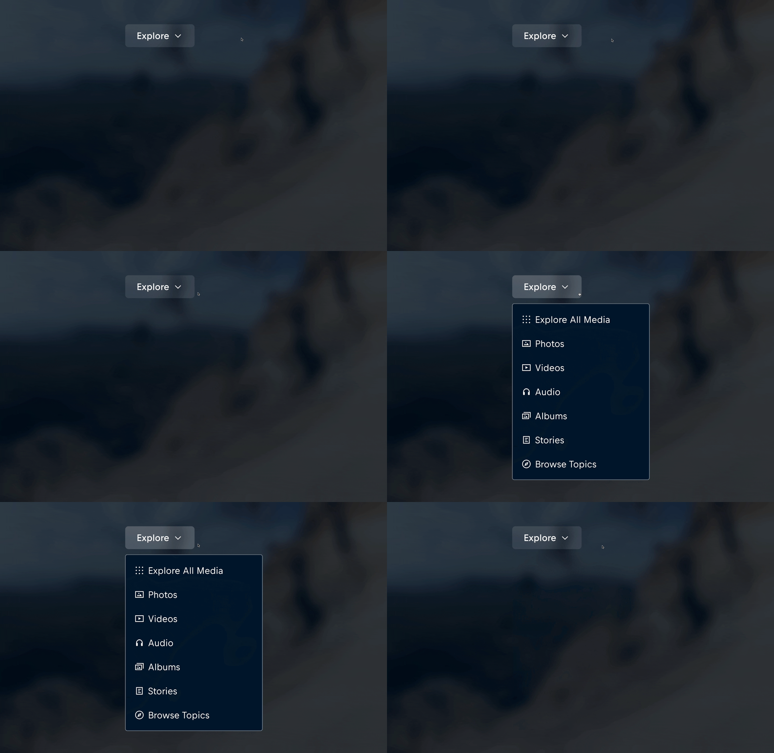
The default behavior can be changed by setting the triggerType property to 'hover'. This implementation includes an automatic fallback to click/tap functionality on touch-enabled devices, ensuring consistent user experience across all platforms.
When implementing hover-activated Action Menus, consider the following best practices:
- Position navigational links in the menu rather than within the trigger element. This approach establishes a more distinct separation between the interaction trigger and its subsequent available actions.
- Implement precise, descriptive labels for actions - utilize specific terminology such as "Explore All..." or "Overview" when directing users to comprehensive content pages.
- Incorporate appropriate visual indicators on trigger elements to effectively communicate that additional options will be presented upon interaction (e.g., directional chevron adjacent to the label text).
Item Active State
The Action Menu should:
- Use an active state only for selections that remain persistent, indicating the item is actively influencing the system or interface, helping users recognize which item is in effect.
- Avoid using an active state for immediate actions, as these are executed instantly without remaining in effect.