Mode & Appearance
Mode & Appearance
Cosmos web components can react to a dark or light environment – called modes – by adapting their appearance.
By default, the appearance of a web component integrates into a light mode environment. A text component appears dark in a light mode environment and light in a dark mode environment.

Even though Cosmos' web components adapt to a dark or light environment by choosing a contrasting appearance – like a Text renders dark in a light mode environment or light in a dark mode environment – some components behave differently.
A Tooltip, for example_,_ chooses to render dark when used in a dark mode environment and light in a light mode environment.
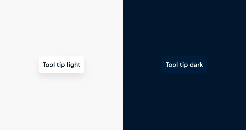
Changing the Appearance
Changing the appearance of a component can be done for individual components or a group of components at once.
Changing the appearance of a single component is as easy as utilizing its appearance property.
In Figma, the appearance of a component can be changed in the sidebar.
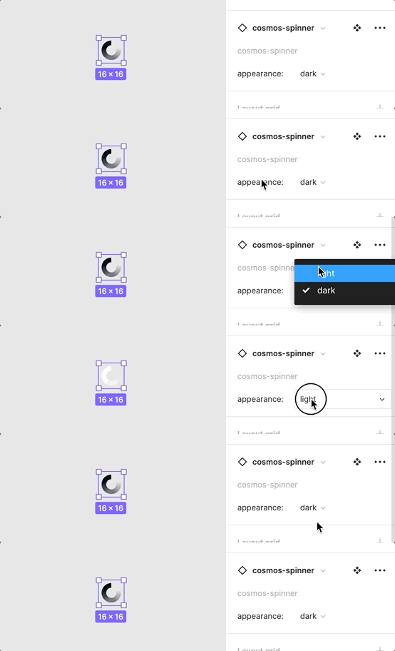
Spinner appearance property
As mentioned earlier, the mode of an environment and the appearance of a component strongly correlate. By default, a component adapts to the mode provided by its environment. Therefore changing the appearance of components at once can be achieved by placing them in a different environment.
In code, changing the appearance of multiple components is as easy as providing a different mode to them using the Mode provider. If not specified differently, they'll automatically adapt their appearance to the new environment mode provided.
Unfortunately, in Figma, the appearance of multiple components can only be changed at once when they're of the same type.
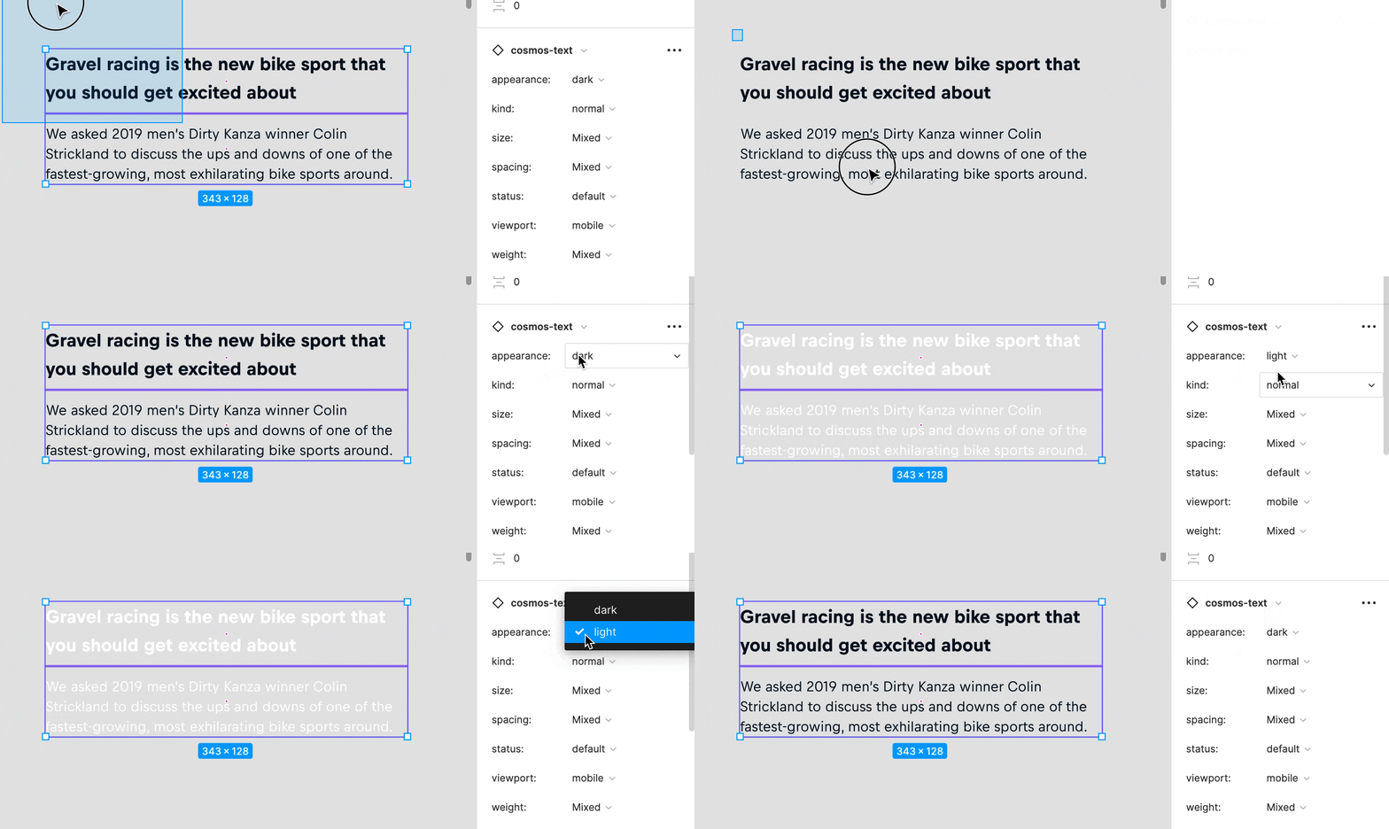
In code, the appearance of a component is derived from the closest definition of a mode – modes can be nested.
Furthermore, when the appearance property of a component is used, the mode provided from its context will be ignored entirely.