Forms
Forms
What is a form?
A form is a structured document with control elements, created for the collection of user information, allowing users to input information, make selections, and submit data. Clear and simple forms enhance user response quality by preventing confusion and ensuring accurate data submission.
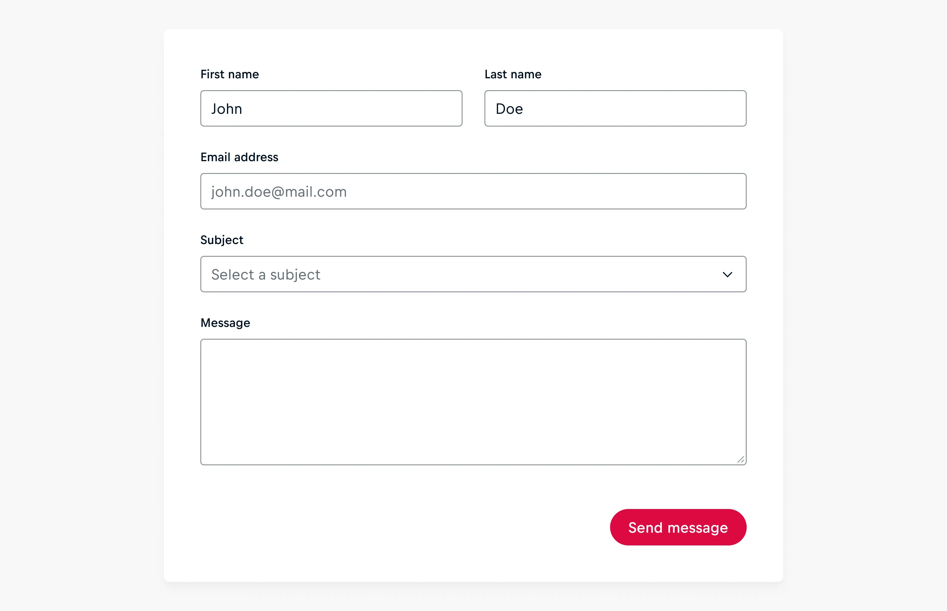
Forms are employed to gather information from users, serving various purposes such as:
- Authentification: Login, registration.
- Data collection: Gathering customer feedback, survey responses, or demographic information .
- Application processing: Submitting job applications, enrollment forms, or event registrations.
- Communication facilitation: Contact forms, appointment scheduling, or subscription sign-ups.
Input Types
Inputs play a crucial role in gathering user data within a form, emphasizing the significance of selecting the appropriate input to elicit desired responses. While this overview covers various input types, for in-depth details on specific components, refer to the linked guidelines.
Free-text Inputs
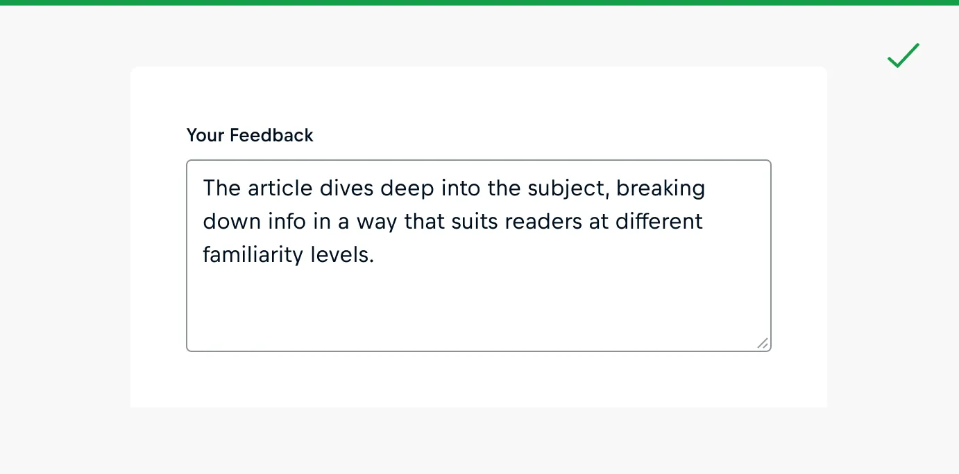
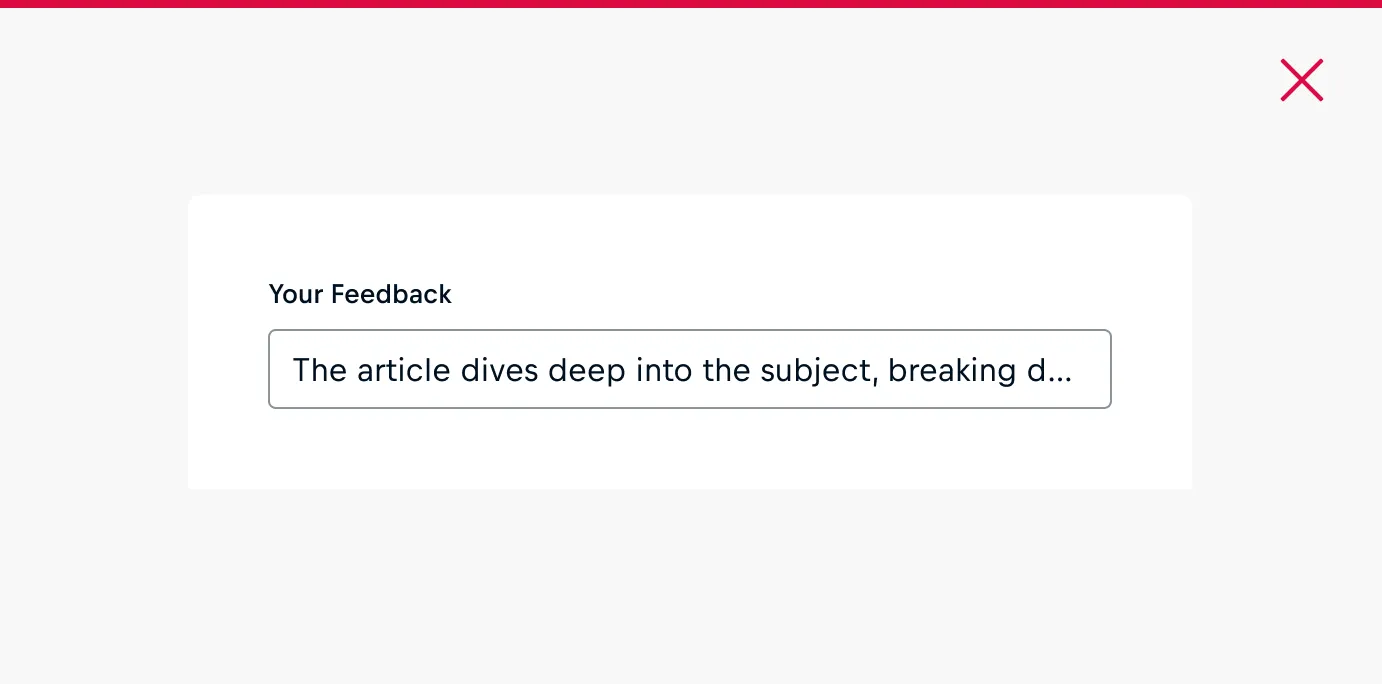
Free-text input components, such as Input and Textarea, enable users to provide unstructured information by typing in responses or comments. The component should be aligned with the required data, and whenever feasible, match the input field length to the corresponding type and size of the input.
Selection Inputs
Selection inputs allow users to make selections from a predefined list of options. It depends on the component whether only one or several options can be selected.
Component | Usage | Examples | Limitations |
|---|---|---|---|
Checkbox | Enables users to opt in or opt out of an option | Accept terms and conditions, receive newsletter updates | Hit area is limited to the tickbox and label |
Allows users to select zero, one, or multiple options from a group of checkboxes | Filtering options, notification settings | Hit area is limited to the tickbox and label | |
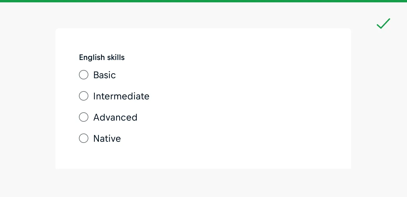
Radio Group | Allows users to choose a single value from a list of 2 to 6 mutually exclusive options | Gender selection, travel class preference, payment method, survey response | Lists with 6 or fewer options; not to be used as a toggle |
Select | Presents a dropdown list of 6 or more options that are mutually exclusive, allowing users to choose a single option from the list | Choose country, language, timezone, product category | 6 or more options |
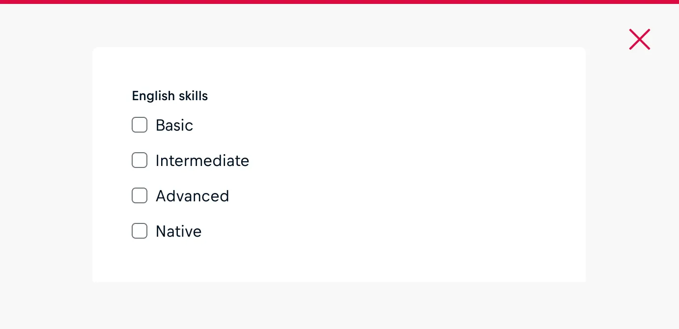
Form Anatomy
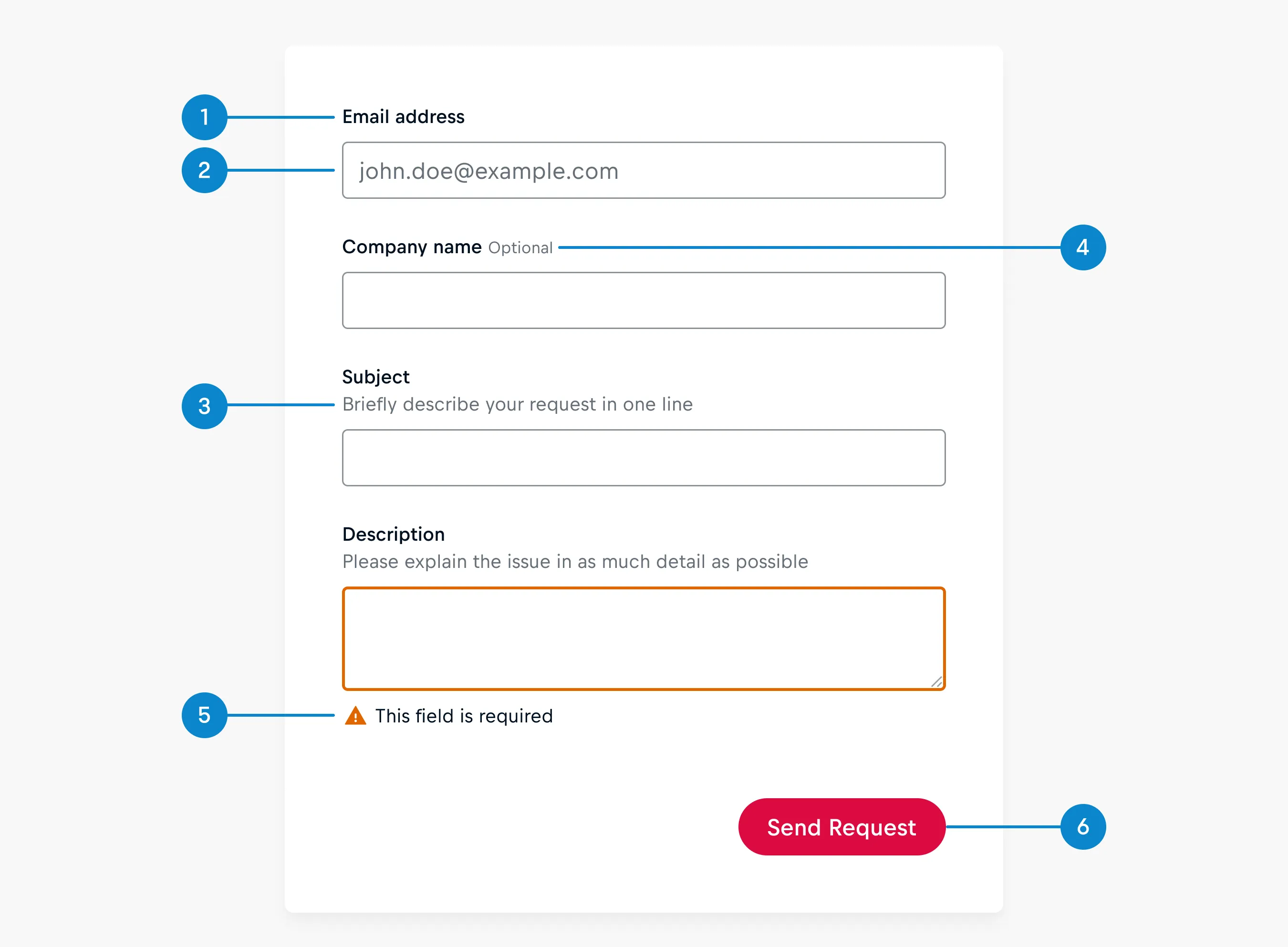
Forms typically include some or all of the following elements:
- Label
- Placeholder
- Help Text
- Optional/Required Label
- Validation Message
- Action Buttons
Label
Labels help users to understand what information is being requested of them.
A label should:
- Be assigned to all input fields.
- Be succinct and descriptive, consisting of only 1-3 words.
- Use sentence-case for optimal readability, capitalizing only the first word of each label.
- Avoid the use of colons and periods after label names.
- Refrain from including interactive elements such as links or buttons, as they are considered inaccessible by assistive technologies.
- Not be used as placeholders in input fields.
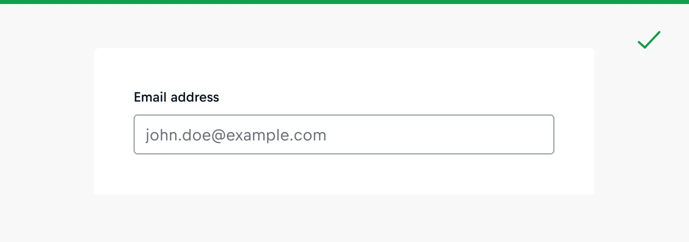
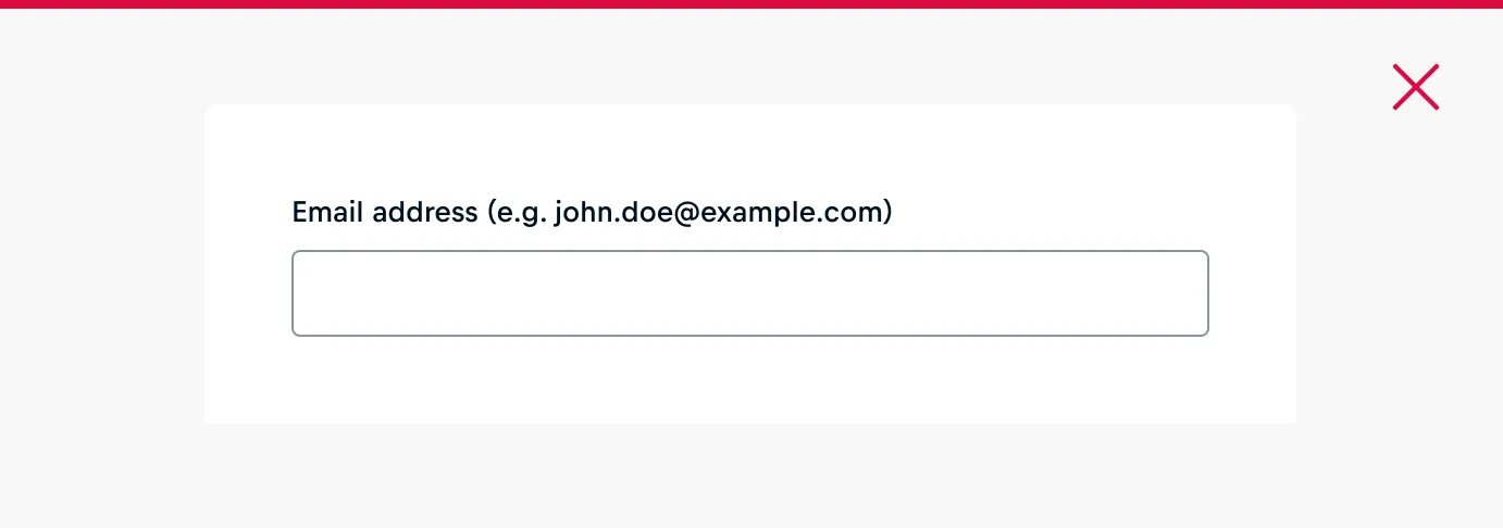
Placeholder
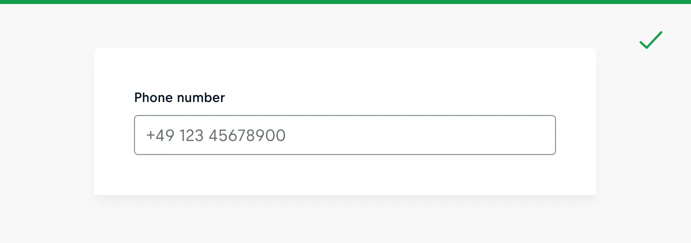
Placeholder text provides hints or examples of what to enter.
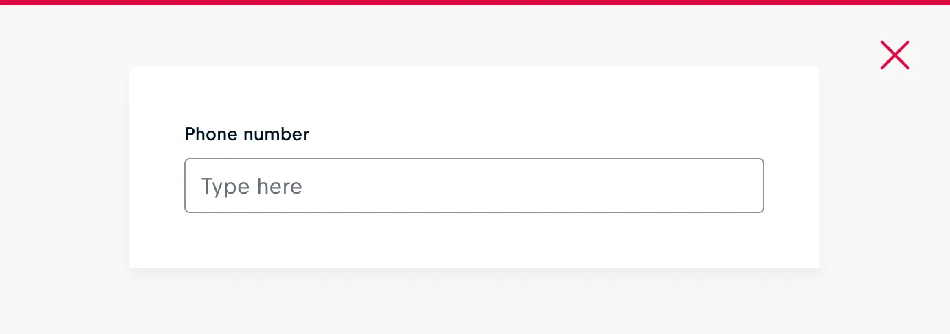
A placeholder should:
- Be used in conjunction with a label.
- Serve as a supplementary element to the label and help text without repeating them.
- Be provided only when necessary.
- Be regarded as temporary, and reliance on them to instruct users on required information entry should be avoided.
- Be employed when the requested input may be unfamiliar to the user or to offer a useful example.
- Be concise and clear, avoiding any overflow beyond the input field.
- Properly anonymize examples, avoiding the use of real values.
Help Text
Help text provides extra guidance or instructions to the user. It can also clarify how the information will be used.
A help text should:
- Be used when extra guidance or instructions are needed.
- Be supplementary to the label, not repeating it.
- Use sentence-case for optimal readability.
- Be brief and descriptive as some assistive technologies read it.
Required/ Optional Label
"Required" labels in form components signal essential fields, while "optional" labels indicate areas users can choose to complete. The used pattern should be consistent throughout your product, or at least consistent between all of the same types of forms within the product.
A required label should:
- Be utilized if entering information is mandatory to submit a form.
- Be assigned to fields when the majority of the fields in the same form are "optional".
An optional label should:
- Be utilized to indicate fields that users may choose to complete, aiming to prevent an excess of optional fields in the form.
- Be assigned to fields when the majority of the fields in the same form are "required".
Validation Message
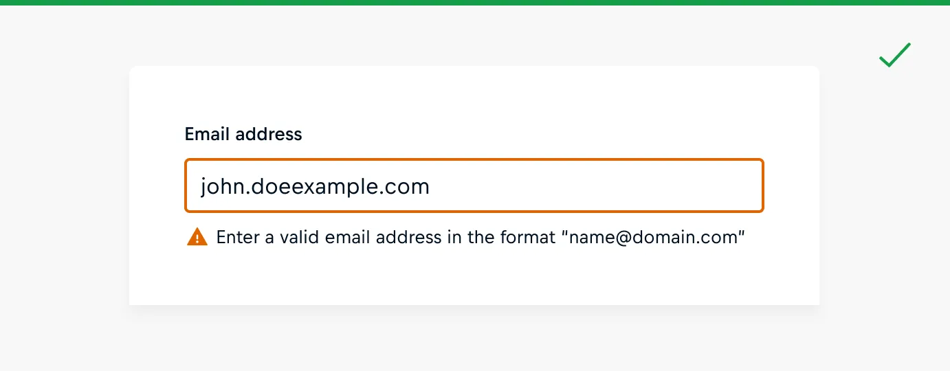
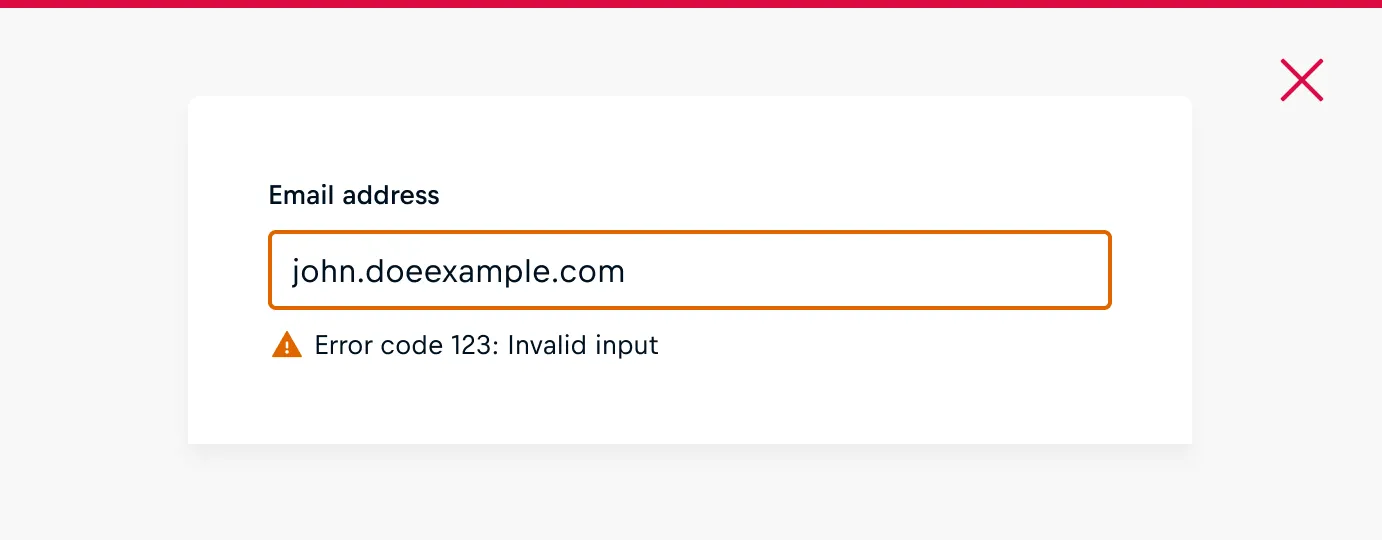
Validation messages provide feedback on the accuracy and completeness of user input, guiding users to correct errors for successful form submission. Learn more about form validation here.
A validation message should:
- Be supplementary to the components label and help text without repeating them.
- Instruct how to avoid possible errors with a validation message.
- Be as concise and clear as possible.
Action Buttons
Action buttons in form fields initiate user operations, like submitting or saving information.
An action button should:
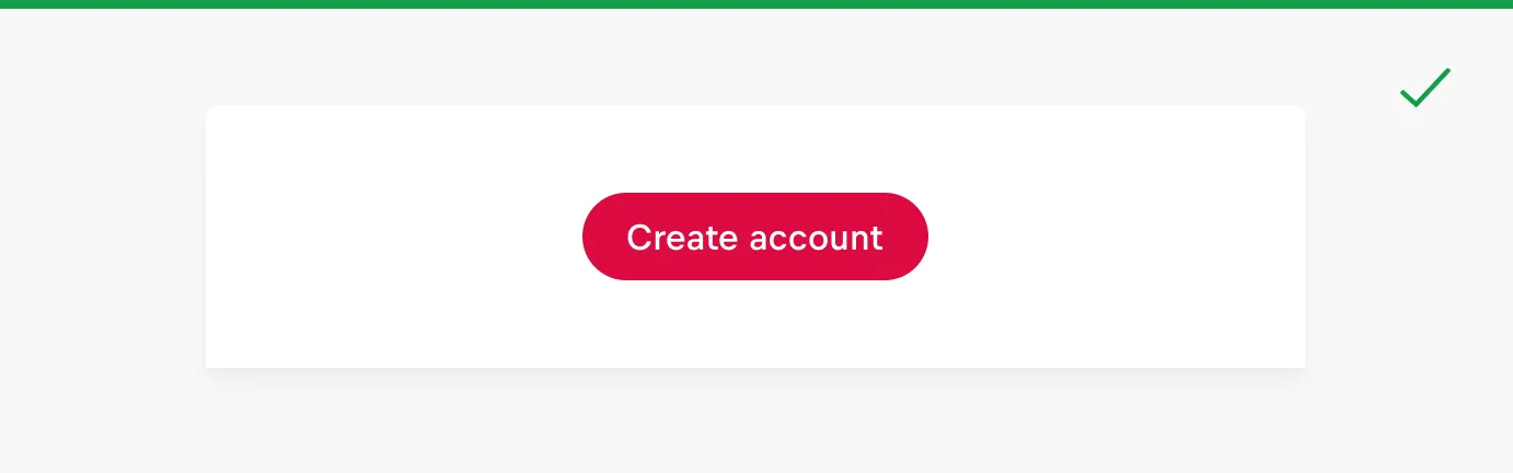
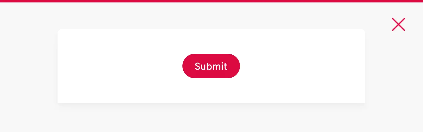
- Use a clear call-to-action like "Create Account" instead of generic terms like "Submit".
- Avoid "Reset" or "Clear" buttons to prevent accidental data loss.
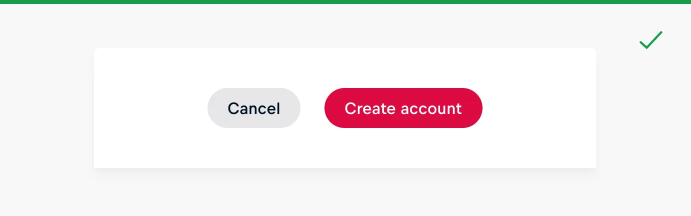
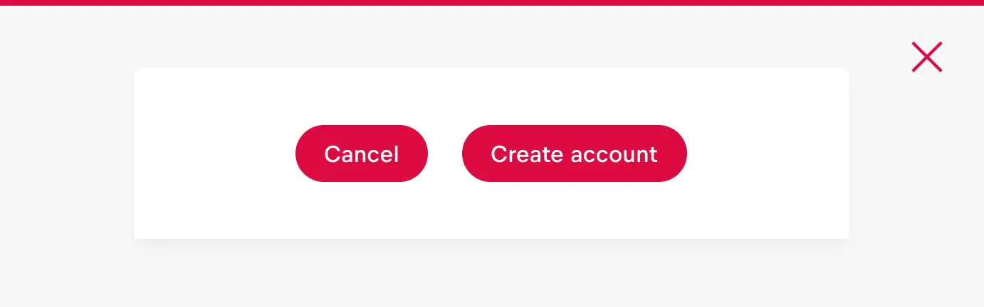
- make a clear distinction between primary and secondary buttons, reserving primary buttons for submission, while secondary buttons handle actions like saving for later or navigating back.
Form Layout
Container Variants
Forms can be presented in many types of containers, most commonly in dedicated pages, side panels, or modals. The choice of container should depend on the context.

Dedicated page Complex, lengthier forms or when information requires a focused and immersive user experience, such as complex or multi-step processes.

Modal/ Dialog Used when quick and context-specific interaction is needed without navigating away from the current page.

Side panel Recurring requests, enabling users to easily access the form while maintaining the main context.
Group Content
Grouping related fields into sections can enhance the usability of a form, making it easier for users to scan and complete. Sections should be grouped logically and in a predictable order. Grouping content can be established through:
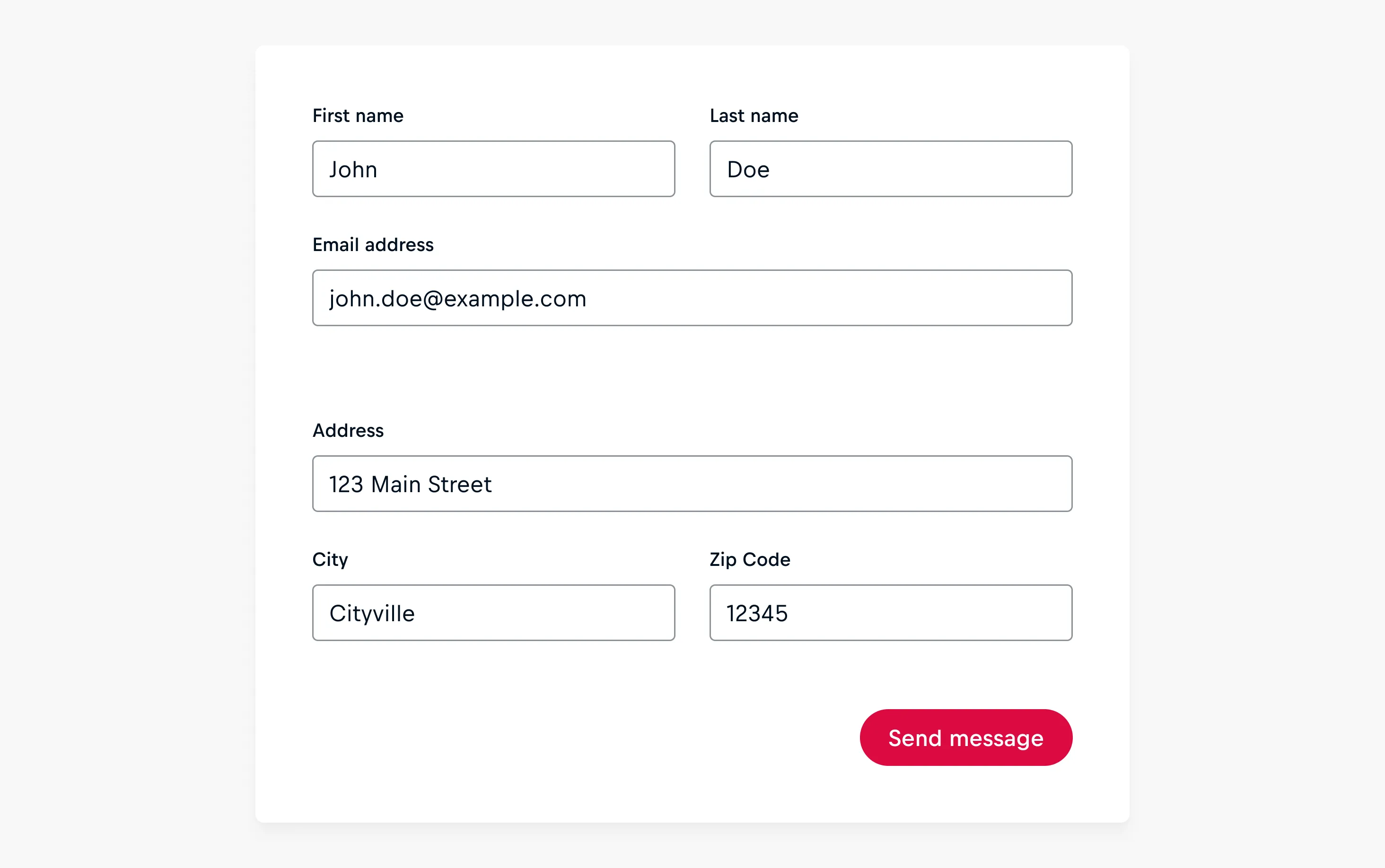
Spacing between Sections
Spacing can be used to effectively group related fields visually, following the recommended spacing guidelines.
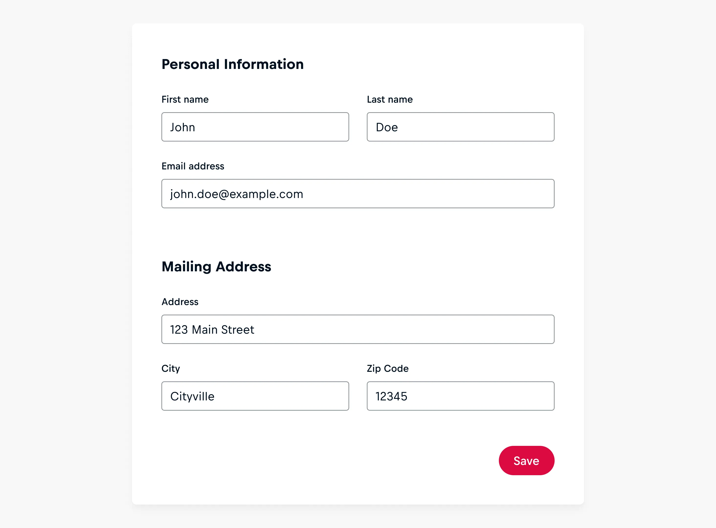
Section Titles
Section titles should be kept to the point. If necessary, concise descriptions in body-sized paragraph text beneath the section titles can be included.
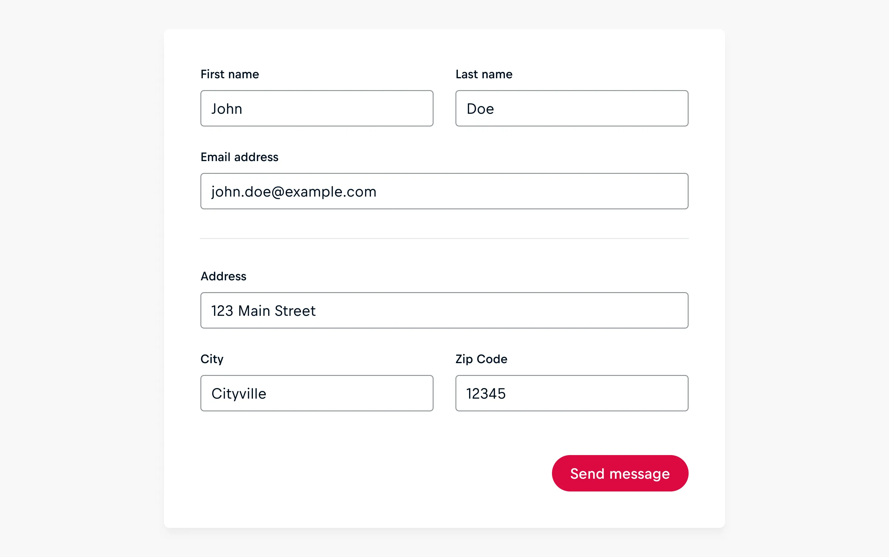
Separator Lines
The content within the form can be visually separated by integrating separator lines which can also be used in combination with section titles.
Columns & Width
Columns
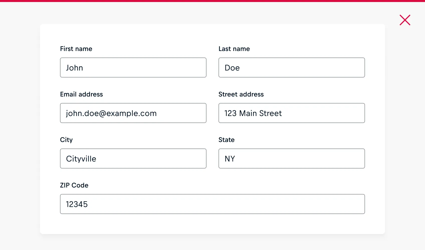
Organizing fields in a single column ensures a smooth flow through the form. While single-column forms are generally recommended, there are situations where multi-column layouts can be appropriate, especially on larger screens with significant space.
Related fields such as [first name] and [last name] can be grouped horizontally.
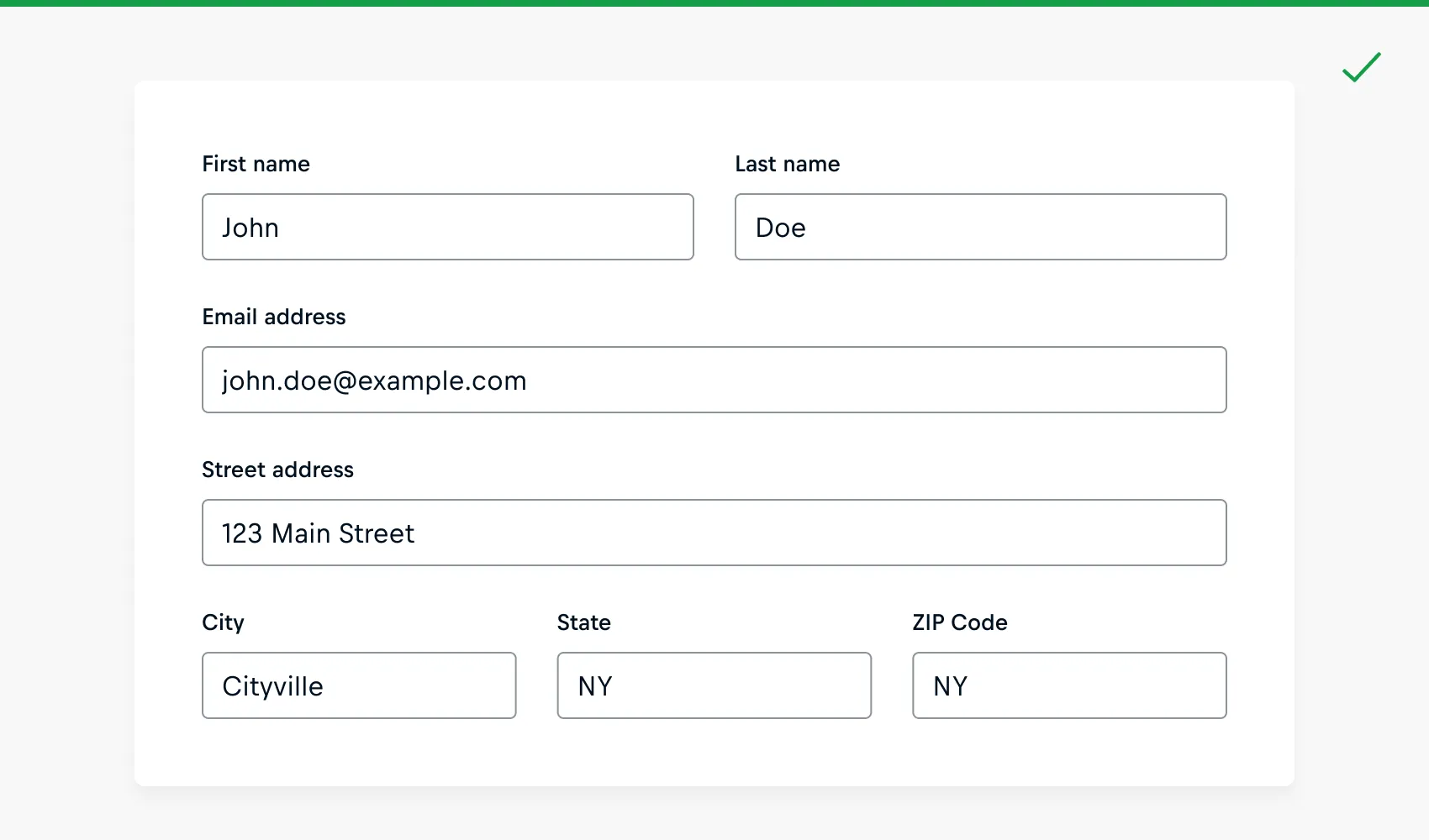
Maximum Widths
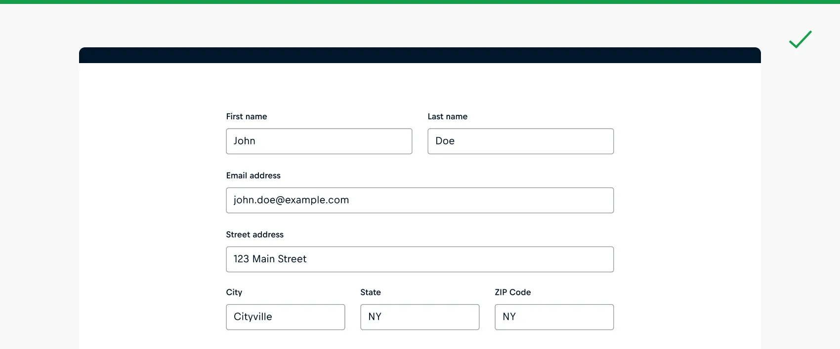
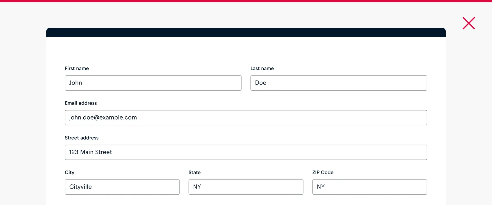
A maximum width for full-page forms should be set for enhanced readability so users can concentrate on a specific screen area while completing the form.
Best Practices:
- The inputted value should comfortably fit in the available space on different viewports
- The inputted value should not unnecessarily overflow or break lines when not needed.
- The widths should be aligned to the layout grid of a platform for improved and more straightforward width handling.
Button Width
The width property sets a button's width to automatically fit its content or container.
A button should:
- In general, use 'content’ width.
- Use full-width to be associated with another full-width component or section, following the Gestalt Principles of common region and closure.
- Have a width that is less than half of the viewport width, when set to 'full-width' on viewports larger than mobile.
- Use content-width when placed horizontally next to other buttons.
- Use full-width when placed vertically next to other buttons.
- Use the same width value among adjacent buttons.
Long Forms
It's essential to respect the user's time and privacy while minimizing the number of fields to only request necessary information. Facing a form with numerous fields can be overwhelming for users, and the perception of a form being excessively long varies depending on the audience and context. There are techniques to help make longer forms feel less daunting:
Multi-step Form
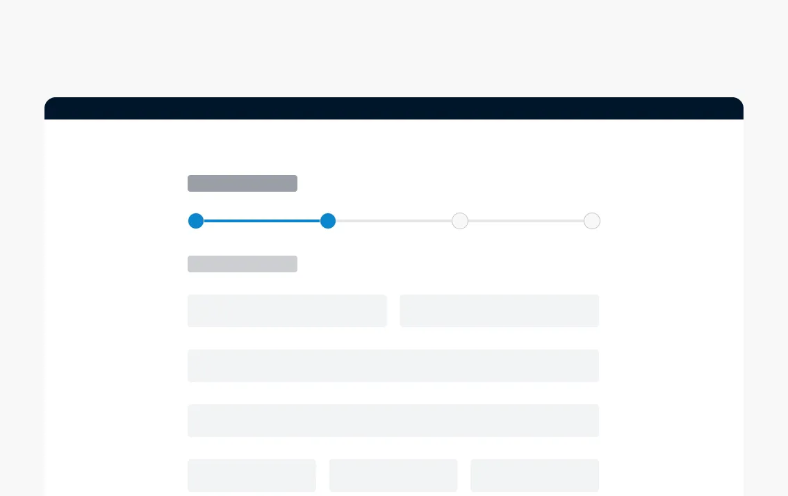
A multi-step form breaks down the fields into several screens and uses a progress indicator (either vertical or horizontal). Maintain a linear relationship between the sections.
Progressive Disclosure
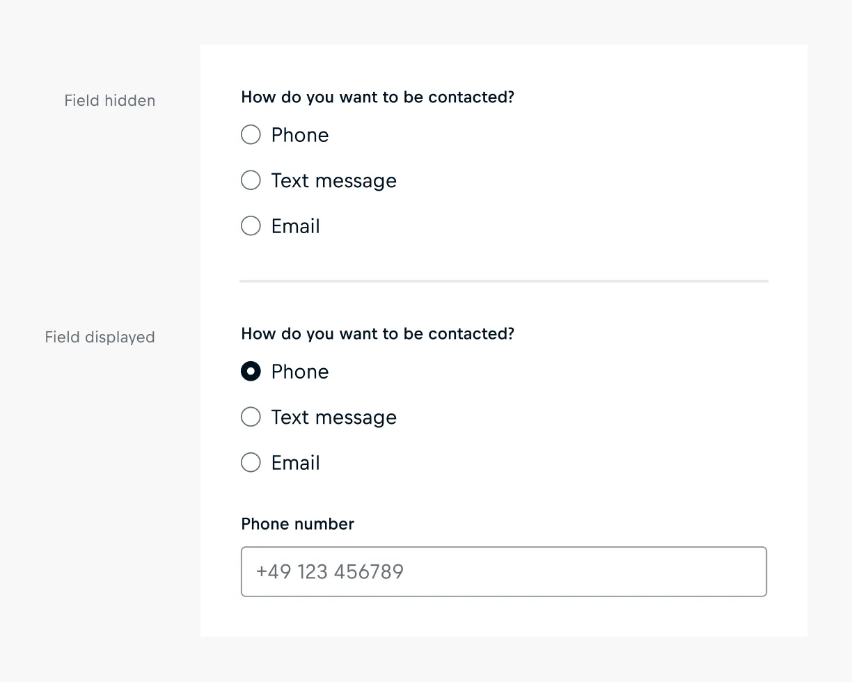
Utilize progressive disclosure to expose additional content based on the user's prior choices. This method enables users to concentrate on relevant information, keeping workflows concise.
Spacing
Maintaining a unified and consistent design for sections within the form is essential to keep the UI clear and clean.
👆 Please note
Spacing primitives should be used to define distances between elements or panel padding. The following spacing values serve as an orientation but may vary depending on the product and use case. It is particularly important to ensure that the spacings remain consistent across the entire platform.
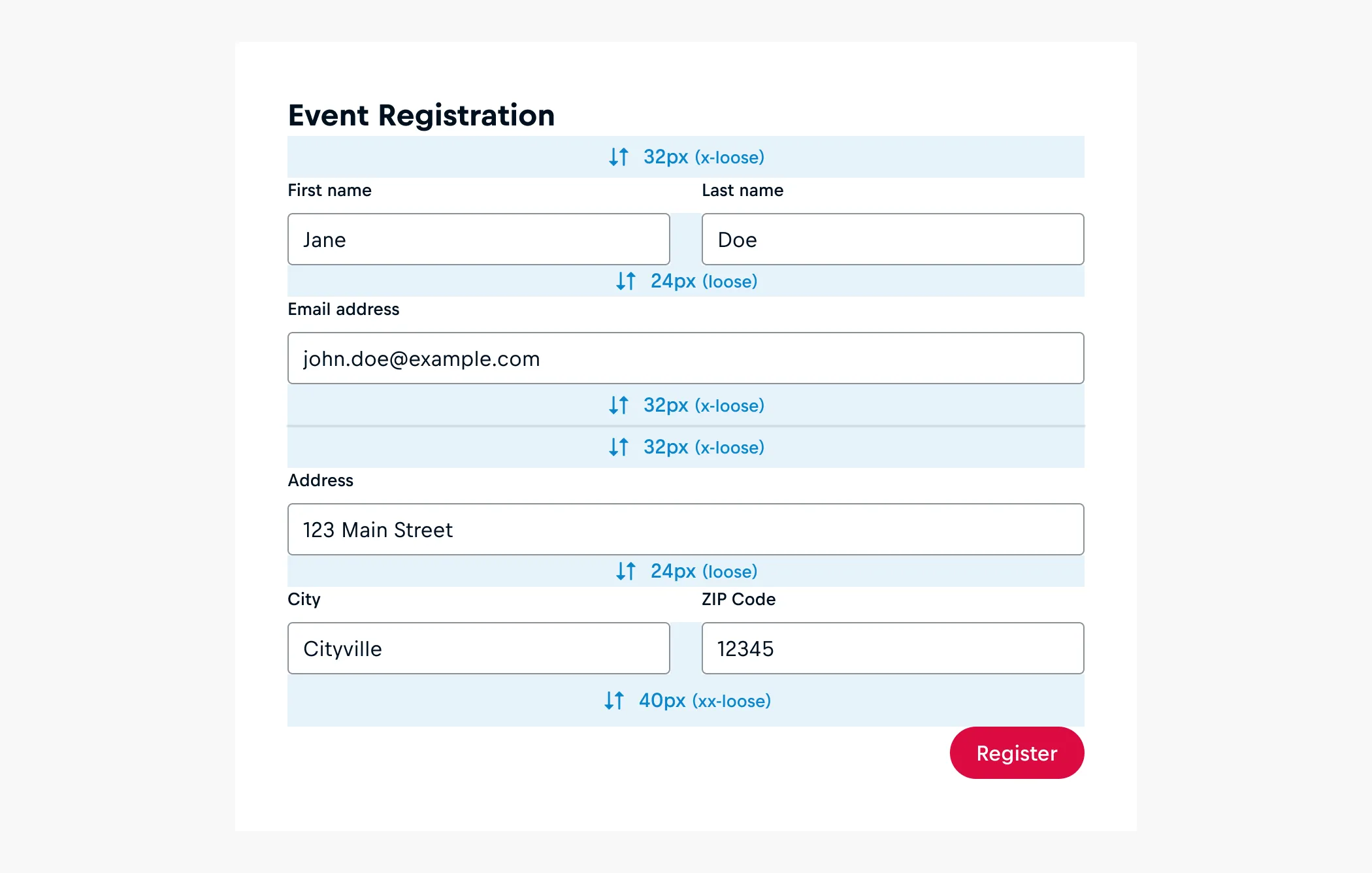
- For section titles and the initial field in each section, utilize cosmos-spacing-x-loose(32px), unless specific factors require a different spacing. This can be adjusted for narrower viewports, potentially decreasing to cosmos-spacing-loose(24px), depending on the size of the title and subtitle of the form.
- Between input fields, cosmos-spacing-loose(24px) can be employed, whether horizontal or vertical.
- When introducing dividers for visual separations between sections, aim to use a cosmos-spacing-x-loose(32px) spacing rule (top + bottom).
- Maintain cosmos-spacing-xx-loose(40px) between buttons and inputs, unless specific factors require a different spacing.
Button Placement
Button alignment in a form is subjective and depends on the form's type. There is no definitive right or wrong choice. What matters is making a deliberate decision and maintaining consistency across the product.
Right Alignment
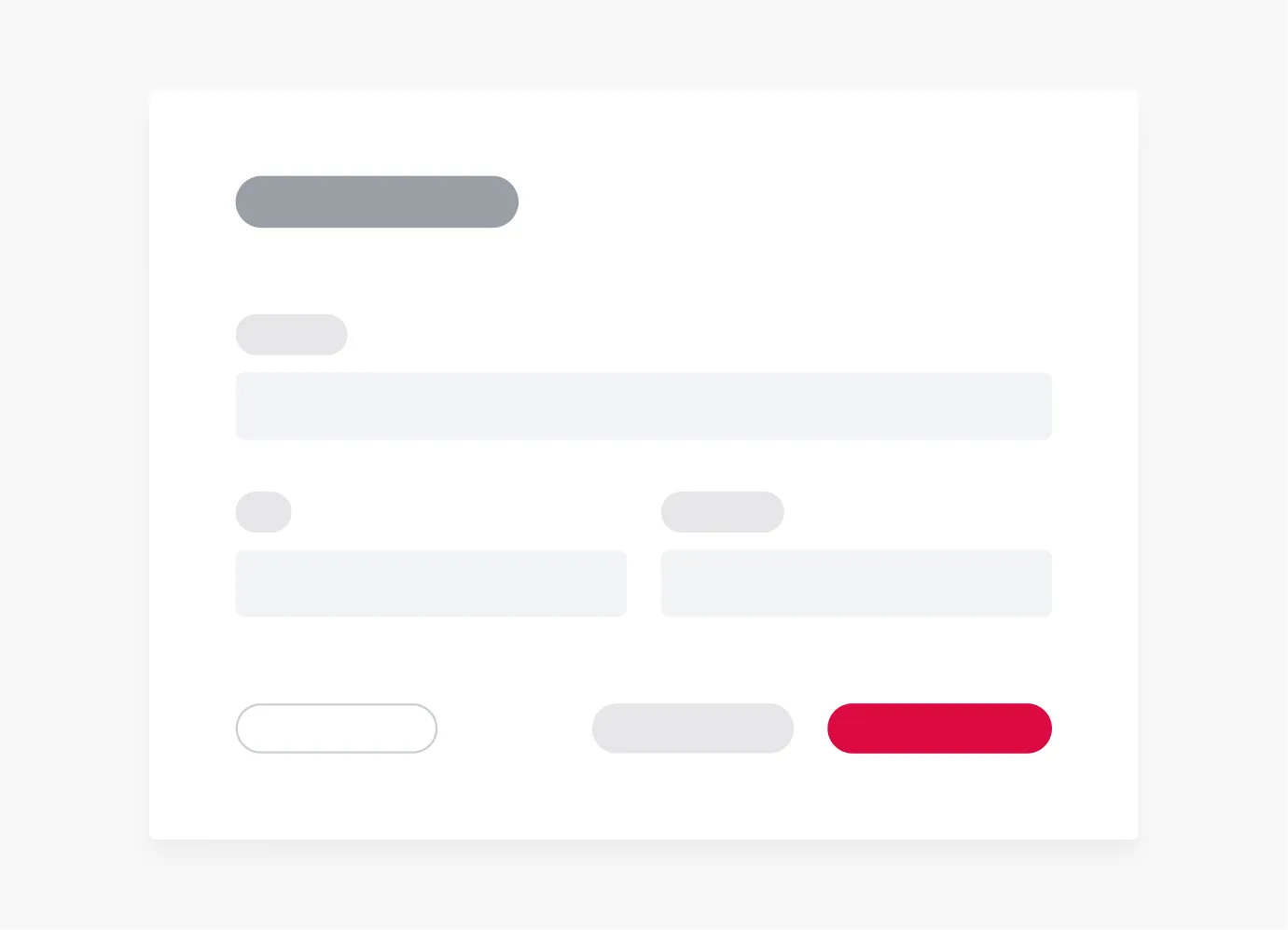
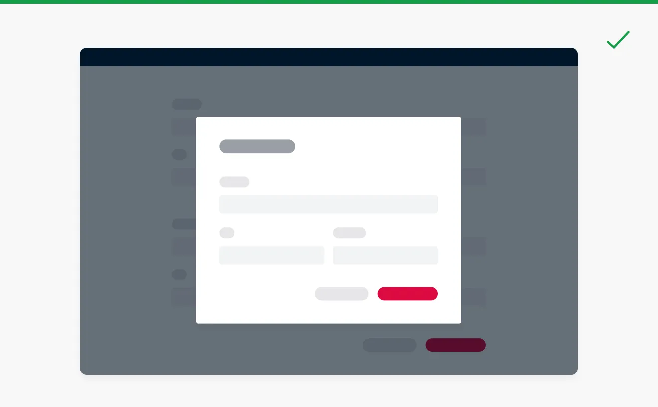
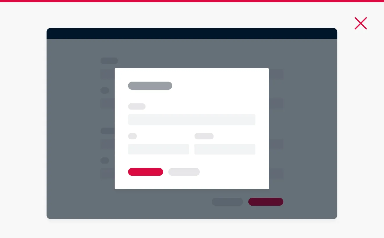
It is recommended to use right-aligned buttons in modals or multi-step forms where the primary action button implies a navigation step forward.
Left Alignment
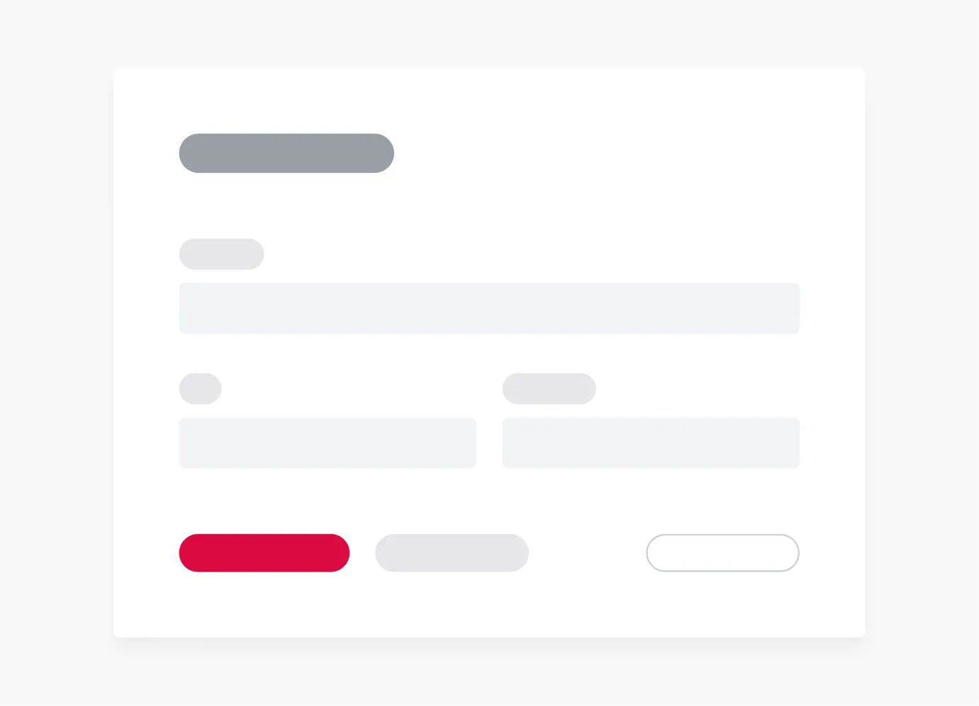
In non-dialog and in-page forms, it is recommended to left-align buttons to facilitate quick and intuitive interaction, aligning with a left-to-right reading flow.
Vertical Alignment
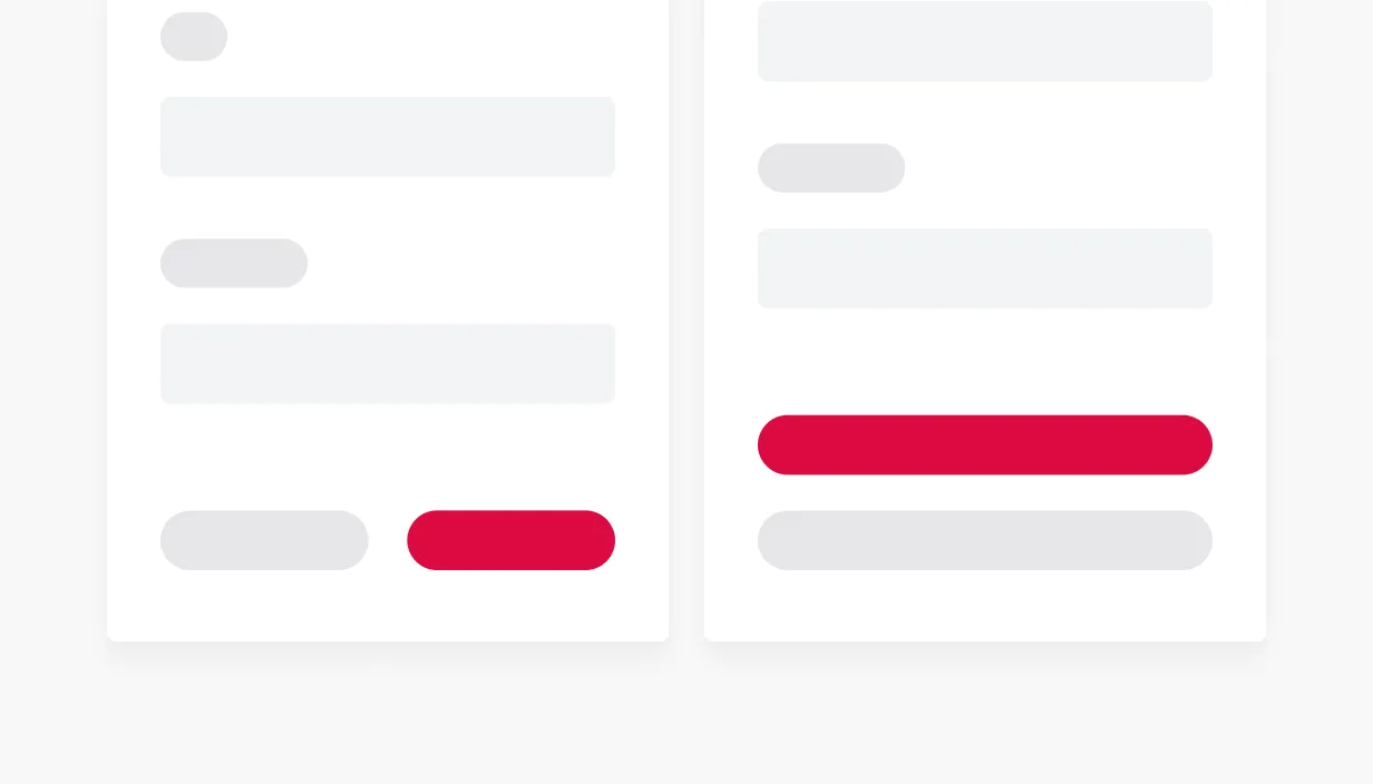
Generally, avoid placing a button below another button if there's space to place them side-by-side. In tight spaces or when you are concerned about the length of a button’s label (especially when it gets translated), it is practical to stack the buttons vertically.
Form Validation
Validation in a form is a crucial aspect of ensuring that the data submitted by users is accurate, complete, and conforms to the specified requirements. For example, it can include checks for proper formatting of information such as email addresses, phone numbers, and dates.
Errors
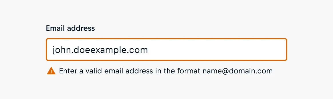
Clear and concise feedback should be provided when users enter invalid information, displaying messages below the respective fields. Provide validation messages and use plain language to describe errors and provide suggestions for resolution. Errors can include:
- Incorrect format
- Leaving required fields blank (or incomplete)
- Weak passwords
- Character limitations
When to validate?
Generally, there are different strategies when it comes to input and form validation:
On-Blur Validation
On-blur validation checks user input validity when the focus on an input field is removed or "blurred" as the user clicks or tabs away from a form field. During the blur event, the entered data is checked, enabling the identification and communication of client-side errors early on.
Eager Validation
The user input is checked for errors as soon as it is entered, providing immediate feedback. In general, the user should be allowed to make a valid entry before the error message is displayed. However, there are cases where eager inline validation can be helpful, like inputs with password fields with visible password strength criteria, or invalid characters (e.g. alphanumeric characters in a numeric input).
Submit Validation
Submit validation checks user input when the user attempts to submit the form. It ensures the entered data meets specified criteria, providing feedback on any errors before allowing the form submission. Submit validation ensures accurate and secure user-submitted data by checking predefined criteria on the server side, minimizing errors, and maintaining data integrity.
Our Validation Lifecycle
While user inputs will be validated the first time on submit, we provide more instant feedback to users after a form has been submitted using the on-blur validation.
💡 Did you know?
Cosmos form fields integrate seamlessly in native HTML forms following the validation lifecycles as outlined in this section.
When validation and form submission are handled by an application, the validation strategies have to be manually implemented following Cosmos' validation lifecycle guidelines.
Here is the lifecycle in more detail:
Pre-Submit
In a pre-submitted state, inputs will not be validated at all. The user is allowed to fill out the inputs without worrying about correctness.
On-Submit
Once the form is submitted, inputs are validated and the user is made aware of any issues. The user can then work through the form to correct any issues that have arisen. When no validation message is set the native validation message of the browser is used as a fallback.
Post-Submit
As the user works through correcting any errors they have been warned about, we provide validation on-blur so the user is immediately aware of any mistakes they might still be making as they fill out the specific input.
Submit Button States
Disabled Buttons
In general, we advise against the use of disabled action buttons in forms and recommend using clear validation messages instead. Interacting with enabled buttons is more user-friendly and transparent when submitting forms.
Why to avoid Disabled Buttons
- Transparency: A disabled button doesn't communicate what's wrong, leading to confusion for users. Communicate errors clearly through validation messages, indicating what went wrong and how to correct them.
- User engagement: Disabled buttons may give the impression that the form is incomplete or malfunctioning, potentially disengaging users.
- Accessibility: Disabled buttons may not be as accessible to all users, including those who rely on screen readers or other assistive technologies. Clear and specific error messages are more universally accessible.
Busy Buttons
Providing necessary information to users when form validation and submission happen asynchronously is crucial for great user experience and usability. Switching submit buttons into a busy state provides feedback on ongoing processing actions to users.
Busy buttons serve multiple purposes:
- Asynchronous validation: During asynchronous validation, the busy button is non-clickable, avoiding user interference and ensuring a controlled submission process.
- Preventing duplicate submissions: To prevent duplicate submissions, the busy button activates after the initial click, ignoring subsequent clicks for a smoother user experience.
- Status display for processing actions: Equipped with a spinner, the busy button visually communicates ongoing processing actions, reducing uncertainty and enhancing transparency.
Accessibility
Ensuring the accessibility of online forms is crucial for providing an inclusive user experience for individuals with diverse abilities. Developers and designers play vital roles in achieving this goal. Here are considerations for both developers and designers:
Considerations for Developers
Semantic HTML
- Ensure all form controls have clear labels and accessible names. The accessible name, determined by the Accessible Name and Description Calculation, should clearly describe the control's function.
- Use ARIA roles and attributes to enhance, not replace, semantic HTML. Overusing or misapplying ARIA can negatively impact accessibility.
- Use the appropriate input type for the specific purpose of the text input.
Form Structure
- Use fieldset and legend to logically group related controls, making form structures easier to understand.
- Provide help text to assist users in completing fields correctly and understanding the expected data format.
- Use placeholder text in input fields to offer hints or examples, but ensure it doesn't contain essential information and is not used as a replacement for labels.
- Label fields explicitly as 'required' or 'optional' which aids users, especially those relying on screen readers, in identifying mandatory fields.
- Break lengthy forms into shorter segments to keep users informed about their progress.
- Ensure forms are designed responsively to accommodate users across various devices and screen sizes.
Screen Reader and Keyboard Accessibility
- Test with a variety of screen readers to ensure compatibility and a consistent user experience.
- Facilitate keyboard navigation by maintaining a logical order in the DOM tree. The sequence for navigating through form elements should be logical and intuitive for users.
Error Handling and Validation
- Provide explicit validation messages when a form submission fails, guiding users on how to rectify errors.
- Avoid auto-tabbing between inputs to reduce user errors.
- Avoid disabling the submit button. Instead, use validation messages to guide users on the necessary actions to complete the form.
Related WCAG Criteria
Considerations for Designers
Provide clear Instructions
- Craft clear instructions and guidance with consideration for your audience's language proficiency levels.
- Form title: Choose a title that succinctly conveys the purpose of the page or section.
- Form subtitle: Provide additional context to offer supplementary details and guide users effectively.
- Form field label: Define input clearly by providing descriptive labels that precisely communicate the information users need to input.
- Form field help text: Clarify complex inputs to explain complex terms or expectations associated with input fields.
- Validation messages: Communicate errors clearly, indicating what went wrong and how to correct errors.
- Action buttons: Choose a clear call-to-action to provide explicit guidance and let the user know what happens next.
Color Contrasts and Visual Design
- Pay attention to color contrasts to ensure readability for users with visual impairments.
- Consider visual design elements that enhance clarity and make the form aesthetically pleasing without compromising accessibility.
Organize your Form
- Don't overwhelm users with lengthy forms. Break them into smaller, manageable steps.
- Design your form layout so it's clear and organized. Group similiar fields, use the right amount of space, and keep the design consistent.
- Put Inputs in a logical order: think about how users naturally flow through information.