Overview
Component Overview
Actions
Asset Items
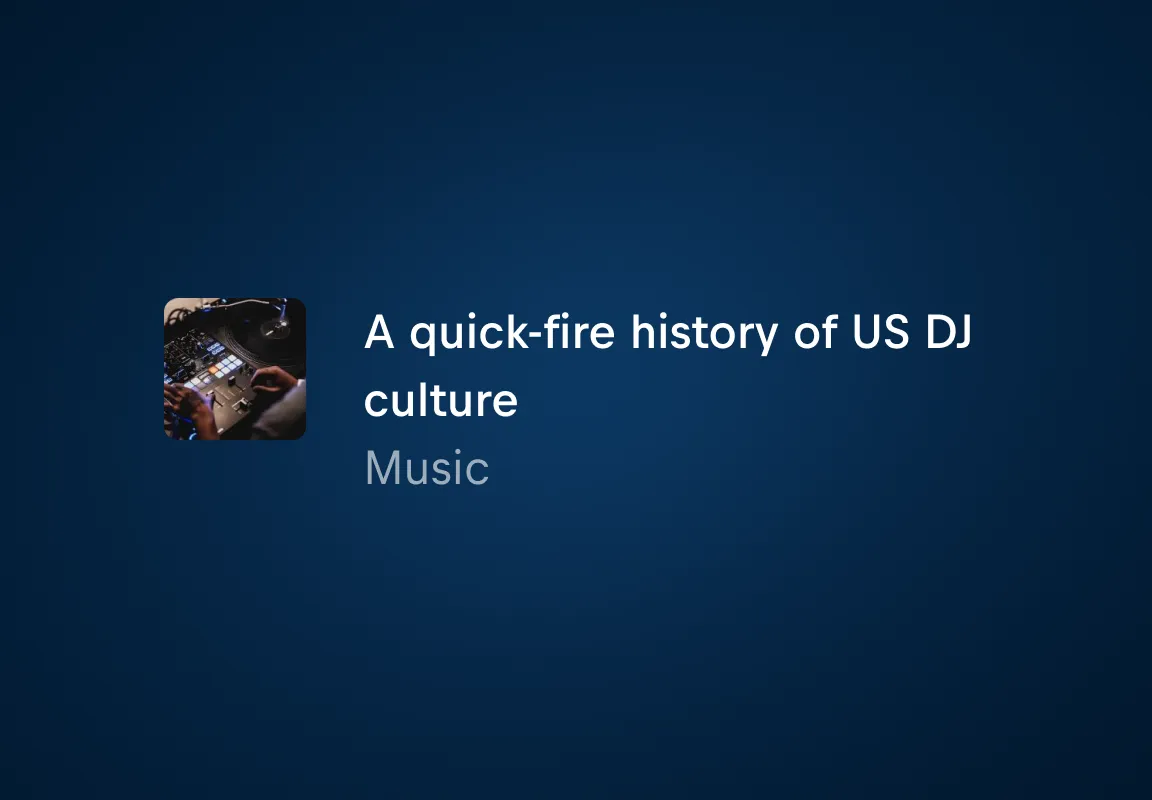
Default Items are for content that doesn't have a specific Asset Item component in our design system and should, therefore, only be used as a fallback.
A Link Item is a teaser to feature external assets on Red Bull's web platforms.
A Person Item can either serve as a teaser for a person’s internal or external profile page or to feature a person.
A Product Item is a teaser to the detail page of a product.
A Story Item is a teaser for editorial content, leading users to a story page.
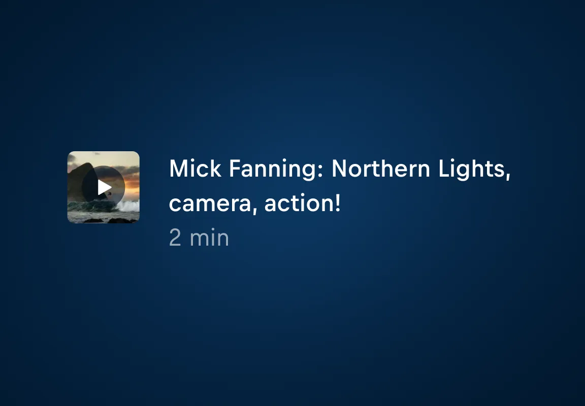
A Video Item serves as a teaser for a Video asset linking to it.
Cards
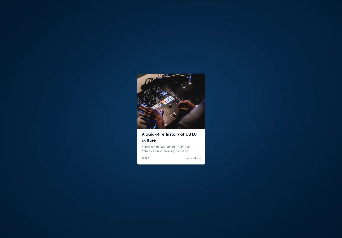
Default Cards are for content that doesn't have a specific Card component in our design system and should only be used as a fallback.
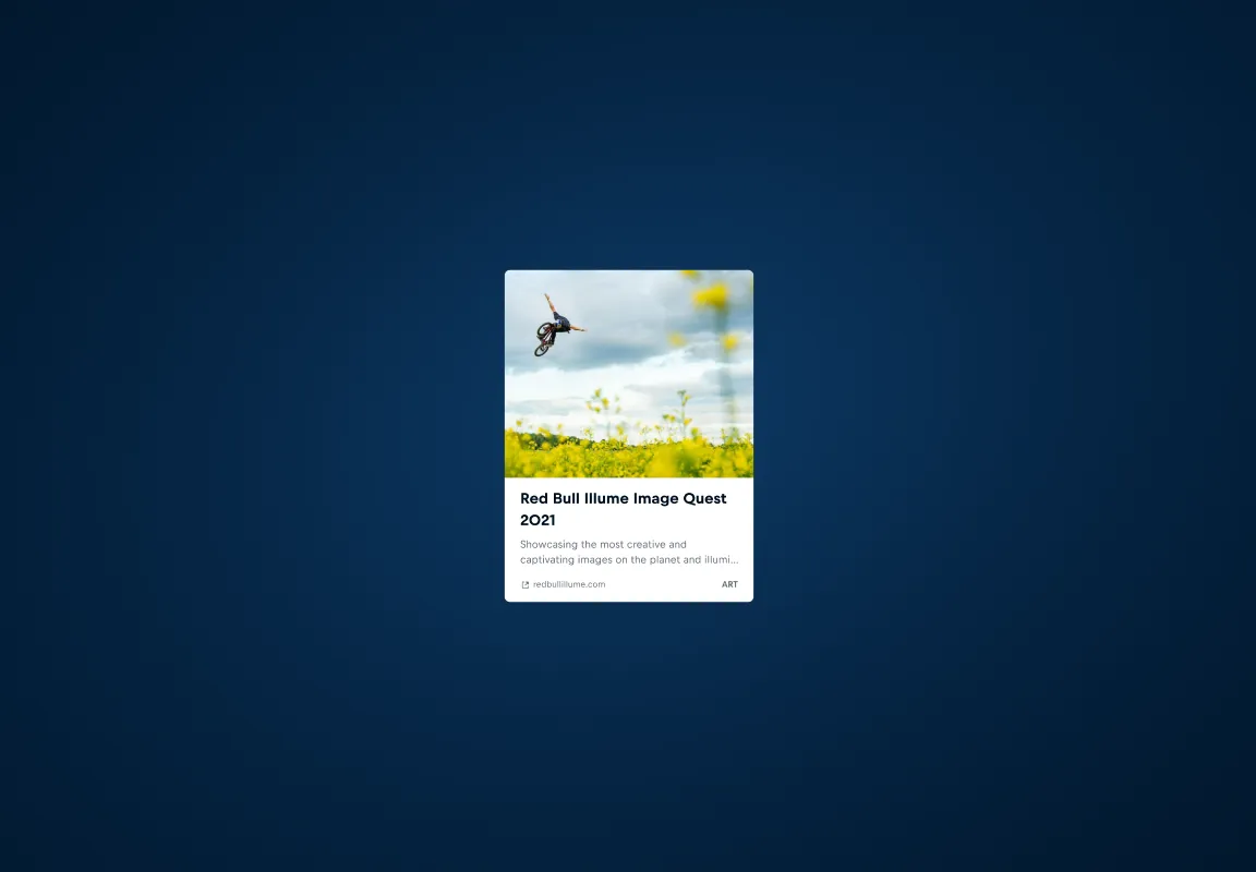
A Link Card is a way to feature external assets on Red Bull's web platforms.
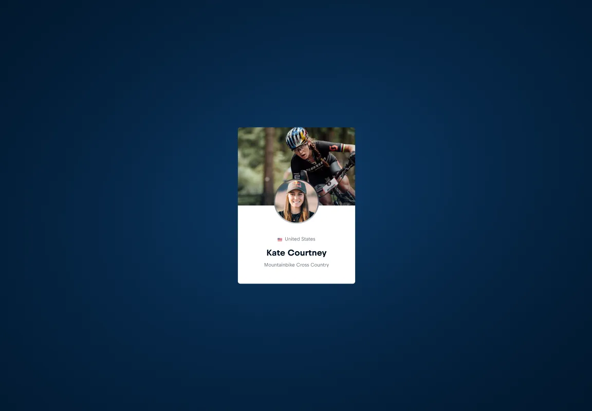
A Person Card is a teaser for a person's profile page.
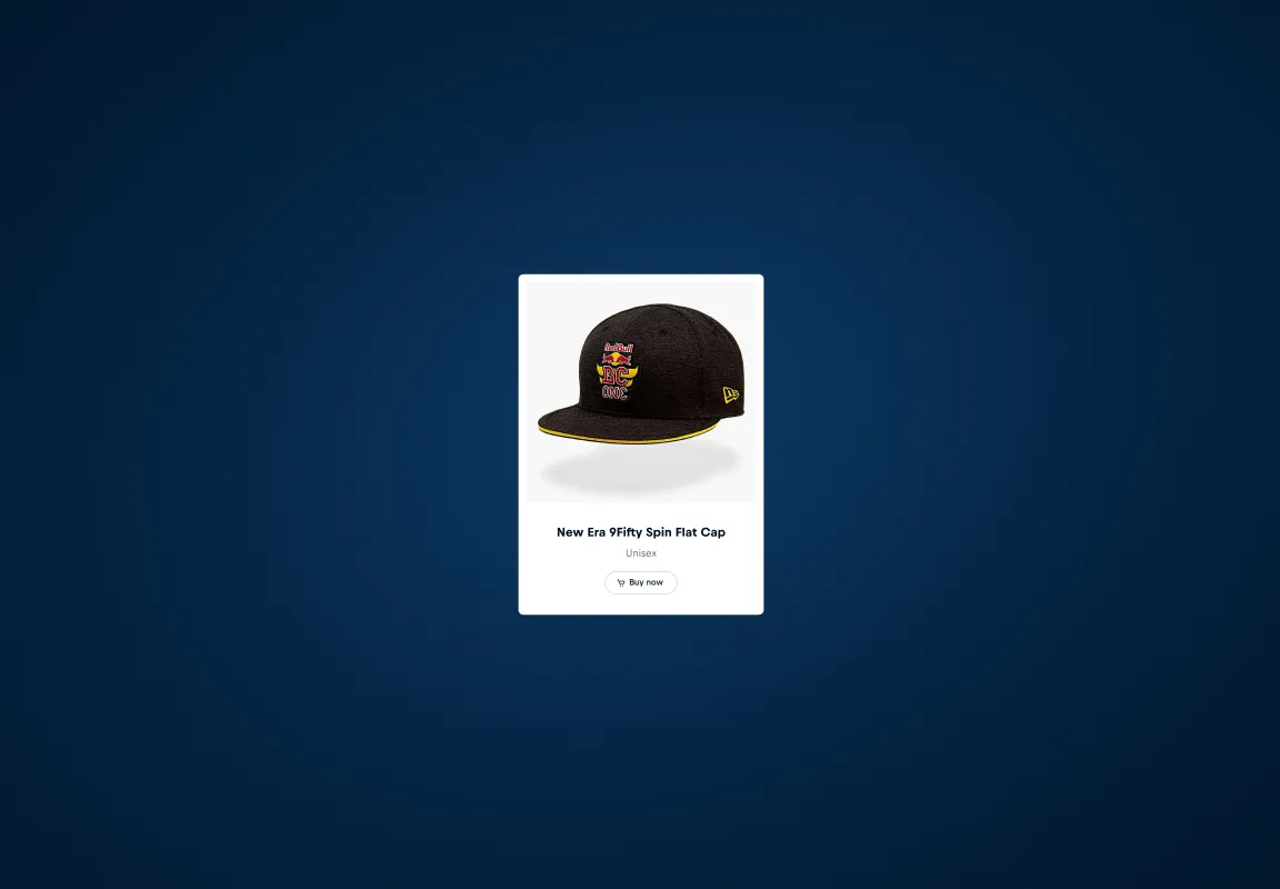
A Product Card is a teaser of the detail page of a product.
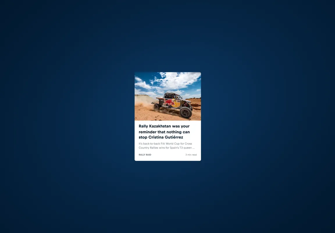
A Story Card is a teaser for an editorial content piece.
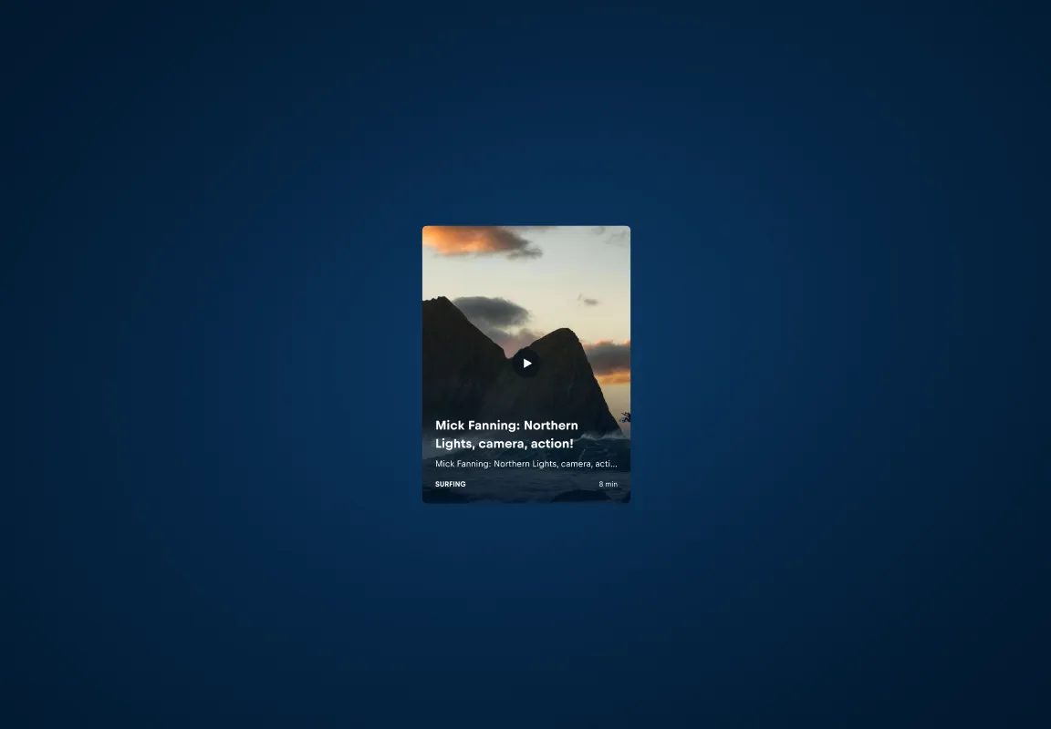
A Video Card is a teaser for an online video.
Form Fields
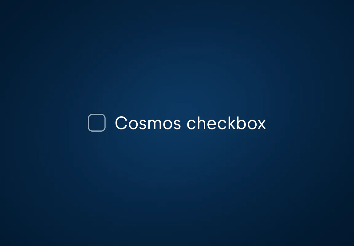
Checkbox
Checkboxes allow users to select an option.
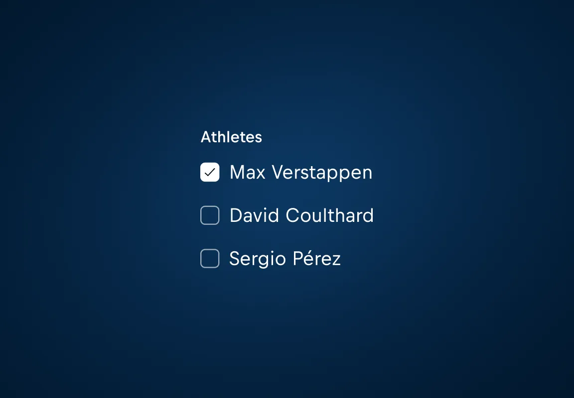
A Checkbox Group combines two or more Checkboxes as one form field, providing multiple choices to a user.
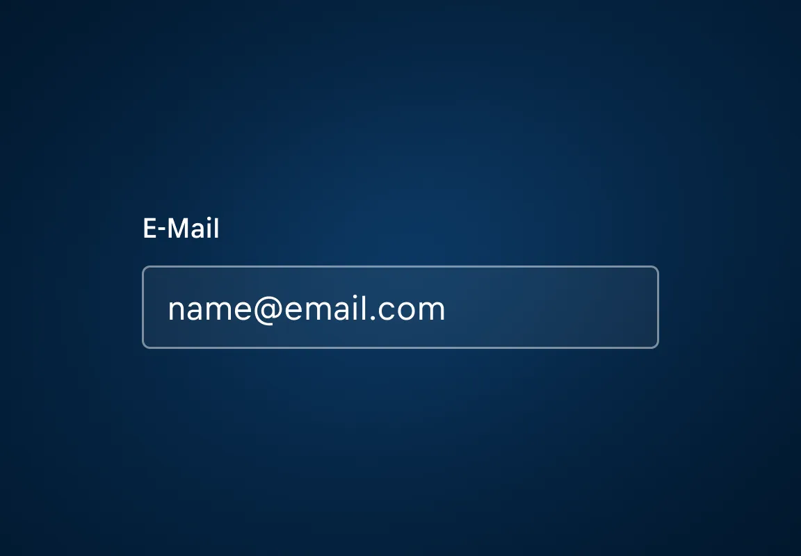
Input
Inputs allow users to submit or edit data.
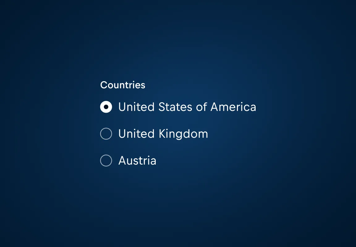
A Radio Group enables the user to select from a list of options. Radio Groups are only used for single selections.
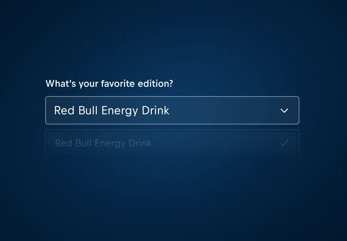
Select
A Select allows a user to select from a list of options.
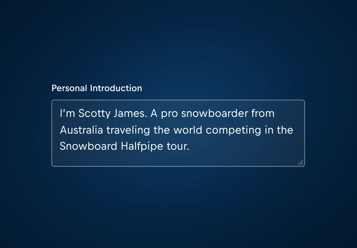
Textarea
Textareas allow users to submit or edit long data.
Guidance
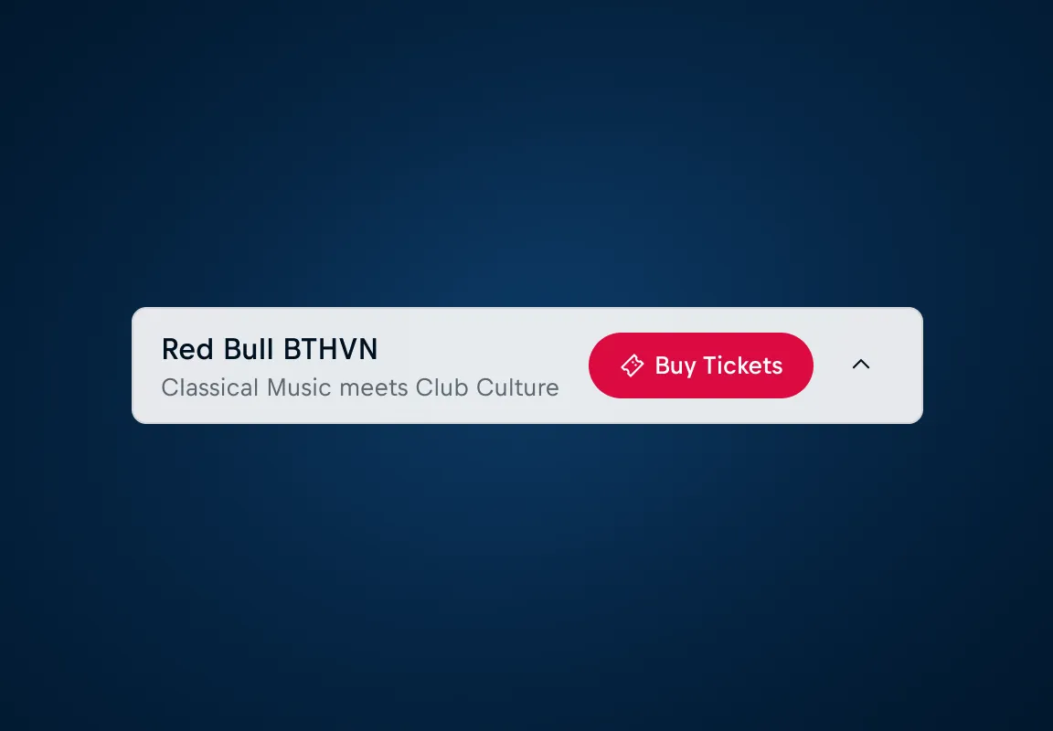
Floating Bar A floating bar is a fixed, non-modal interface element that keeps key information visible while users scroll.
Tooltip
Tooltips are floating, user-triggered messages that provide contextual information about a user interface element or feature.
Indicators

Media

Avatar
An Avatar refers to a visual element that represents a user or a person.
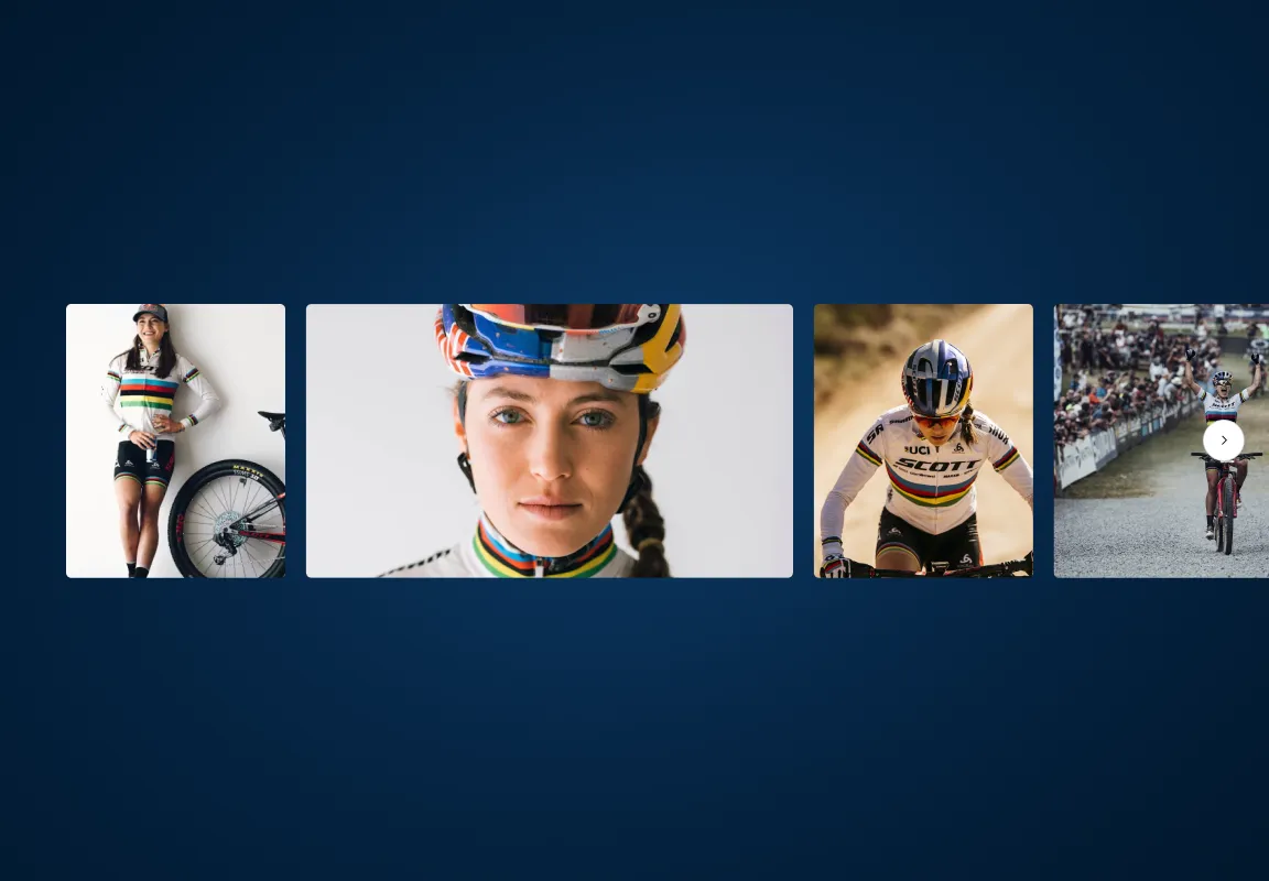
Carousel
A carousel displays horizontally scrollable content within a confined space.
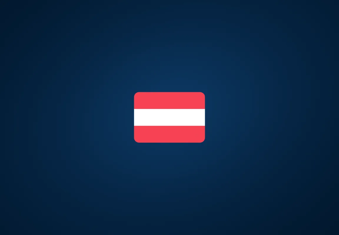
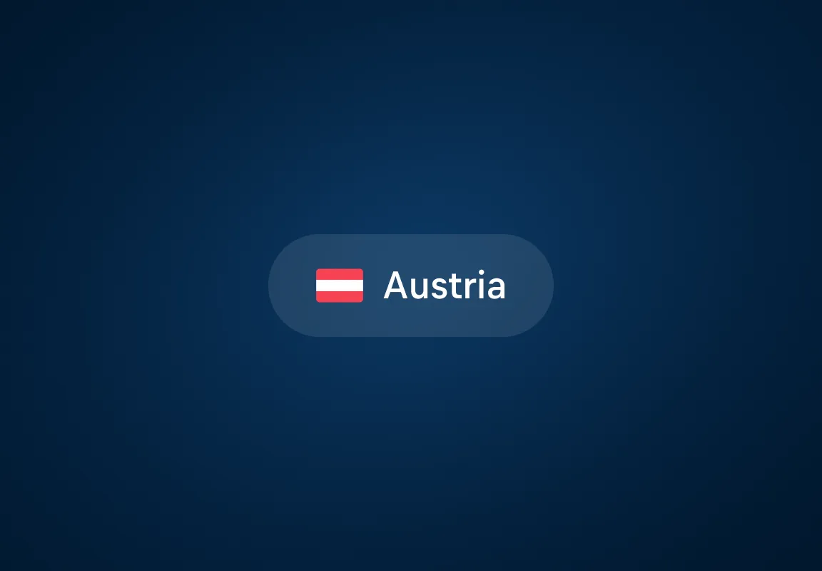
Flag
A Flag is a visual representation of a country or nationality.

Icon
Icons are visual representations of commands and actions or common information.
Image
A component to preload and display image assets.

Use the Media Preview component to display media within components or content.
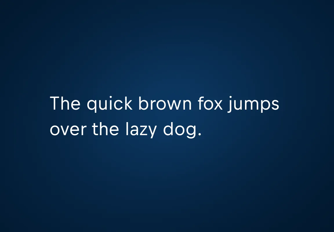
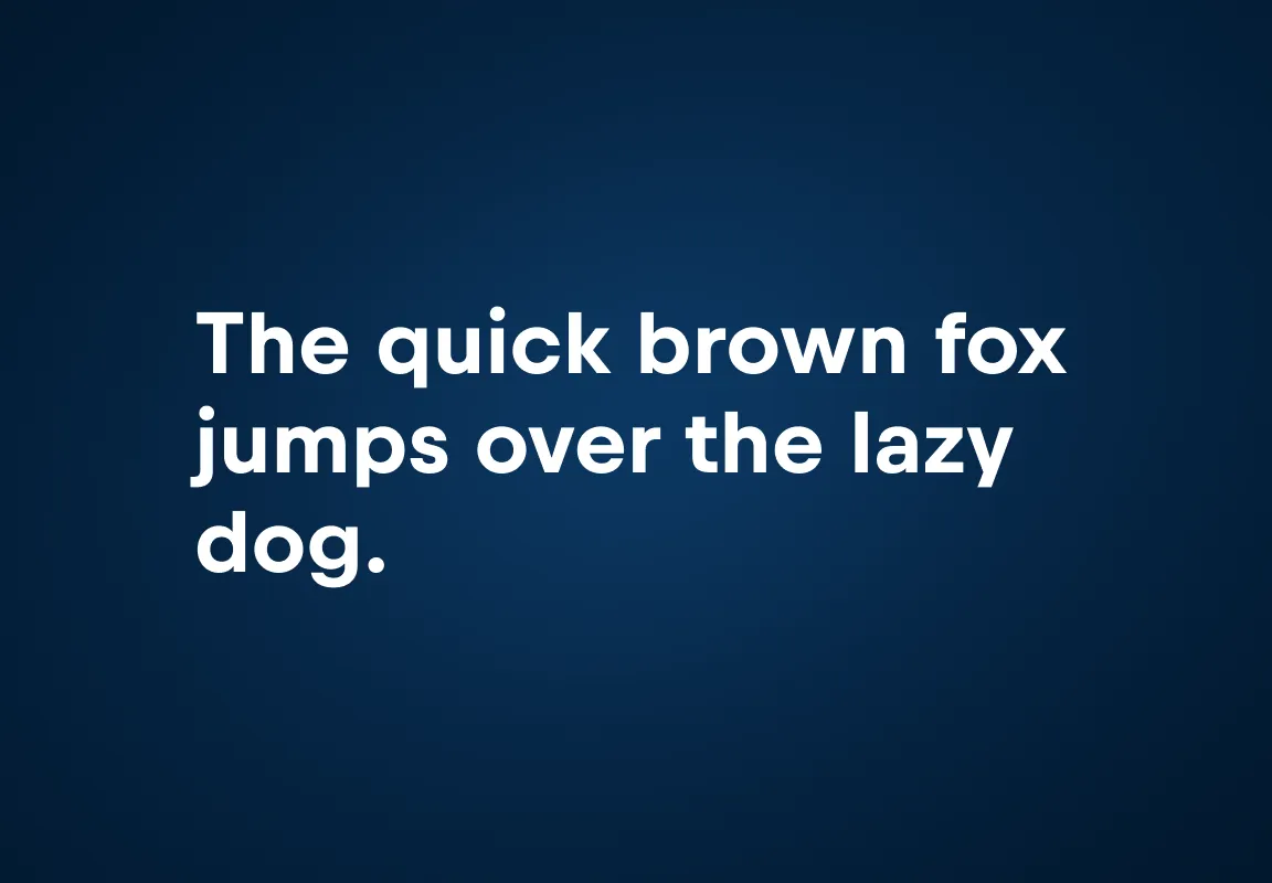
Typography
Utilities

Mode
The Mode is a utility that allows you to control the appearance of nested components in one go.