Design
Design
Components are user interface elements defined by the design system to be used across designs. Cosmos components help create interfaces that enable a consistent User Experience across all consumer-facing products. Using Cosmos components ensures that digital experiences stay up to date, and don't break when components are updated.
New to Figma? Here's a comprehensive guide to using libraries.
Library Access
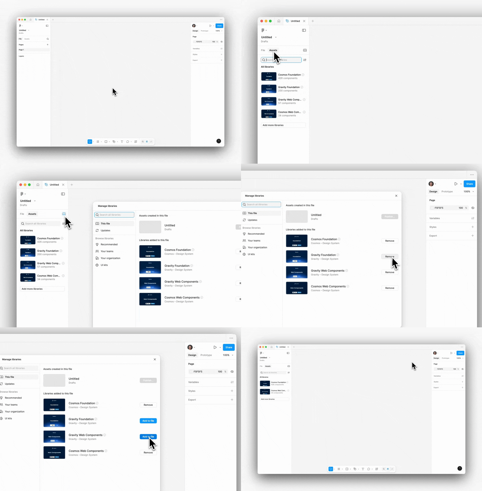
Access the Library overview from the Asset Panel in a Figma file where the Cosmos Foundation and Cosmos Web Components libraries are avaible by default.
☝️ Pro tip
Cosmos and Gravity are available by default, ensure you correctly turn off the libraries not required beforehand.
Using Web Components
Web Components can be easily added to the Figma file by dragging them from the Asset panel onto your canvas.
Variants
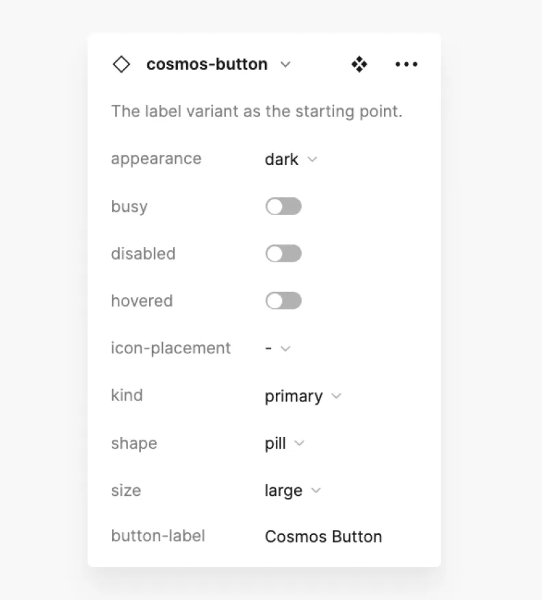
Most of the Web Components offer multiple variants to cater to the most common use cases. These variants are available from the Instance Options panel:
Slots
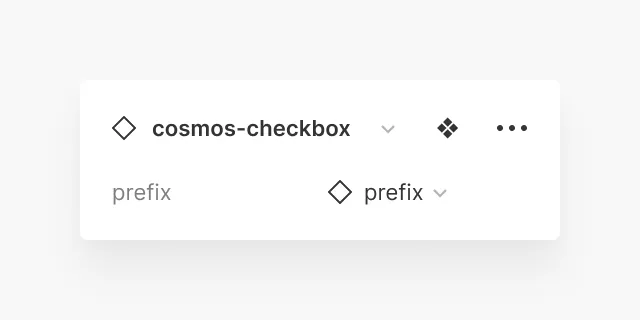
For more complex components and patterns like e. g. Checkbox and Radios, we use Slots in our components – in our Design as well as in our Code Library. Slots allow you to replace nested components with your own local components. Usually, Cosmos Web Components provide templates for easy access to commonly used content for each component. Component slots are always clearly marked by allowing you to swap instances directly from your layer panel:
It should be noted that the component properties are modeled after the Code API. By respecting the limitations of the components, minimum effort in development is ensured, and coherent User Experience patterns are followed across applications.
Design-only properties
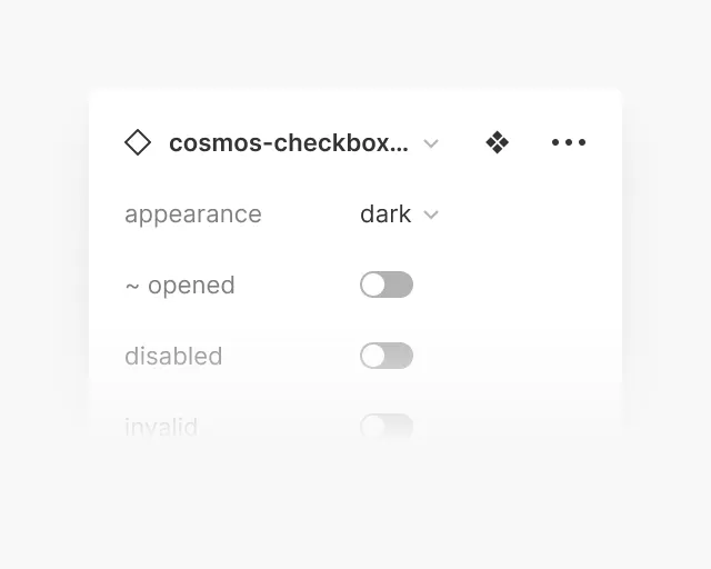
A “tilde” (~) in front of component properties indicates that this property is a design-only property and is not available in code. Here’s an example of the Cosmos Checkbox component which has its 'opened' property only available in design:
Property panel layout
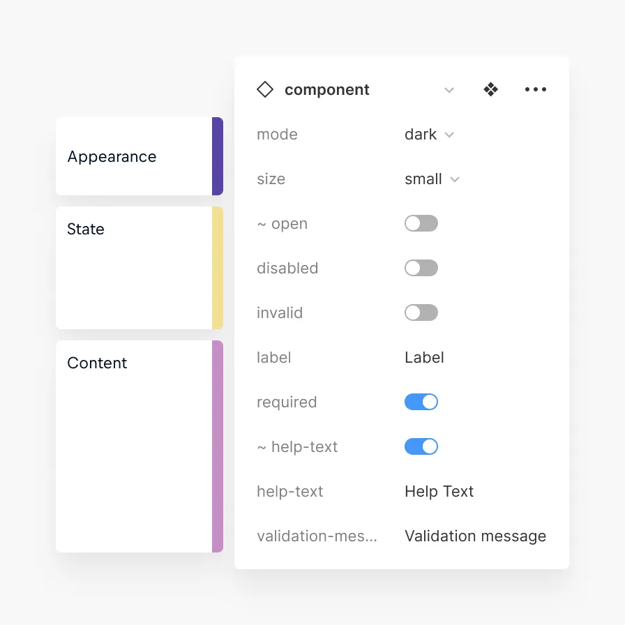
The properties in the property panel layout are ordered for easier wayfinding by the following sequence that should help you intuitively find properties across components:
Purpose | Example | Ordering within Group |
|---|---|---|
Appearance | e.g. appearance, mode, kind, type, size | By order of logical design decisions taken:
|
Content | e.g. text, image, nested components, slots | Order by appearance in UI from top-to-bottom, left-to-right. |
State | e.g. hover, active, focus, disabled, invalid, open | States the user can control first, then alphabetically ascending. |
The following graphic demonstrates the layout logic:
Detaching Web Components
When possible, it's recommended to not detach web components. This is especially true for low-level components – form fields, buttons, etc. This way it's possible to ensure that design files stay up-to-date when library updates are available, with visual and functional updates without confusion in handover and QA.
If components need to be detached in order to make it work for a design project, it should be ensured that exposed base components are not detached when not absolutely necessary.
If components that you feel would be beneficial are missing from the Design System, please get in touch with us on MS Teams in the 'Cosmos – Front-Office Design System / Support'-Channel' – or share your idea directly with us on Echo.
Web Component Library Updates
Design Systems are living organisms. Every new release comes with a change log description that will help make informed decisions when updating project files:
🚀 RELEASE (default) | Marks a new component added to the Cosmos Web Components Library |
|---|---|
✨ UPDATE | Marks non-breaking updates to an existing component |
❗️ BREAKING | Marks a breaking update to a current component |
🐛 BUG FIX | Marks a critical bug fix to a current component |
🚫 DEPRECATED | Marks a component that was previously available and will now be deprecated |
Please keep components up-to-date by routinely checking for library updates when opening design files. Library updates trigger a notification in the bottom right corner of Figma, allowing (reviewing and) applying updates to designs.
It is always recommended to use Figma’s new Update dialogues that allows previewing of the changes before updating a library file in a design.