v4 to v5
v4 to v5
Person Card
The '🚫 cosmos-person-card-retired' component has been removed from the library in favor of the 'cosmos-person-card' component. The new version supports modernized design with cover variants, optional athlete number display, more flexible metadata structure, improved layer organization, and the removal of unused properties. Current instances should be migrated to the new 'cosmos-person-card' component.
Person Item
The '🚫 cosmos-person-item-retired' component has removed from the library in favor of the new 'cosmos-person-item' component. The new version supports the display of athlete numbers, a more flexible metadata structure, improved layer organization, and the removal of unused properties.
All existing instances should be migrated to the new 'cosmos-person-item' component.
Text component
As a result of an accessibility review, it was discovered that the Accent colors used for text are not fully accessible to the required levels (WCAG 2.1 AA, 4.5:1 contrast ratio for text) on Red Bull's platforms. The Text Accent colors in Cosmos Foundation are deprecated and not available anymore starting Q4 of 2023. With this update, the status property of the Cosmos Text component will be deprecated.
As the Text Accent colors are deprecated their usage is to be migrated, the steps and recommendations are outlined below for Figma.
The remaining Accent colors (cosmos-color-positive, cosmos-color-negative, cosmos-color-inform) can be used for graphical elements like icons in containers with outlines or backgrounds as they pass the minimum required level for accessibility on the Cosmos Surface colors (WCAG 2.1 AA, 3:1 contrast ratio). The remaining Accent colors should not be used for text. If the background colors of the content of an experience differ from the Cosmos Surface colors, the contrast of the colors against the new backgrounds should be reviewed.
Extent
The deprecation of the Text Accent colors affects the Cosmos Text component and its ‘status’ property. The status property has the following values:
- default
- inform
- negative
- positive
Migration
It's recommended to migrate before the start of Q4 2023, but if the migration is done later the same approach and steps apply. Here's a list of different situations and how to deal with them when migrating accessibility-compliant implementation.
Text in form validation
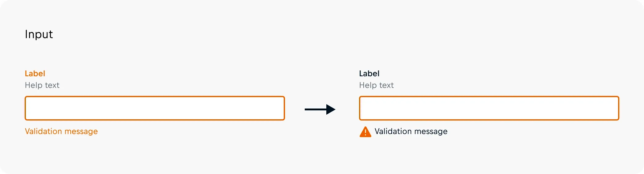
The text accent colors have traditionally been used to indicate an invalid state of a form component. In these cases, the indication should be updated to include an icon in front of the validation message and make all text ‘default’ text status. Outlines of the form components and the icon can be colored with the cosmos-color-inform color to draw attention to the invalid form component as graphics can include accent colors and pass the accessibility requirements (WCAG 2.1 AA, 3:1 contrast ratio).
Highlight important information
Vital information should be ensured to remain accessible by switching all text to the default text status and, when applicable, introducing additional graphical elements to catch consumers' eyes. These graphical elements may use the remaining semantic colors to indicate status.
Success messages
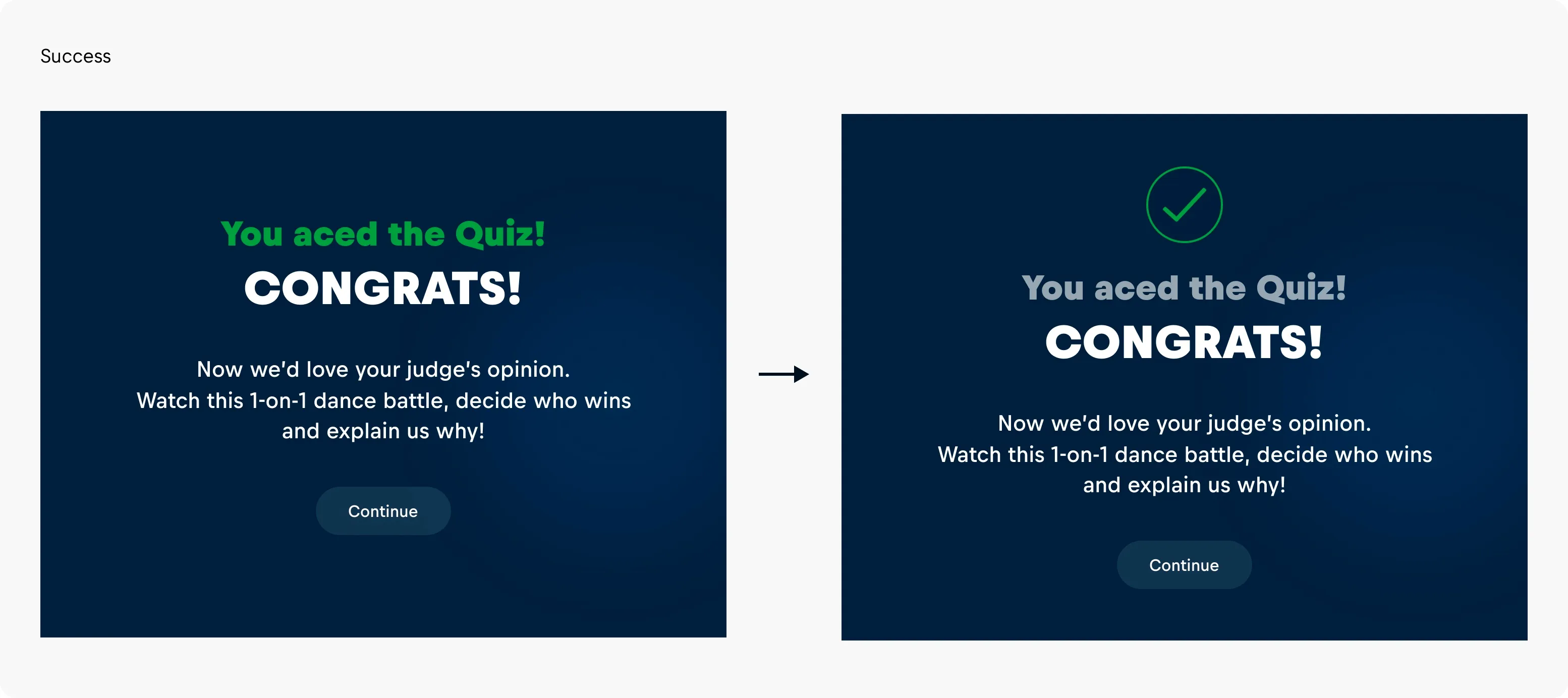
In Cosmos, a cosmos-color-success is available to indicate that an action has been successful and provide a contrasting color to the cosmos-color-negative. Rather than coloring the text, it is best practice to include a graphical element, which can be colored.
- Introduced Q3 – 2023
- Will be resolved end of Q4 – 2023
Web Component library performance update
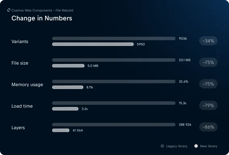
We are releasing a new version of the Cosmos Web Components library. We will continue to provide bug fixes for the legacy library, but all new features will only be available in the new library. The legacy version will be phased out in mid-2024.
After several years with Cosmos development and Figma releases of new capabilities, we saw the potential to combine our own tools with those from Figma. Through performance testing, we noticed that a large number of component variants were causing the library to lag when loading or rendering. We chose not to move forward with just the existing web component library but instead decided to rebuild all components and package them into a new library file. Most of the components have been reworked and gained new capabilities, making them easier to use. The updates include:
- Easier logo replacement on Cards and Product Item
- Better and unified handling of optional and required states of Form Field components
- Easier replacement of prefixes in Form Field components
- Slimmed down Text component, now 25% of the earlier version
- Reduce the number of variants by up to 34%, total removing 3086 variant components
- Removed hover states
When the legacy library is archived, the instances placed within layouts will remain intact with all properties still available, yet it won't link to a library anymore. As a consequence, the original components will not be visible in the Assets panel.
To access the more efficient components, the new library needs to enable them manually in the working files. The library can easily be identified by its name "Cosmos Web Components", compared to the legacy library and components which are now frozen and marked with a warning emoji "⚠️".
Figma provides a guide to library swapping. The new file can be found in the same team as the legacy one, link to the team. The team needs to be joined in order to gain access to the new file. If you have any questions, feel free to contact us through the Support channel in Teams.
Note: When libraries are swapped the overridden media in the components, and some states, will reset back to their default state defined in the new library. The overridden media and states need to be reapplied manually onto the components. Overridden text is preserved.
Ways to not lose overridden media:
- Make a copy of the component instance(s) (whose main component(s) is in the legacy library)
- Detach them
- Swap the library (guide from Figma)
- Replace media from detached components
or
- Duplicate the work file
- Swap the library in one of the files (guide from Figma)
- Replace media from the other file
Performance comparison