v7
Please follow our Migration Guide to migrate from v6 to v7
7.16.0
June 25, 2024
✨ Features
- Input: The input-field is now exported as a CSS shadow part, allowing for the customization of the input field's height.
🐛 Fixes
- Select: The value attribute in the Select component and the selected attribute in slotted options now correctly reflect changes during runtime.
7.15.1
June 18, 2024
🐛 Fixes
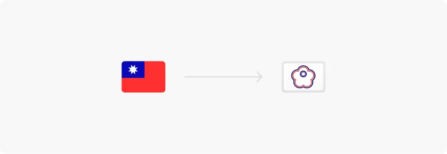
- Flag: The cosmos-flag-TPE and cosmos-flag-TW flags are now displayed as the Worldwide flag due to licensing requirements imposed by official regulatory bodies.
7.15.0
June 18, 2024
✨ Features
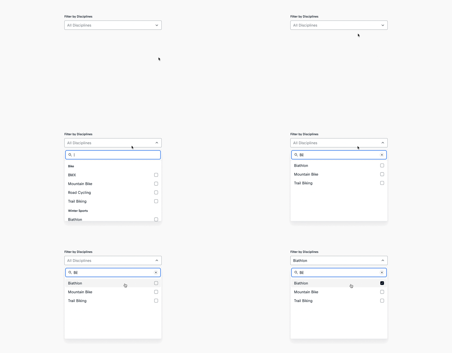
- Select: The Cosmos Select now includes a searchable property, enabling users to quickly filter down the set of options.
🐛 Fixes
7.14.0
May 23, 2024
✨ Features
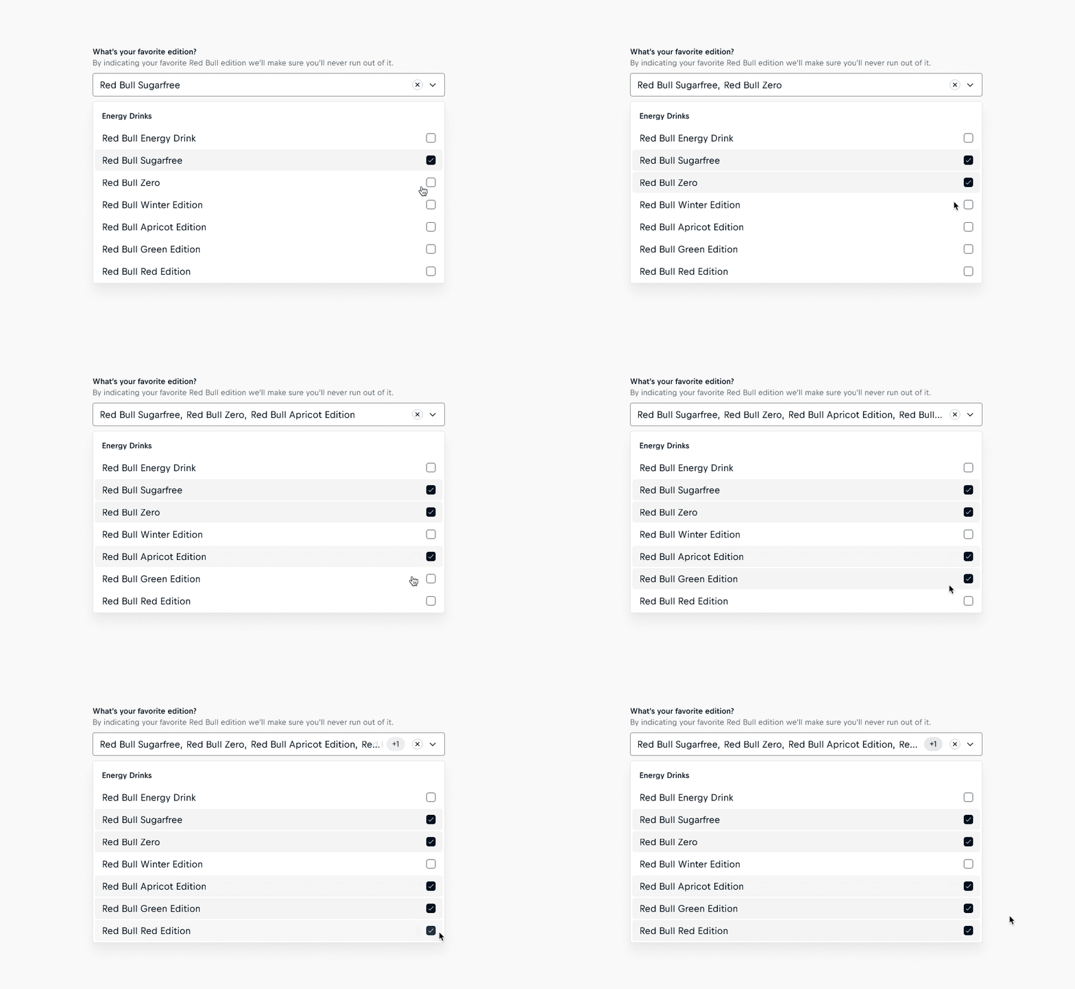
- Select: A badge now appears in the input field, indicating the number of selected options hidden due to overflow. This visual cue informs users about changes in their selections that would not have been visible otherwise.
🐛 Fixes
- Image: The image will no longer re-render already cached content. This prevents the image fade-in animation from triggering unnecessarily.
7.13.1
May 16, 2024
🐛 Fixes
7.13.0
April 30, 2024
✨ Features
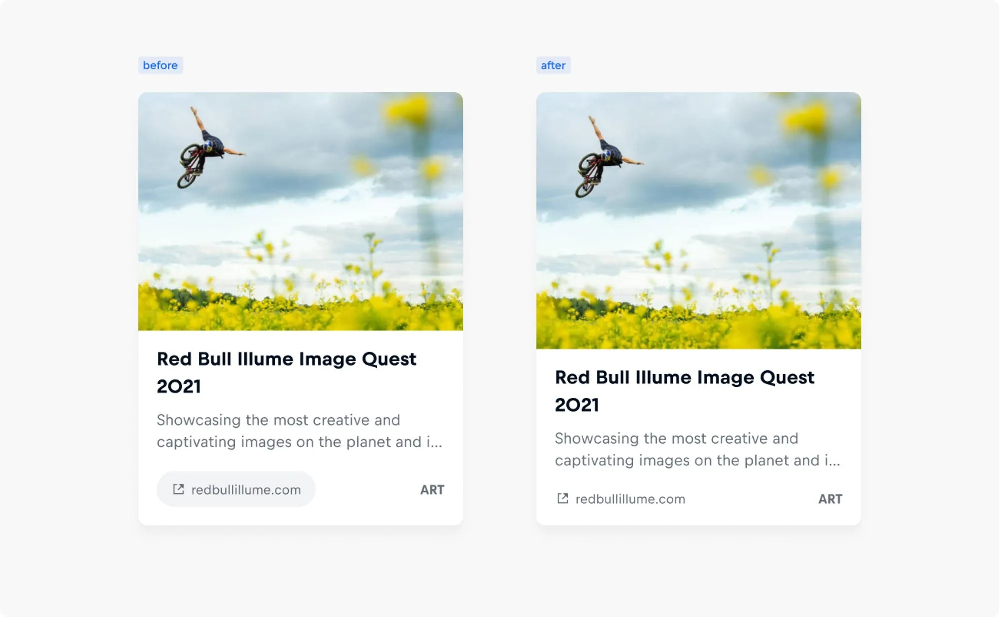
- Link Card: Improving accessibility and usability with enhanced contrast, URLs are now displayed as meta information, departing from the previous button-style presentation.
- Link Card, Story Card, Video Card, Default Card: The tag on Cards appears slightly larger for improved visibility and contrast.
🐛 Fixes
- Link Card, Story Card, Video Card, Default Card: All elements of the card body now respond correctly to responsive Card layouts and render the correct font size.
- Server Side Rendering: The hydration of the components on the client is now faster, when using SSR with preact/react.
- Select: Selecting an option in a multi-select caused the scroll position of the overflowing listbox to reset. Now we ensure it remains unchanged.
7.12.0
April 25, 2024
✨ Features
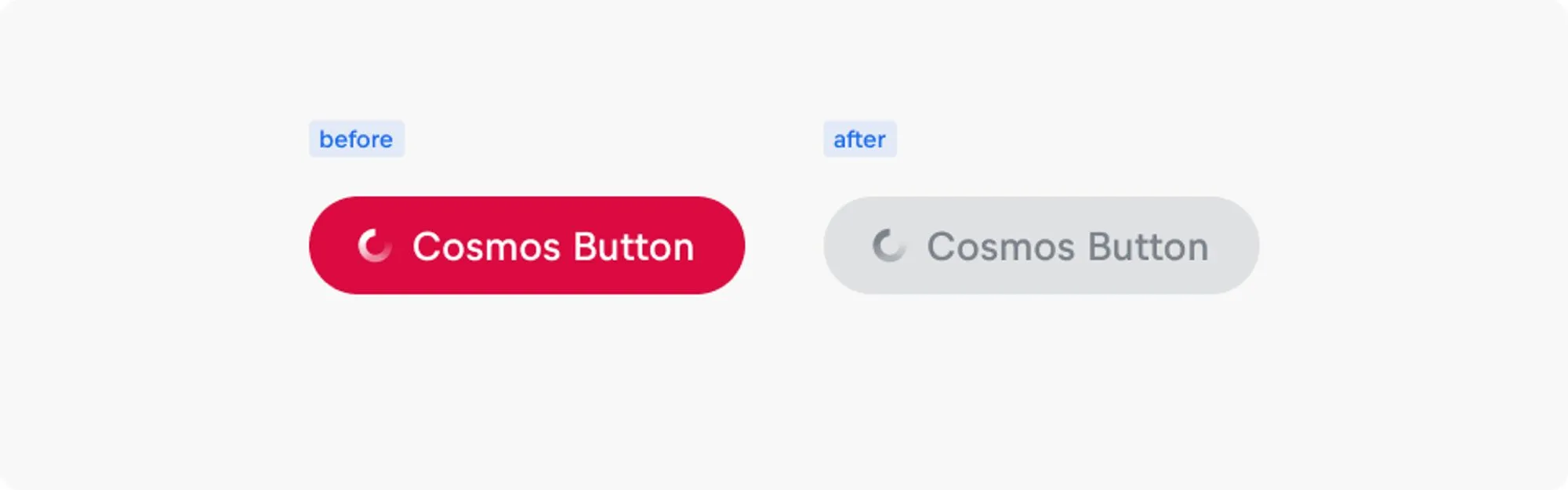
- Button: Busy buttons now accurately reflect their non-interactive state by appearing disabled, aligning with user expectations.
🐛 Fixes
- Button: Resolved layout shifts when Buttons are in a busy state without icons. Now, Buttons maintain consistent dimensions by hiding the label and centering the loading spinner.
7.11.0
April 19, 2024
✨ Features
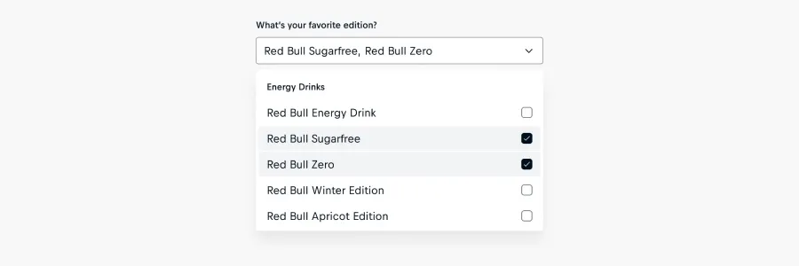
- Select: The Select component now supports a 'multi' variant, allowing users to select multiple items using checkboxes.
- Icon: The icon library now includes new icons for all brands, which convey the original brand colors. Furthermore the icons for Deezer, Messenger and Snapchat have been adjusted to show the most up to date logo.
🚫 Deprecations
- Icon: Some icons of brands have been removed since the platforms they refer to do not exist anymore
Please follow the Deprecation Notes for more information if needed.
7.10.5
April 16, 2024
🐛 Fixes
- Input: We fixed the icon alignment of the date picker icon to be right aligned inside the date input.
7.10.4
April 11, 2024
🐛 Fixes
7.10.2
April 3, 2024
🐛 Bug Fixes
7.10.1
April 3, 2024
🚀 Feature: Updated Country Flag for TW
Flag: Due to regional sensitivities, we need to apply extra care and use the correct flags and naming. We therefore have updated the TW country flag to the internationally accepted standard.
7.10.0
April 2, 2024
🚀 Features

- Icon: The icon library includes four new icons for Youtube, Spotify, Twitch and Instragram, which convey the original brand colors.
Fixes
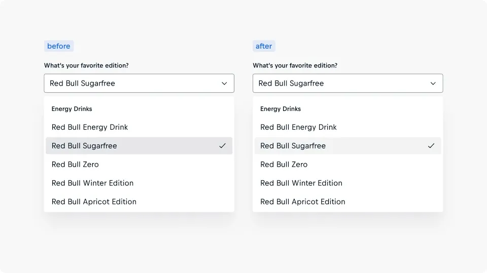
- Select: We've updated the background fill of selected options in light appearances, reducing the contrast to unselected options, as it was perceived as too bold.
7.9.2
March 28, 2024
Fixes
- Form Fields:
- The validation message is restated on assistive technologies when the form is resubmitted.
7.9.1
March 19, 2024
Fixes
We're excited to announce a significant improvement to server-side rendering within Cosmos, thanks to our inaugural contribution to Stencil. This enhancement addresses a persistent issue where components rendered on the server and then hydrated on the client sometimes displayed certain elements twice. This problem has now been resolved, allowing us to remove the related caution from our documentation.
Additionally, this update eliminates the need to list @stencil/core as a peer dependency for @cosmos/web. The required dependencies are now directly integrated into @cosmos/web, streamlining the development process and reducing dependency complexities.
7.9.0
March 12, 2024
Fixes
- We fixed an issue where icon-only buttons would reserve more space than necessary.
- We fixed an issue where our components were hydrated wrongly when using the hydrate script.
7.8.1
March 5, 2024
Fixes
- Checkbox, Checkbox-Group, Input, Select, Radio-Group, Textarea: We've resolved prefix size and spacing alignment issues in validation messages within the Cosmos Form Components.
7.8.0
February 29, 2024
Features
7.7.2
February 27, 2024
Fixes
7.7.1
February 22, 2024
Fixes
- We have identified alignment issues with the prefix sizes and spacings between the prefix and text in certain Cosmos Components. These issues were not accurately corresponding to the text sizes. To address this, we have made changes to ensure proper alignment based on the text sizes.
7.7.0
February 20, 2024
Features
- We have introduced line-height customization across several components where font-family customization was already available.
7.6.0
February 15, 2024
Features
- Features
- Select: We have optimized the visual design of options within selects to enhance clarity and contrast. Simultaneously, we have improved the use of white space to enhance overall alignment and make the best use of available space.
7.5.1
February 13, 2024
Fixes
- Asset Items / Chip:
- Prefixes are now hidden from assistive technologies in the Chip component and specific Asset Items (Person Item, Video Item, Story Item, Link Item, and Product Item) to ensure only essential information is conveyed. For the Default Item, where the significance of prefixes may differ, the slotted content should be hidden explicitly. For details, please refer to our accessibility guidelines.
- We've addressed an issue affecting the visibility of the additional-info-prefixslot.
- We've improved how the URL is announced by assistive technologies, ensuring it is recognised as a single, uninterrupted phrase.
7.5.0
February 8, 2024
Features
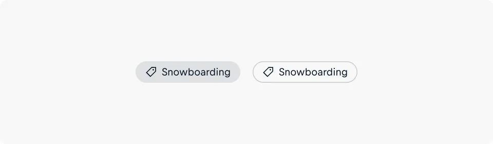
- Badge: The new Badge component is available, serving as a visual cue to spotlight information such as metadata or classifications in user interfaces.
7.4.1
February 6, 2024
Fixes
- Button: We've added a default 1px transparent border to primary, secondary, and bare buttons for consistent sizing
7.4.0
February 1, 2024
Features
- We've improved our form field components with ARIA live regions, ensuring that screen readers announce validation messages in a polite manner, so they are communicated to users sequentially and without interruption. The following components are affected:
- All Form Fields
- Checkbox
- Checkbox Group
- Input
- Radio Group
- Select
- Textarea
7.3.4
January 30, 2024
Fixes
- We have improved aria reference reliability across a number of components following an accessibility review. This improves the consistency in how screen readers are announcing the components. The following components are affected:
- All Asset Items
- Default Item
- Link Item
- Person Item
- Product Item
- Story Item
- Video Item
- All Cards
- Default Card
- Link Card
- Person Card
- Product Card
- Story Card
- Video Card
- All Form Fields
- Checkbox
- Checkbox Group
- Input
- Radio Group
- Select
- Textarea
7.3.3
January 25, 2024
Fixes
7.3.2
January 24, 2024
Fixes
- Mode: We've fixed an issue where the new MutationObserver based approach caused issues with the hydrate functionality and server-side rendering.
7.3.1
January 19, 2024
Fixes
- Mode: We've fixed an issue with where the mode would not properly initialise when using scoped components.
7.3.0
January 18, 2024
Features
- We've updated our cards to use cosmos-title instead of cosmos-text internally.
- Mode: We've moved away from using dom-context in favour of mutationobserver for better performance gain.
- cosmos-icon-pen
- cosmos-icon-sign-up
- cosmos-icon-paste
- cosmos-icon-news
- cosmos-icon-create
- cosmos-icon-copy-link
- cosmos-icon-author
7.2.0
January 16, 2024
Features
- We've added the xx-small option for the size property.
- We've added the clamp property for the title.
7.1.0
January 11, 2024
Features
Fixes
- Set border width of disabled coverup button to 1px
- Update background color of coverup button
- We fixed an issue where some components wouldn't render correctly with their correct initial states in our framework-specific wrappers. This fix was applied to these components:
7.0.0
January 9, 2024
This release is mainly targeting the removal of the previously deprecated status property in the Text component.
🚨 Breaking Changes
💡 Further information including a migration guide available at https://win.gs/CosmosWebMigrationGuides
Fixes