v4
4.30.0
May 07, 2025
✨ Features
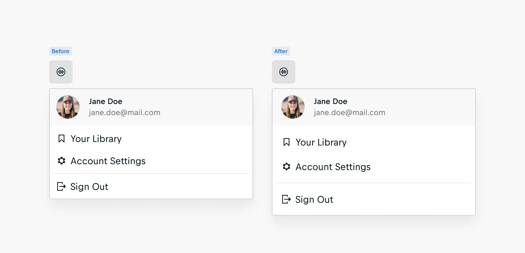
Action Menu: The spacing of the Action Menu has been increased across header, groups, and items to improve its visual balance, enhancing both usability and aesthetics without altering existing functionality.
4.29.0
April 11, 2025
✨ Features

Person Item: The new Person Item component, replacing the previous version, brings more adaptability and focus—ready for a wider range of use cases.
🧩 More flexible metadata – No more rigid metadata rules. Teams can now tailor data to their needs.
🏅 Stronger athlete recognition – New number property displaying crucial athlete identifiers.
🧹 Streamlined properties – Unused fields have been removed to reduce clutter.
🚫 Deprecations
Person Item : The Person Item component has been deprecated and renamed to “🚫 cosmos-person-item-retired” in favor of the new cosmos-person-item component. The new version introduces support for athlete numbers, a more flexible metadata structure, improved layer organization, and the removal of unused properties. This aligns with recent updates to the cosmos-person-card.
Please follow the Deprecation Guide for more information.
4.28.0
March 27, 2025
✨ Features
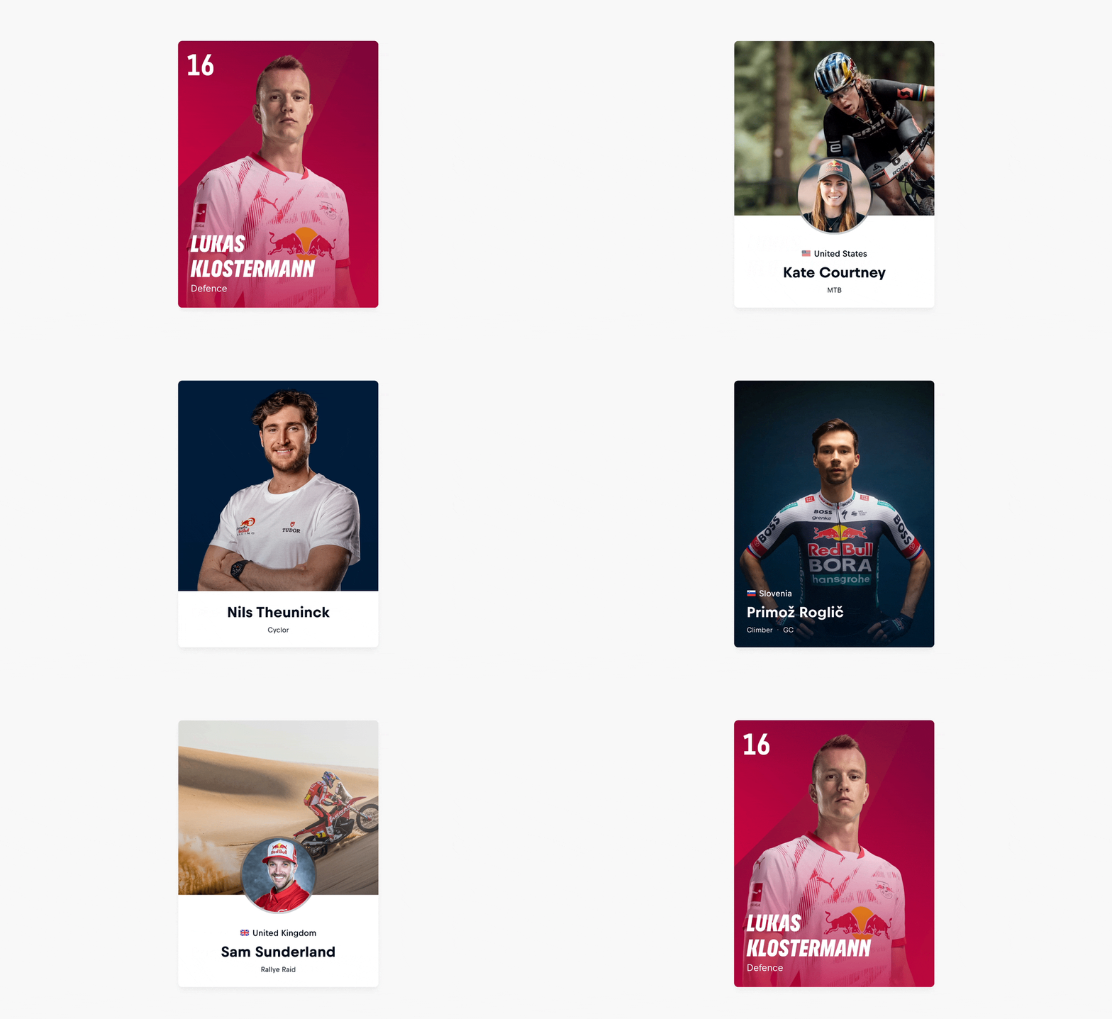
Person Card: The new Person Card component, replacing the previous version, offers greater creative flexibility and visual impact with improved adaptability for various use cases.
📸 Stronger storytelling – With a new cover option to highlight action shots and expressive imagery.
🎯 Less clutter, more clarity – Avatars are now optional, eliminating duplicate assets.
🏅 Stronger athlete recognition – New number property displaying crucial athlete identifiers.
🧩 More flexible metadata – No more rigid metadata rules. Teams can now tailor data to their needs.
🚫 Deprecations
Person Card: The Person Card has been deprecated and renamed to 'cosmos-person-card-retired' in favor of the new 'cosmos-person-card' component, which introduces a modernized design with cover variants, optional athlete number display, more flexible metadata structure, and improved layer organization. Current instances should be migrated to the new 'cosmos-person-card'.
4.27.0
November 26, 2024
✨ Features
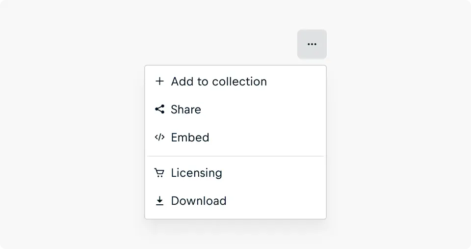
- Action Menu: The Action Menu is a dropdown that can be used to provide quick access to contextual or navigational actions, enhancing workflows and improving the overall user experience without distracting from the main navigation.
4.26.0
October 8, 2024
✨ Features
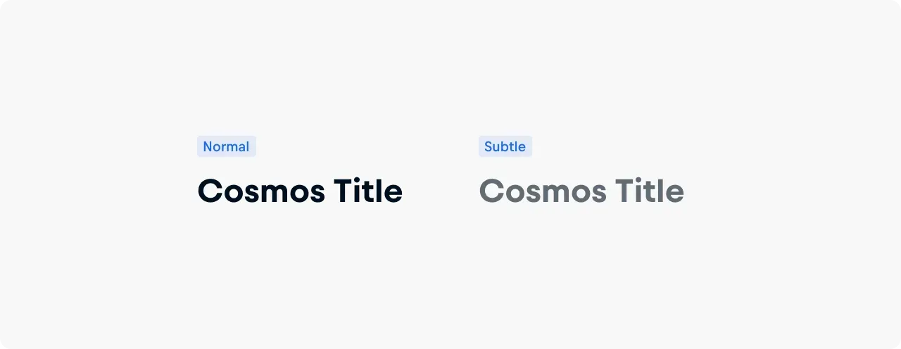
- Title: The Title component now supports a subtle variant, allowing for more flexibility to adjust heading prominence while maintaining clear visual hierarchy in user interfaces.
4.25.0
October 3, 2024
✨ Features
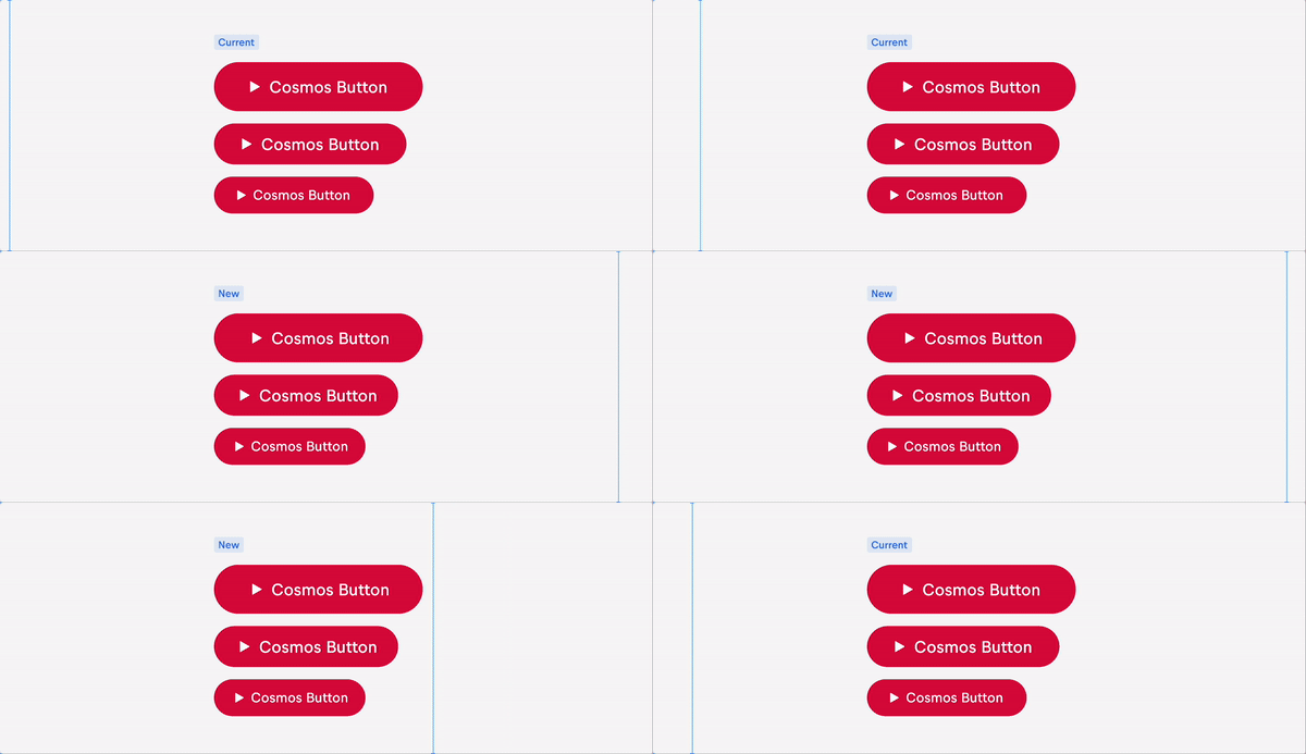
- Button: The complex structure of the cosmos button was causing some minor but noticeable rendering issues and was visually imbalanced when an icon was present As a result, we revisited design of the button, removing redundancies and optimizing the structure for improved loading and visual balance. This has resulted in some minor changes to buttons widths as illustrated.
4.24.0
October 1, 2024
✨ Features
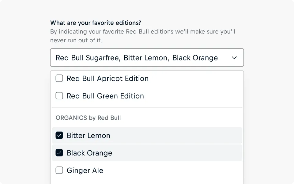
- Select: The Select has received spacing and layout adjustments, visually separating the option groups more to allow for quicker skimming and scanning as well as improving the user experience when selecting multiple options.
💥 Breaking Change
Due to the refactoring of the Select component, there is a risk that content within instances may reset. Please check instances of the Select carefully using Figma Review Update feature.
4.23.0
September 19, 2024
✨ Features
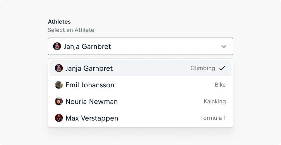
- Select : Meta information is now supported for selectable options, providing context to help users easily pick the right choice from a select list.
4.22.0
June 18, 2024
✨ Features
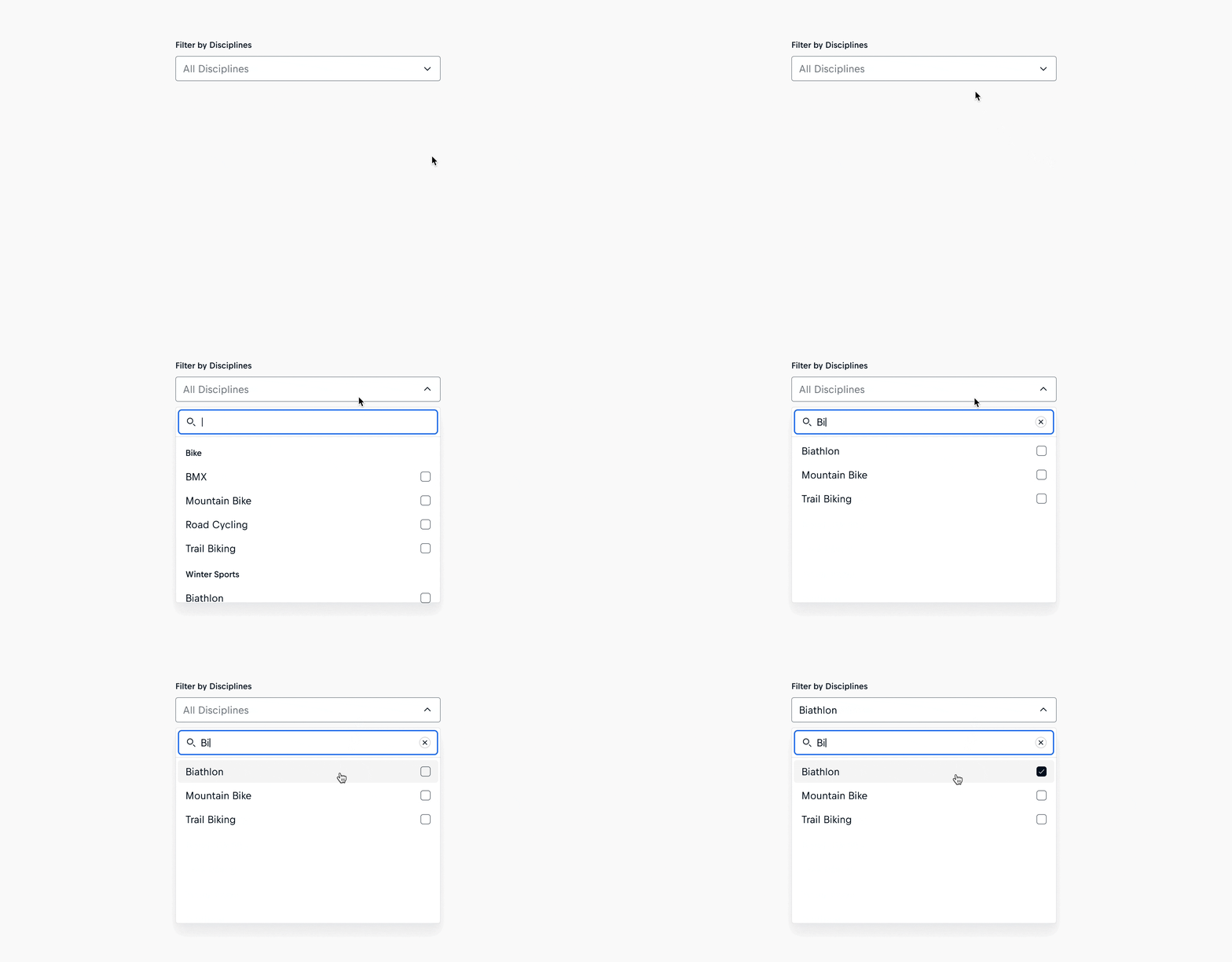
- Select: The Cosmos Select now includes a searchable property, enabling users to quickly filter down the set of options.
4.21.0
May 23, 2024
✨ Features
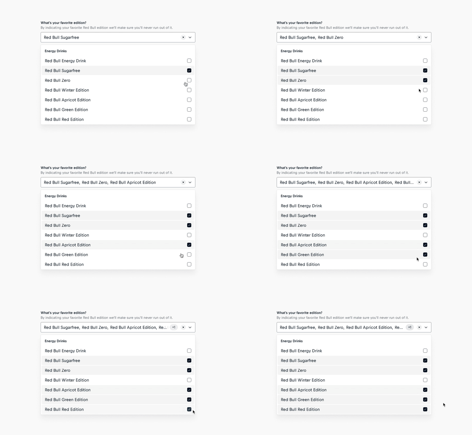
- Select: A badge now appears in the input field, indicating the number of selected options hidden due to overflow. This visual cue informs users about changes in their selections that would not have been visible otherwise.
4.20.1
May 16, 2024
🐛 Fixes
- Select: The listbox of the Select in light appearance now features a border for enhanced elevation on light surfaces.
4.20.0
April 30, 2024
✨ Features
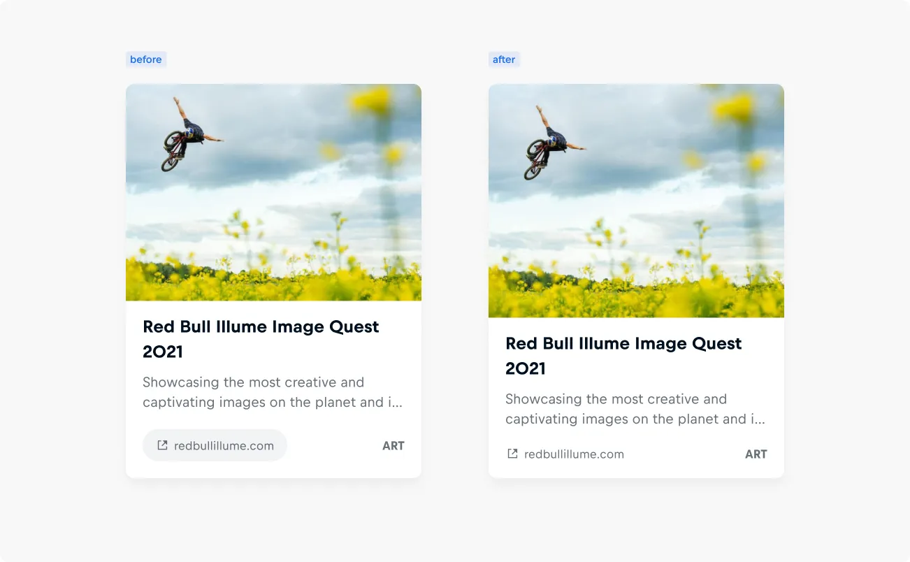
- Link Card: Improving accessibility and usability with enhanced contrast, URLs are now displayed as meta information, departing from the previous button-style presentation.
- Link Card, Story Card, Video Card, Default Card: The tag on Cards appears slightly larger for improved visibility and contrast.
4.19.0
April 25, 2024
✨ Features
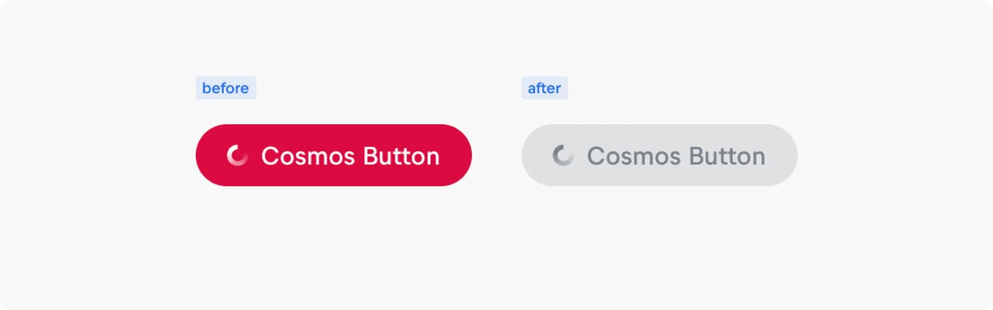
- Button: Busy buttons now accurately reflect their non-interactive state by appearing disabled, aligning with user expectations.
🐛 Fixes
- Button: Resolved layout shifts when Buttons are in a busy state without icons. Now, Buttons maintain consistent dimensions by hiding the label and centering the loading spinner.
4.18.0
April 19, 2024
✨ Features
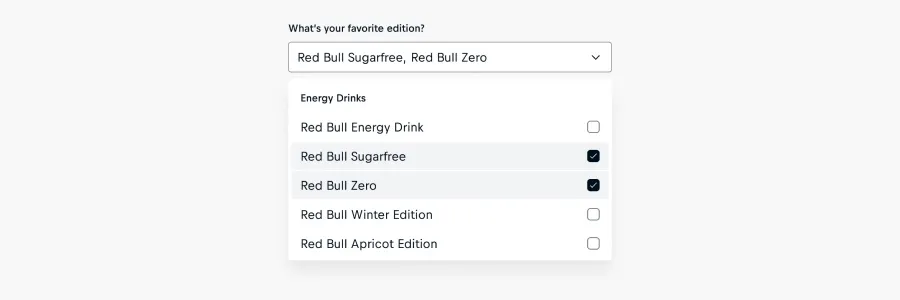
- Select: The Select component now supports a 'multi' variant, allowing users to select multiple items using checkboxes.
4.17.3
April 2, 2024
What's fixed
- Select: We've updated the background fill of selected options in light appearances, reducing the contrast to unselected options, as it was perceived as too bold.
4.17.2
March 5, 2024
What's fixed
- Checkbox, Checkbox Group, Input, Select, Radio Group, Textarea: We've resolved prefix size and spacing alignment issues in validation messages within the Cosmos Form Components.
4.17.1
February 22, 2024
What's fixed
- We have identified alignment issues with the prefix sizes and spacings between the prefix and text in certain Cosmos Components. These issues were not accurately corresponding to the text sizes. To address this, we have made changes to ensure proper alignment based on the text sizes.
4.17.0
February 15, 2024
Features
- Select: We have optimized the visual design of options within selects to enhance clarity and contrast. Simultaneously, we have improved the use of white space to enhance overall alignment and make the best use of available space.
4.16.0
February 8, 2024
Features
- Badge: The new Badge component is available, serving as a visual cue to spotlight information such as metadata or classifications in user interfaces.
What's fixed
- Default Item, Product Item, Link Item, Video Item, Story Item, Person Item: The prefix slots of all asset items have been fixed in Figma for centricity of slotted-in items.
4.15.0
February 1, 2024
Features
- We have renamed the variable sets in the Foundation Library to ensure variables in Code Inspector are better aligned with their counterparts in code. The changes are now updated in the Cosmos Web Components Library.
4.14.0
January 18, 2024
Features
- Default Card, Person Card, Product Card, Story Card, Video Card, Link Card: We've updated our cards to use cosmos-title instead of cosmos-text for headlines.
4.13.0
January 16, 2024
Features
4.12.2
January 9, 2024
What's deprecated
- Person Item in the Cosmos Web Components legacy library. ℹ️ Please migrate to "cosmos-person-item-new".
- Text component's accent colors and status property in the legacy library. ℹ️ Please use cosmos-color-text-default or cosmos-color-text-subtle instead of the accent colors.
More information is in the Migration guide.
Please note that the legacy library is being phased out in favor of the new Figma Cosmos Web Components library. Please switch over as soon as possible to ensure continued support and improved functionality.
4.12.1
January 11, 2024
What's fixed
- Button: The background colors of the Cover-up variants have been updated from cosmos-color-surface-glass-dark-45 to cosmos-color-surface-glass-dark-60 for improved color contrast. This update applies to the default and busy variants in light and dark appearances.
- Button: The background color of the disabled Cover-up variants has been updated from cosmos-color-surface-glass-dark-20 to cosmos-color-surface-glass-dark-45 for improved color contrast. This update applies to the light and dark appearances.
- Title: The inner text layer widths of the mobile variants have been updated to fill their container.
- The component descriptions of all asset items and form field components that contain a prefix placeholder have been updated. You can find the link to a tutorial in the descriptions.
4.12.0
Dec 21, 2023
Features
4.11.0
December 1, 2023
Features
4.10.1
November 27, 2023
What's fixed
- Checkbox, Checkbox Group, Radio Group: The hit-area has been updated to 24x24px to meet a11y requirements.
4.10.0
November 24, 2023
Features
4.9.5
November 9, 2023
What's fixed
- Button, Checkbox, Checkbox Group, Input, Radio Group, Select, Textarea, Avatar: glass-40 color styles are updated to glass-45 across all affected components following the deprecation of glass-40 color primitives.
4.9.4
November 7, 2023
What's fixed
- Select: The elevation-style cosmos-elevation-2-above has been added to the Option Groups of the opened states, as this was missing in Figma.
4.9.3
October 5, 2023
What's fixed
4.9.2
September 27, 2023
What's fixed
- Link: The values of the 'size' property were wrongly arranged. Now they've been rearranged according to their size.
4.9.1
September 19, 2023
What's fixed
- The restructuring of the Color, Elevation and Backdrop Blur styles have been applied to the Cosmos Web Components.
4.9.0
September 5, 2023
Features
- Person Item: Introduced the profile-image-framed property for controlling the frame of the profile image
4.8.0
August 24, 2023
Features
- Avatar: A new standard component for visually referencing a person is available and has been added to the Person Card and Person Item components.
- Documentation links of all components are updated.
4.7.1
August 17, 2023
What's fixed
- Product Item: A design-only property for displaying and hiding meta information has been added to the figma component. The four-pointed star "✦" is used to indicate a design-only property, which can be disregarded when implementing components in code.
4.7.0
August 10, 2023
Features
- Default Item: A new standard component to feature or work as a fallback for an unspecified content type.
4.6.0
August 3, 2023
Features
- Video Item: A new „additional-info“ meta information with prefix property has been added to the component.
4.5.0
August 1, 2023
Features
- Story Item: A new "additional-info" meta-information with prefix property has been added to the component.
- Person Item, Link Item: A prefix property has been added to the "additional-info" meta-information.
4.4.0
July 27, 2023
Features
- Link Item: A new standard component is available to feature external assets on Red Bull's web platforms.
4.3.1
July 27, 2023
What's fixed
- Image: the light appearance of fallback images is updated for improved accessibility and applied to Cosmos Web Components with a fallback image.
4.3.0
July 26, 2023
Features
4.2.0
July 18, 2023
Features
- Text: The status property is deprecated, due to Text Accent colors being deprecated, and scheduled for removal at the end of Q4, 2023.
4.1.0
July 12, 2023
Features
- Person Item: The current version of the component has been deprecated in design as new Figma features allowed for a leaner approach for building the new component. Please migrate over and use the "cosmos-person-item-new"
4.0.0
June 29, 2023
In version 3.2.0 we introduced a new version of the Checkbox and the old version was deprecated. In this version, we remove the old component from the library as its deprecation window is closing.
All instances of the old Checkbox will be detached from the library component when the update is applied and should be replaced with the current Cosmos Checkbox. Please refer to the Checkbox documentation for more information on its usage.