v11
Web Components – 11.6.1
November 4, 2025
🐛 Fixes
- CarouselCarousel: Visible (overflowing) slides are now interactive, with navigation buttons appearing on hover.
- CarouselCarousel: The scrollToSlide method now works properly with RTL (right-to-left) layouts, ensuring smooth and accurate scrolling behavior.
- CarouselCarousel: Fixed an issue causing the slidesInView event to emit slides out of order.
- CarouselCarousel: We’ve fixed an issue that was preventing scrolling on IOS + Safari
Web Components – 11.6.0
October 30, 2025
✨ Features
- Modal Dialog : The Modal Dialog component focuses user attention on a specific task, decision, or message while maintaining the underlying page context. Use it thoughtfully, as it interrupts user flow and blocks background interaction.
Key Features include
📱 Multiple predefined sizes with a responsive, mobile-optimized layout
🧩 Flexible header, body, and actions slots with overflow scrolling and persistent actions
♿ Built-in accessibility including focus traps, proper layer management and motion control
Web Components – 11.5.0
October 22, 2025
✨ Features
- Floating BarFloating Bar: We added CSS custom properties for customizing the expand toggle button and mobile scrim overlay.
🐛 Fixes
- CarouselCarousel: Non-interactive slides now display a grab cursor while dragging for improved UX consistency.
- AngularAngular Wrapper: We fixed an issue where @cosmos/web-angular and @cosmos/web-scoped-angular would not allow being installed in Angular projects other than 20. The range has been adjusted to correctly support 18, 19 and 20 again.
🚫 Deprecations
- IconIcon: Icons cosmos-icon-google-podcasts and cosmos-icon-google-podcasts-branded have been deprecated due to the discontinuation of the associated services.
Please follow the Deprecation Guide for more information.
Web Components – 11.4.2
October 14, 2025
🐛 Fixes
- Link: We fixed an issue where the focus ring did not properly wrap around images inside links.
Web Components – 11.4.1
October 9, 2025
🐛 Fixes
- Select : We fixed an issue where flags would not display in the selected value on initial page load.
- Select : We fixed an issue where the Select caused document overflow on page load.
Web Components – 11.4.0
October 7, 2025
✨ Features
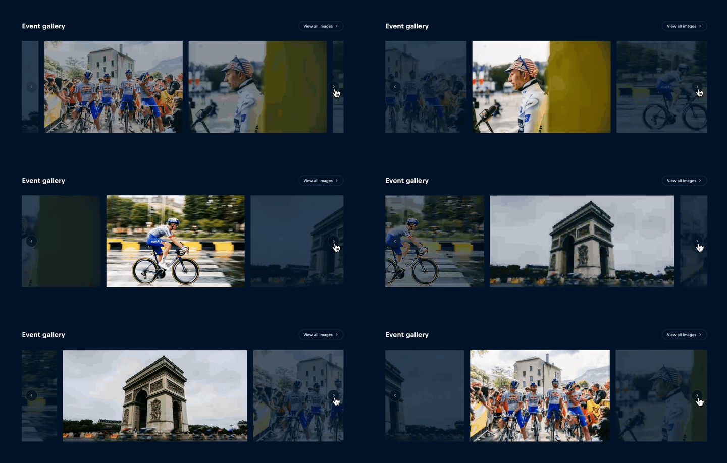
- Carousel : We’ve added new features to enhance your carousel experience: • 🔁 Enable infinite scrolling with the new loop prop. • 🎯 Added option for center-aligning slides within the carousel viewport. • 🏷️ Automatically apply class names to slides that are in view or snapped, making it easier to style active or visible slides with custom CSS.
🐛 Fixes
- Carousel : Keyboard navigation now should now properly work with overflowing content in the carousel.
11.3.1
September 25, 2025
🐛 Fixes
- TooltipTooltip: We have resolved an issue with the follow prop in the tooltip to ensure correct behavior in Preact.
11.3.0
September 18, 2025
✨ Features
- Carousel :
- The slidesinview event will now also trigger every time the carousel enters the viewport.
- The slidesinview event will now emit all visible slides, not just those visibly inside the carousel container.
🐛 Fixes
- Button, Person Card, Person Item, Action Menu: We have resolved an issue causing text to be cropped in certain components when viewed in Safari.
11.2.0
September 16, 2025
✨ Features
Floating Bar: We are introducing the new Floating Bar component, a fixed element that keeps key information visible as users scroll. It adapts to different viewports, expands to reveal additional content, and gives teams structured control over content. Key Features Include:
📱Responsive Behavior: Adapts to viewport width, rendering as a floating element on large screens (≥1000px) and as a bottom sheet on smaller screens.
🧩 Content flexibility: Provides dedicated slots for header-collapsed, header-expanded, and body, enabling teams to control content across states.
👀 Customizable visibility: Easily controlled via a simple visibility API, with smooth transitions in and out of view, which can be tied to consumer-defined viewport or scroll conditions.
♿ Accessibility & RTL support: Built with accessibility standards and right-to-left language support to ensure inclusive use.
11.1.4
September 11, 2025
🐛 Fixes
- Carousel :
- The slidesinview event now properly fires when the --cosmos-carousel-slides-per-view css property is changed at runtime.
- The carousel will now only emit the slidesinview event when it’s inside the viewport.
11.1.3
September 9, 2025
🐛 Fixes
- Select : We’ve fixed an issue where text within the Select was being cut off in Safari browsers.
11.1.2
August 26, 2025
🐛 Fixes
- Carousel : The --cosmos-carousel-offset-left and --cosmos-carousel-offset-right SCSS properties have been adjusted to --cosmos-carousel-offset-start & --cosmos-carousel-offset-end in order to better accommodate LTR/RTL usage.
11.1.1
August 22, 2025
🐛 Fixes
- Image: We disabled preloading of the image property when the srcset property is set to prevent the browser from downloading multiple images.
11.1.0
August 20, 2025
✨ Features
- Carousel: We're introducing the Carousel Component - a flexible and intuitive solution for displaying any content (images, cards, text, and mixed media) in a horizontally scrollable format for when space is limited or content is secondary.
Key features include: ↔️ Smooth horizontal scrolling and snapping with touch gesture support 📱 A responsive design that adapts to different screen sizes 🧩 Flexible layout configurations with CSS variables ♿ Accessibility and RTL language support ⏳ Lazy loading for improved performance
11.0.4
August 14, 2025
🐛 Fixes
- Select: The multi-select now properly recognizes and displays default values set via the value prop after initial render.
11.0.2
August 5, 2025
🐛 Fixes
- Button : VoiceOver was announcing button labels twice when using aria-label on Button components, while other screen readers handle this correctly. The new buttonAriaLabel prop provides VoiceOver-compatible labeling that eliminates the duplicate announcements. We recommend migrating from the deprecated ariaLabel prop to buttonAriaLabel for optimal screen reader compatibility.
11.0.0
July 24, 2025
Features
- Runtime/SSR: We've updated to the latest version of Stencil, bringing incremental underlying improvements to runtime performance and server-side rendering. The Stencil team has rewritten key internals, resulting in enhanced stability and performance across the framework.
- Experimental Declarative Shadow DOM Support: This release includes experimental support for Server Side Rendering using Declarative Shadow DOM. While our testing with the CA team showed promising improvements to First Contentful Paint, this feature is not production-ready and should be used with caution. Consumers can enable this by setting serializeShadowRoot: "declarative-shadow-dom" as an option to hydrateDocument and renderToString.
💥 Breaking Changes
- Server Side Rendering Methods: Due to the Stencil update, methods for server-side rendering of web components have changed. To maintain existing functionality, it is required to pass a serializeShadowRoot: "scoped" as an option to hydrateDocument and renderToString.
⚠️ Important Considerations
The experimental Declarative Shadow DOM support has known limitations that prevent production use:
- Server-side hydration takes significantly longer to complete
- The current DSD standard implementation duplicates styles for each component instance (e.g., multiple cosmos-text components will inject duplicate styles), resulting in substantially increased response sizes
- Overall performance may be negatively impacted in component-heavy applications.
We will continue monitoring developments in this area and provide updates as the standard matures and these limitations are addressed.
Please follow the Migration Guide for more information.