Usage
Usage
This guide outlines the best practices for utilizing the Icon component in our design system, ensuring consistency and functionality across user interfaces.
An Icon should:
- Help make the information more glanceable.
- Be used with a purpose, not only for decoration.
- Be used as non-interactive component. If icons need to be interactive, use the Button component or wrap it within a button or a tag.
- Be used consistently in groups, sharing the same style – either outlined or filled.
- Be vertically center-aligned to text when used in conjunction.
- Have their size set to match the line height of text when used in conjunction.
- Match the text color when used together, such as in active, error or disabled states.
- Maintain each shape's originally defined color (text-dark-default). When customized, color of the shapes can be overridden.
If you need an icon that's not available in the system or to unblock your project, please submit a request through Echo. For uncommon icons, like those for third-party vendors, consider creating them locally, ensuring they follow the guidelines.
Using in Code
NPM package
All icons are published as part of the @cosmos/foundation NPM package. All SVG source files are optimized and located in @cosmos/foundation/primitives/icons.
Static File Host
Icons are hosted on Cosmos' static file host and can be accessed via URL.
<!-- Accessing an icon directly from the static host -->
<img src="https://rbds-static.redbull.com/@cosmos/foundation/latest/icons/gravity-icon-can.svg">
Exported list of all available icons
For creating lists of available icons, dynamically generating icon pickers, or implementing other custom use cases, the Foundation also exports a full JSON list of all available icons.
import { cosmosIconCodes } from "@cosmos/foundation";Using in Figma
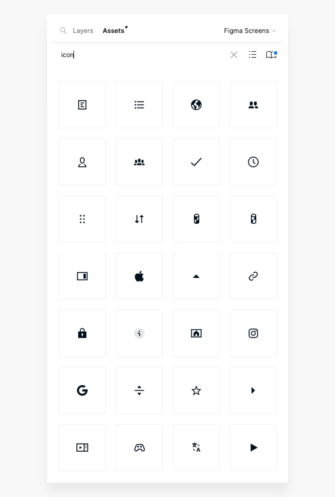
Icons are available as Components from the Foundation library, accessible directly from the Asset Panel once the library is enabled.
Arrow Icons Usage
The following guidelines define the appropriate use of conventional Arrow icons, Chevrons, and Carets in our design system. By following these basic pointers, we ensure a consistent user experience:
- Use Arrows for navigational transitions between different sections or pages and directional guidance.
- Use Chevrons for on-page interactions and indicating direction or progression within elements that offer generous space.
- Use Carets for compact on-page interactions and small navigational controls, such as indicating sorting or expandable content in lists and menus.