Guidelines
Guidelines
Usage
A floating bar is a fixed interface element that keeps key information visible while users scroll. It can expand to reveal secondary content and appears as a bottom sheet on viewports below 1000px (regardless of touch capability).
Common Use Cases
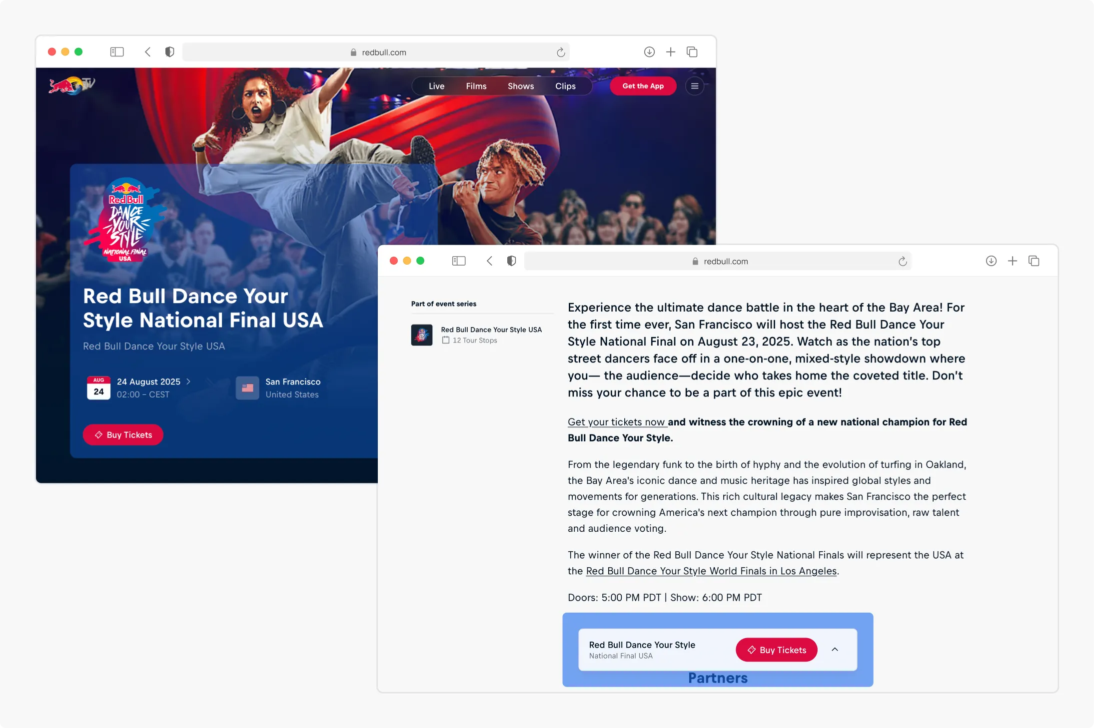
Mirrored hero information Keep key details and actions from the hero section accessible after users scroll beyond it, ensuring continuity of context and decision points.
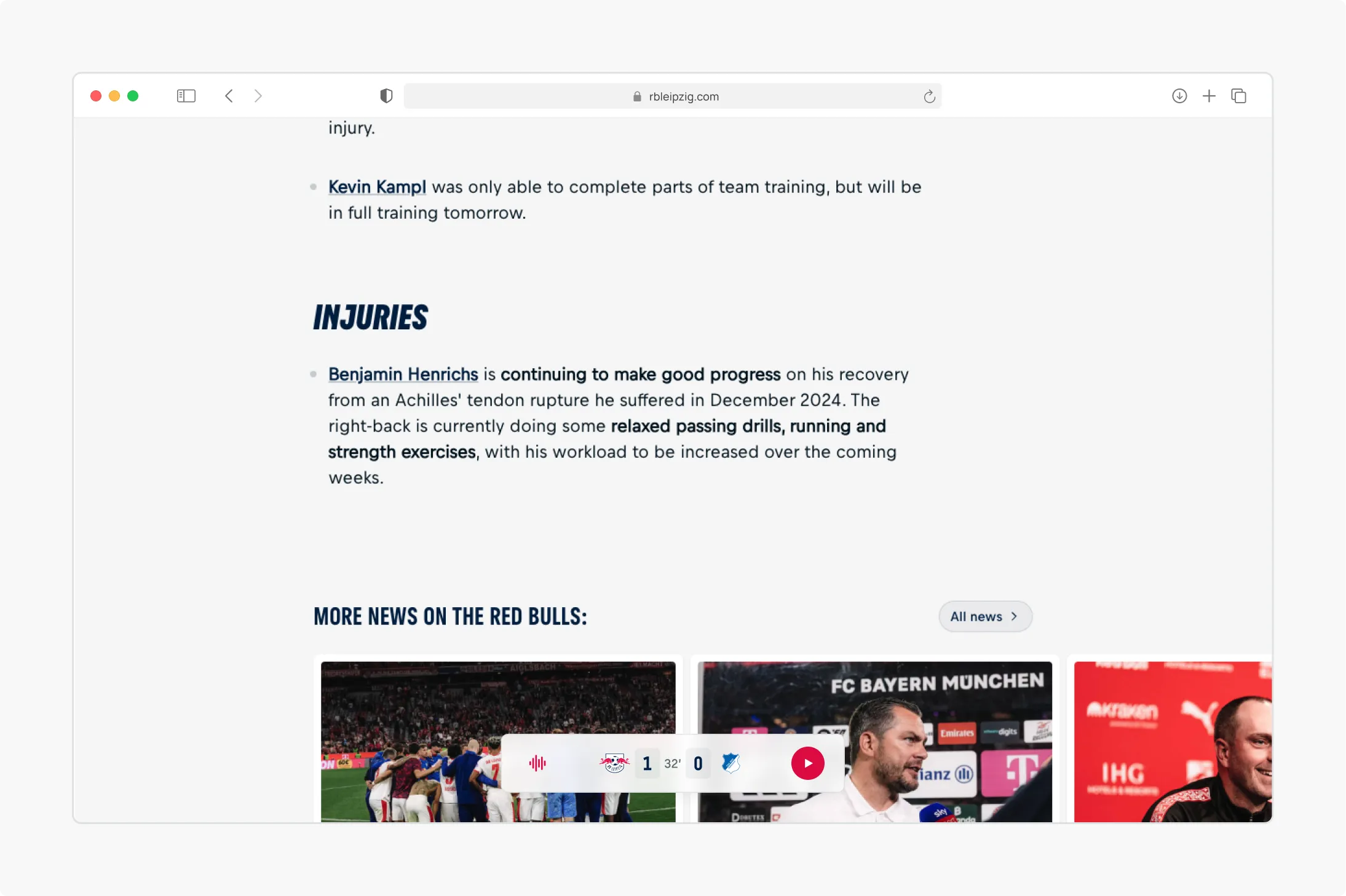
Contextual metadata Surface live or time-sensitive metadata—such as a match score or event status—so users remain aware of critical updates while engaging with content.
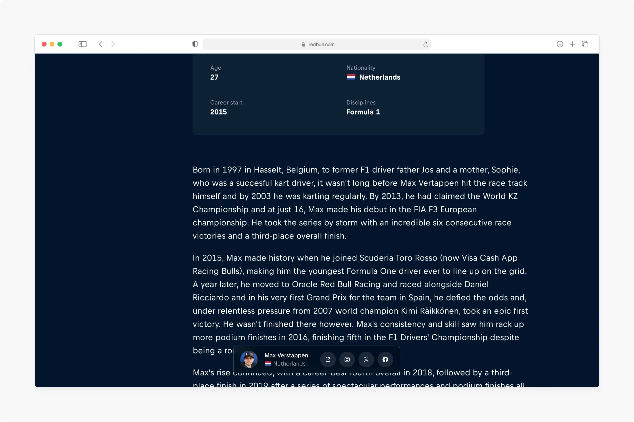
Persistent actions Provide lightweight, context-relevant actions that remain available as the user navigates. such as sharing or following an athlete directly from an athletes page.
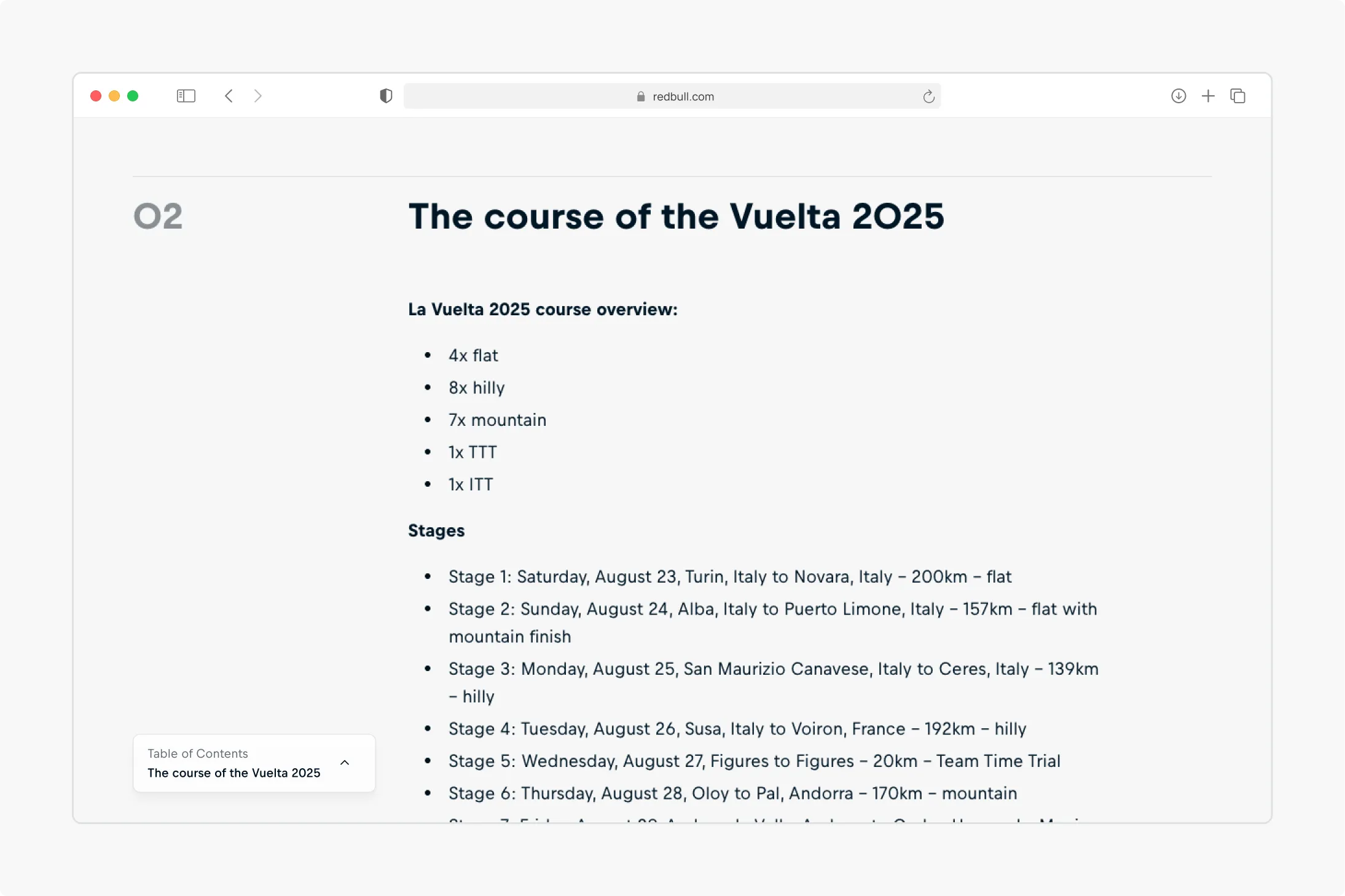
Navigational Aids Offer structural guidance within long-form material through expandable tables of contents, chapter markers, or section guides that support orientation and movement.
Best Practices
A floating bar should:
- Contain information or actions valuable enough to justify the screen real estate as the user scrolls
- Avoid duplicating full content sections – only the most critical, lightweight details should persist.
- Be expandable when additional detail is required.
- Remain singular – only one floating bar should be present per page to preserve focus and clarity.
- Be complementary to the primary page content.
Layout
Responsive Behavior
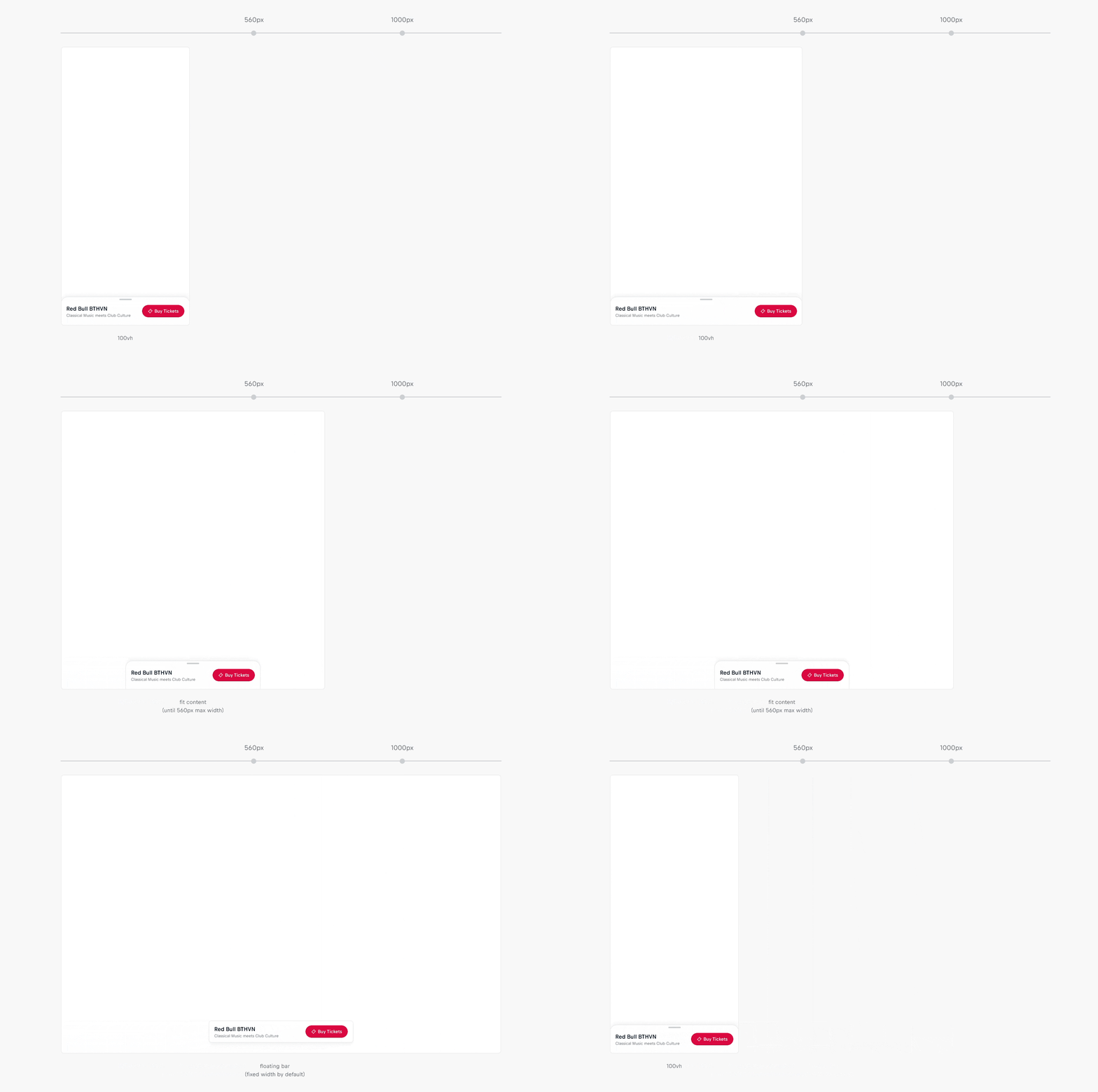
The component switches layout based on viewport width. At ≥ 1000px, it renders as a floating bar. Below this breakpoint, it renders as a bottom sheet.
Width
By default, the floating bar has a fixed width of 420px. When fit-content is enabled, the floating bar hugs its content up to a maximum width of 560px.

In its bottom sheet layout, the component’s width is responsive and changes based on the viewport:
- On small viewports (≤ 560px): The component spans the full width of the screen (100vw).
- On medium viewports (561px - 999px): The component "hugs" its content, shrinking to fit, up to a maximum width of 560px.
Best Practices
A floating bar should:
- Use the default fixed width when consistent sizing and alignment are more important than adapting to content.
- Enable fit-content when content is minimal, allowing the bar to shrink for a lighter, less dominant presence.
- Enable fit-content when content is larger, ensuring additional detail, longer labels, or localized text remain legible without truncation.
- Make full use of the available width for essential information and actions.
Height
Layout Behavior
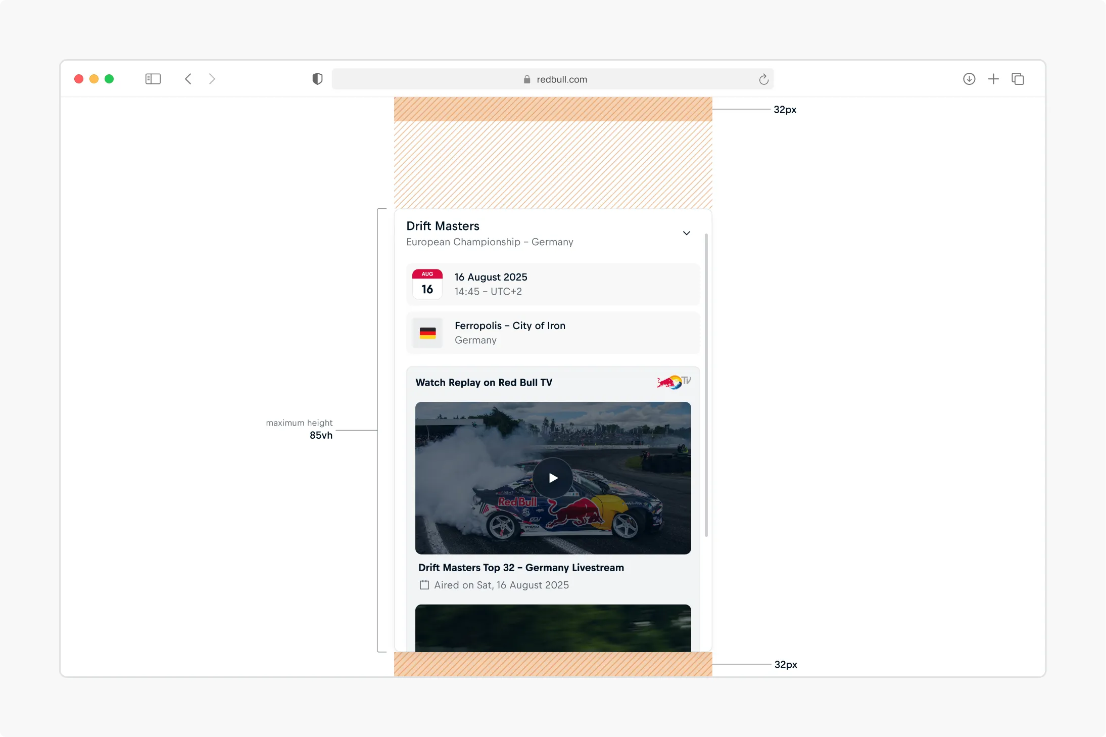
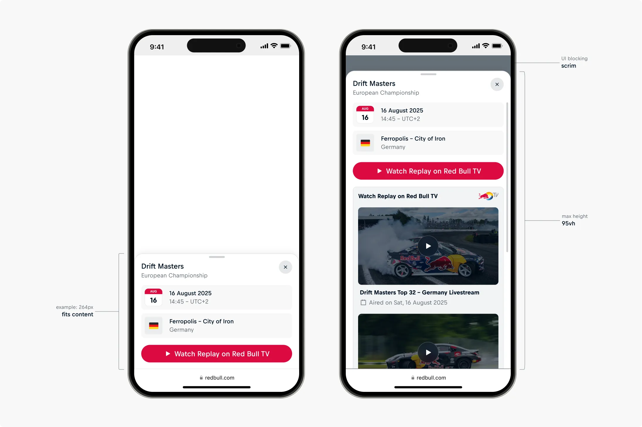
In its expanded state, the floating bar can grow to a maximum height of 85vh, including 32px margins at the top and bottom of the viewport. On smaller viewports, the layout switches to a bottom sheet, which can expand to 95vh. When the bottom sheet reaches its maximum height, a blocking scrim is applied behind it. When body content exceeds the height limit, the body becomes vertically scrollable.
Header
The component header has a fixed height of 64px in the floating bar layout and 84px in the bottom-sheet layout. This limitation ensures that only essential content is placed there, helps maintain visual consistency across states, and keeps the main page content as the primary focus.
Best Practices
A Floating Bar should:
- Keep interactive elements visible near the top, so they remain accessible even when body content scrolls.
- Prioritize the most important content first, since overflow will require scrolling.
- Avoid overloading the bottom sheet with excessive content, since a blocking scrim will shift focus away from the rest of the page.
Position
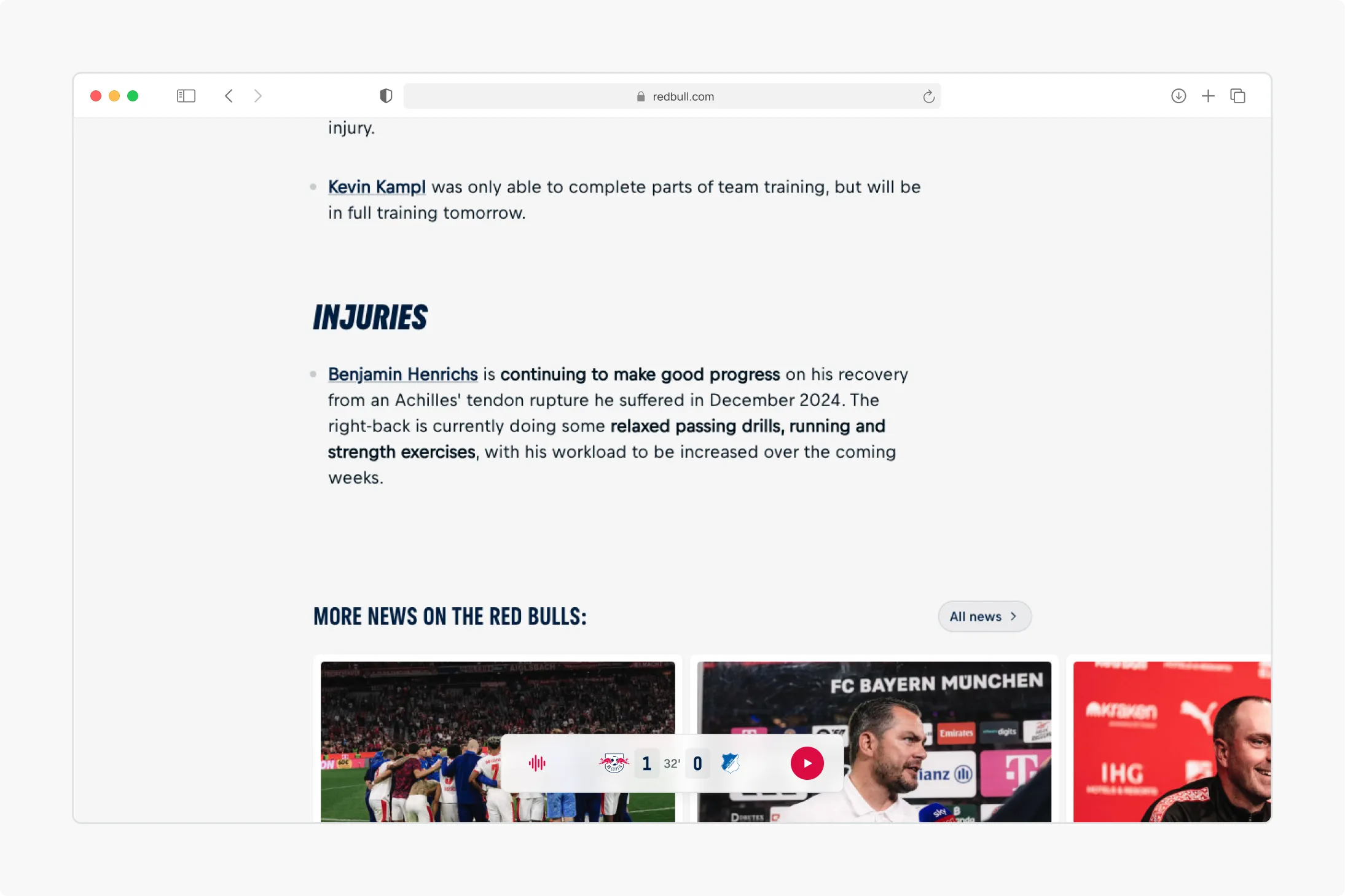
On desktop, the component can be aligned horizontally using the align property, which accepts start, center, or end. The values start and end automatically adapt to text direction (LTR or RTL). The default alignment is center. On viewports below 1000px, the component switches to the bottom-sheet layout, where it is always centered.
Best Practices
A floating bar should:
- Use center (default) alignment when it is independent of surrounding page layout. This provides a balanced, neutral placement suitable for most cases.
- Use start or end alignment when it needs to visually align with page layout. This reinforces integration into layouts with strong horizontal structure.
- Use the --cosmos-floating-bar-inline-offset CSS property when fine-tuning is required to better align the component with main page content.
- Maintain consistent horizontal alignment across page types (e.g. athlete, event, story pages) so users build reliable expectations about the floating bars position.
Content
The floating bar has three slots: header-collapsed, header-expanded, and body. The expanded-header and body are only rendered when the component is expandable.
Header
The floating bar has two header slots, visible in their respective states (collapsed and expanded). This allows product teams to change header content from collapsed to expanded —for example, a button shown in the collapsed header may be repositioned into the body, where additional context or related controls can appear (view example below).
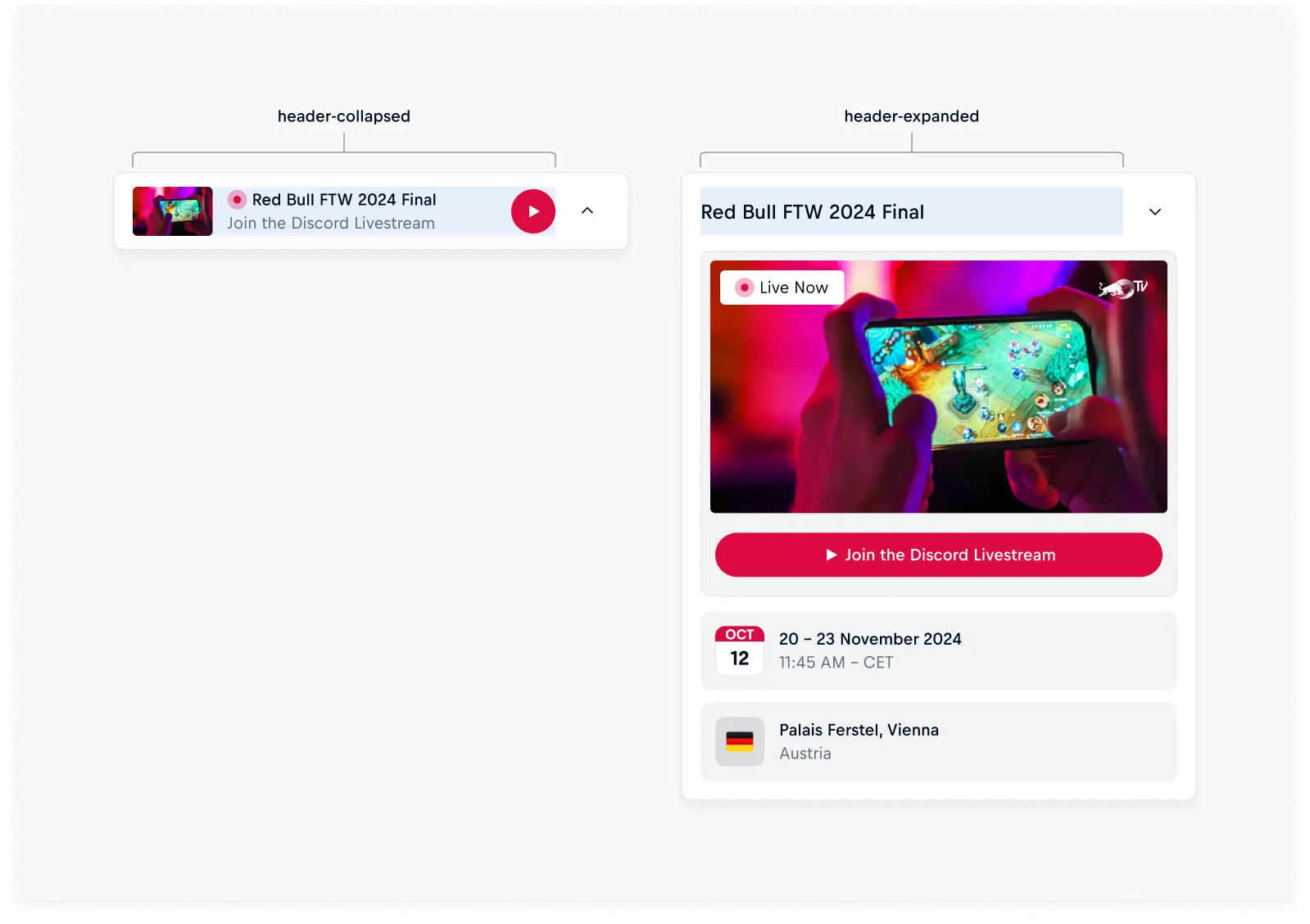
Body
The body of the floating bar is rendered only when the component is expandable. It can contain any type of content and is not height-restricted. Content exceeding the component’s maximum height becomes vertically scrollable.
Best Practices
A floating bar should:
- Keep header slot content lightweight, surfacing only the most important actions or entry points.
- Use concise, clear labels in header slots to avoid overwhelming the user with excessive information or complex interactions.
- Adapt content to the available width—for example, shorten labels or reduce elements when space is limited, and provide additional detail when space allows.
- Use the body for more detailed or secondary content.
- Avoid overloading the body, balancing the amount of content with the user’s ability to focus and scroll.
- Align header and body content logically, so controls and their related details are easy to connect.
Interaction
Expandable
The expandable property enables expand/collapse functionality and displays the expand indicator (chevron on desktop or drag handle on mobile). The entire header area is interactive, not just the indicator. On mobile, this provides a native-like gesture model, allowing users to drag the sheet with velocity-based snapping and a rubber-band effect when pulled beyond its limits.
Entry and Exit Triggers
The floating bars visibility can be tied to viewport conditions, such as scrolling or the position of other content within the viewport. When visible is set to false, the component animates out of view.
Best Practices
A Floating Bar should:
- Have expandable set to false when no secondary content is necessary.
- Appear only in page sections where its content or action is directly relevant and justified by the user’s current context.
- Enter based on configurable triggers such as scroll position, element visibility, or user interaction, and exit once the user leaves the relevant section or crosses a defined threshold.
Accessibility
Focus Not Obscured (WCAG 2.4.11 AA)
A Floating bar may partially cover focused elements but must not completely obscure them. Since “partially” is not precisely defined in WCAG, the safest approach is to guarantee that focused elements are always scrolled into view with clearance above the floating bar.
Recommendation
Use CSS scroll-padding-bottom to ensure focused elements are scrolled into view with sufficient clearance above the floating bar. The recommended value is 112px, derived from the components height (64px) + default margin (32px) + clearance (16px).
Initial Focus
The floating bar is a fixed element, which means its visual placement is separate from its position in the DOM. Since keyboard focus order is determined by the DOM order, product teams are responsible for placing the component in a logical position in the DOM tree.
For most use cases, placing the <cosmos-floating-bar> tag just before the closing </body> tag or before a site-wide footer is sufficient. This ensures that keyboard users encounter the floating bar's content after the main page content, which aligns with its visual position as a summary or supplementary element.
The following recommendations outline preferred patterns for maintaining accessibility while preserving the primacy of core content:
General Recommendations
- Prioritize content first: Users should engage with the primary content before the floating bar becomes focusable.
- Delay entry into focus order: Keep the floating bar outside the tab sequence until it becomes contextually relevant.
- Maintain predictability: Introduce the floating bar into focus only once, at a clear and consistent point in the interaction.
- Avoid auto-focus: Do not automatically shift focus to the floating bar when it becomes available.
Scenarios
The appropriate entry point for a floating bar depends on its role within the page and the type of content it supports. In some cases, the floatingbar should appear late in the focus order, acting as a summary or reinforcement. In others, it may need to enter earlier, particularly when it provides navigational or structural support. The following scenarios outline recommended patterns for different use cases:
Mirrored Hero Information
When the floating bar duplicates or summarizes content from the hero section.
- Introduce the floating bar into focus before exit acting as a natural recap before users move on.
- Positioning at the bottom reinforces its role as a closing summary.
- This ensures users have a final opportunity to review key details.
Contextual Metadata and Persistent Actions
For live, time-sensitive metadata or actions tied to content context:
- Introduce the floating bar into focus either before exit (mirroring hero behavior) or contextually within the flow, depending on content structure.
- Its role should be supplementary, reinforcing information without disrupting the primary reading path.
Navigational Aids
For tools such as expandable tables of contents, chapter markers, or section guides:
- Insert the floating bar into focus just before the content it relates to, enabling orientation at the right moment.
- Ensure it remains a stable option in the tab sequence without receiving auto-focus.