Guidelines
Guidelines
A modal dialog is a focused overlay that appears on top of a page to capture the user’s attention for a specific task or decision.
Modal dialogs temporarily block interaction with the underlying content until the user completes an action or dismisses it. Best used for short, self-contained interactions where it’s important to keep the user anchored to their current context.
They should be used sparingly to avoid disrupting workflow, and designed with clear titles, concise content and obvious actions to help users complete their task quickly and confidently.
Common Use Cases
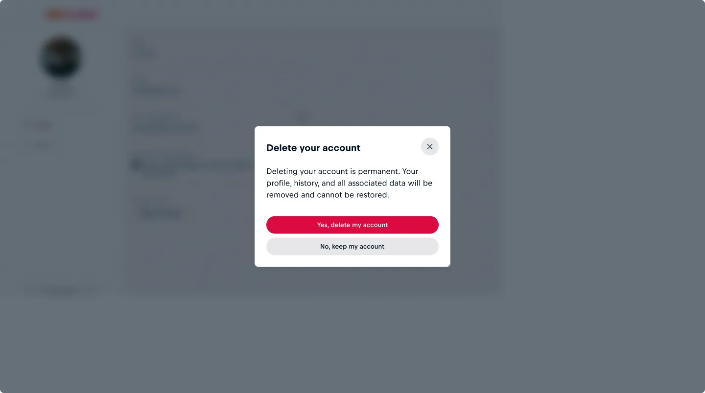
Critical Confirmation
Dsplay a modal dialog for destructive, irreversible, or high-impact actions. This forces explicit confirmation from the user and prevents accidental execution, such as deleting accounts, removing data or making security changes.
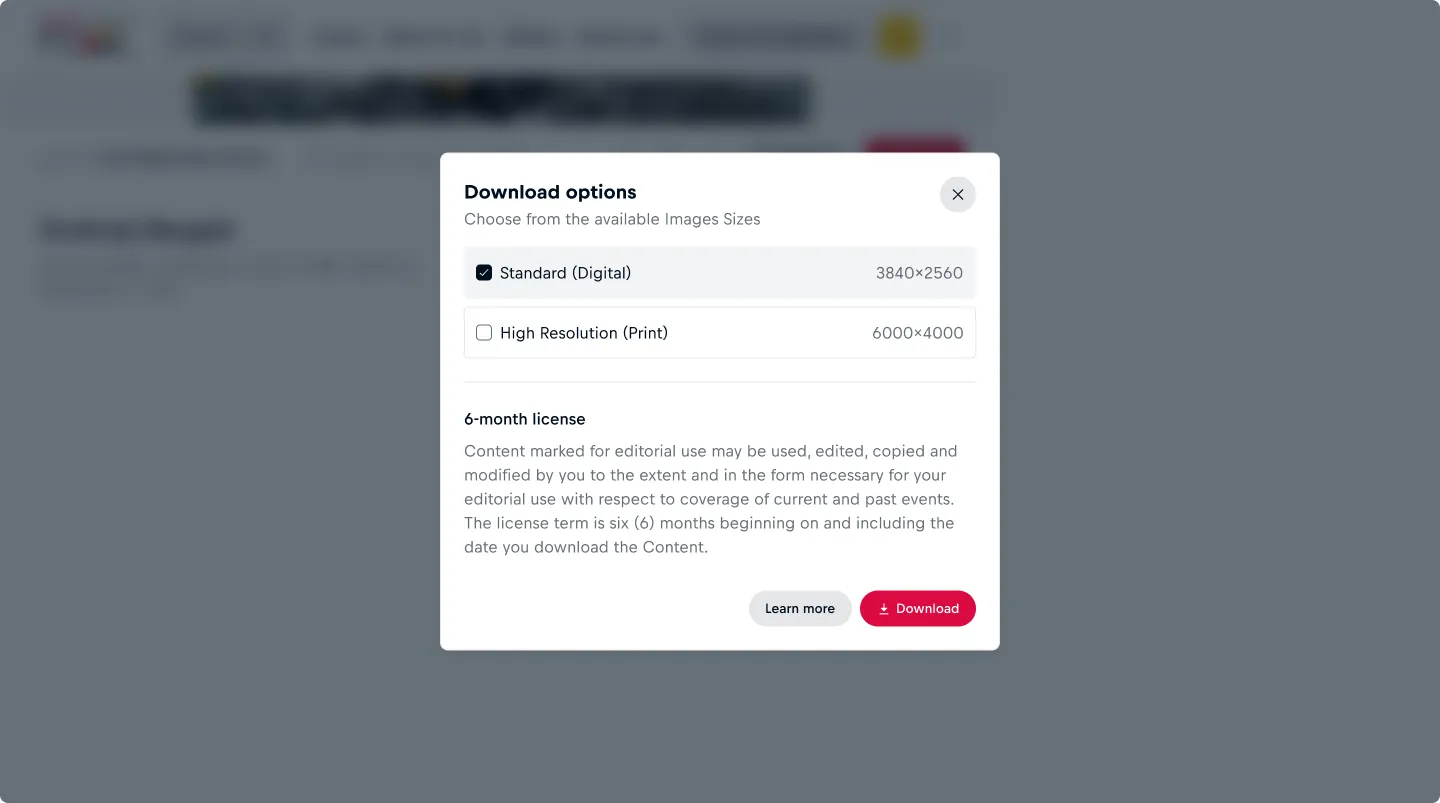
Focusing Tasks
For when a user must complete an isolated task before continuing. Focus attention on a specific decision or input, such as choosing an option, setting a format, or adjusting parameters without distraction from the rest of the interface.
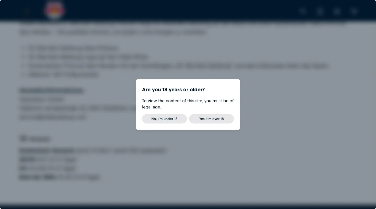
Interruptive Alert
Use a modal to immediately communicate a status or outcome that demands the user’s attention before continuing. For non-dimissable modal dialogs, for example payment or age verification, set dismissible="false". In this case, always provide a clear action for the user to progress.
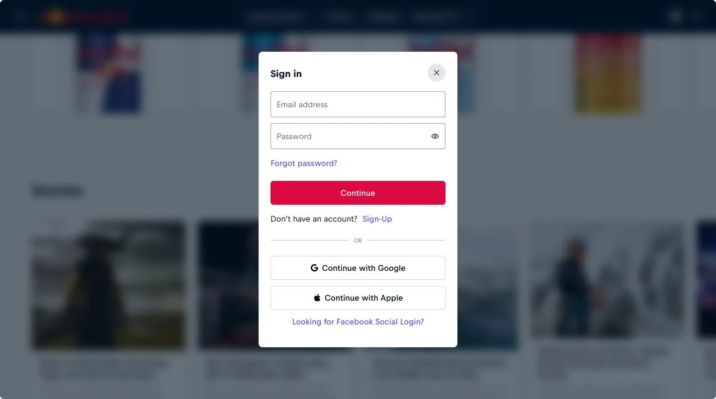
Authentication or Security Checks
Use a modal for login, re-authentication, or verification when sensitive actions require interruption.
Usage Considerations
Surprise modal dialogs Avoid “surprise” modals (automatic popups) that block users without warning; they tend to be disruptive and may harm usability.
Nesting modal dialogs Avoid nesting modal dialogs as this introduces unnecessary complexity, accessiblity challenges and can easily confuse or disorient users.
Multi-stepped modal dialogs For multi-stepped modal dialog processes, provide progress indication within the body above the content and backward navigation in the actions.
Anatomy
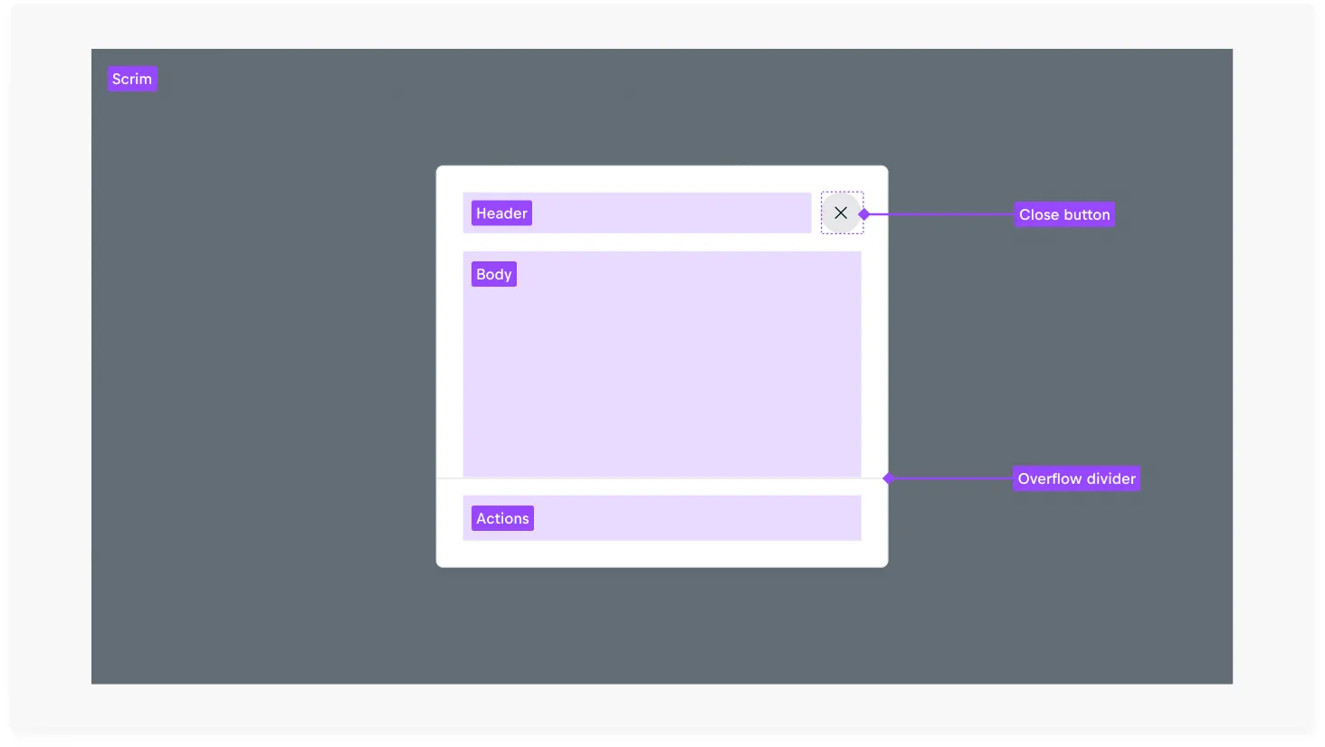
Content
Header
A header is required in every modal to establish clear context. Since opening a modal takes users out of their current flow, the header provides a purpose to the modal dialog.
The header is a flexible slot, but a concise, action-orientated title such as 'Delete Account' is strongly recommended to clarifiy context and intent.

Header with a common, default title and subtitle.

Header with a custom slot and a visually hidden title.
Dismissing modal dialogs
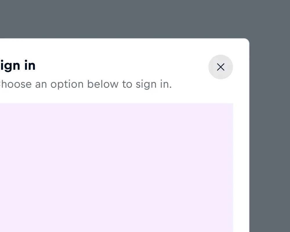
By default modal dialogs are dismissible by clicking the scrim and close button, actions can also be used to trigger a dismissal. In bottom sheet format, dismissible modal dialogs are indicated by a drag handle which can be interacted by a downward swipe gesture and close button.
If a modal dialog is not dismissable, the scrim is uninteractive and there is neither a drag handle or close button visible. In this case, always include a visible and clear action for the user to proceed.

Body
The body can contain any type of content and is not height-restricted. Content exceeding the component’s maximum height becomes vertically scrollable. However, avoid introducing overly complex or long-form content into the body which could be more effectively presented on a page.
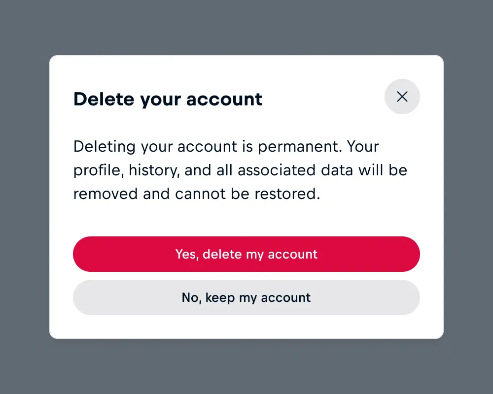
Body with a common, simple text layout. Typically this is left aligned.

Body with long-form content that is overflowing.
Actions
The actions container, often referred to as the footer, contains a slot for task-relevant actions. It should contain the actions necessary to complete the current task. Keep action labels clear and concise, reflecting the header content for consistency.
If the modal is dismissible, offering a “Cancel” button is acceptable as redundancy supports different user habits and ensures more predictable dismissal paths.
When the modal dialog is not dismissible, always include a visible and clear action for the user to proceed.
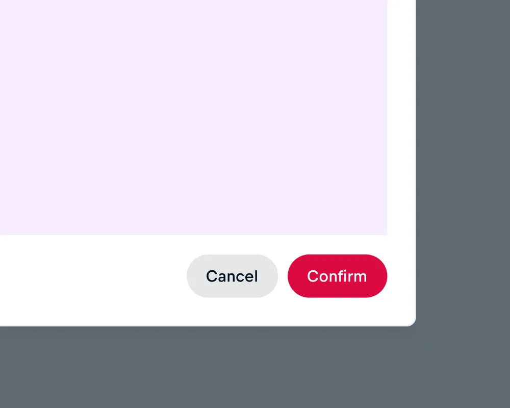
Actions with a common layout displaying right-aligned, hierachial actions.
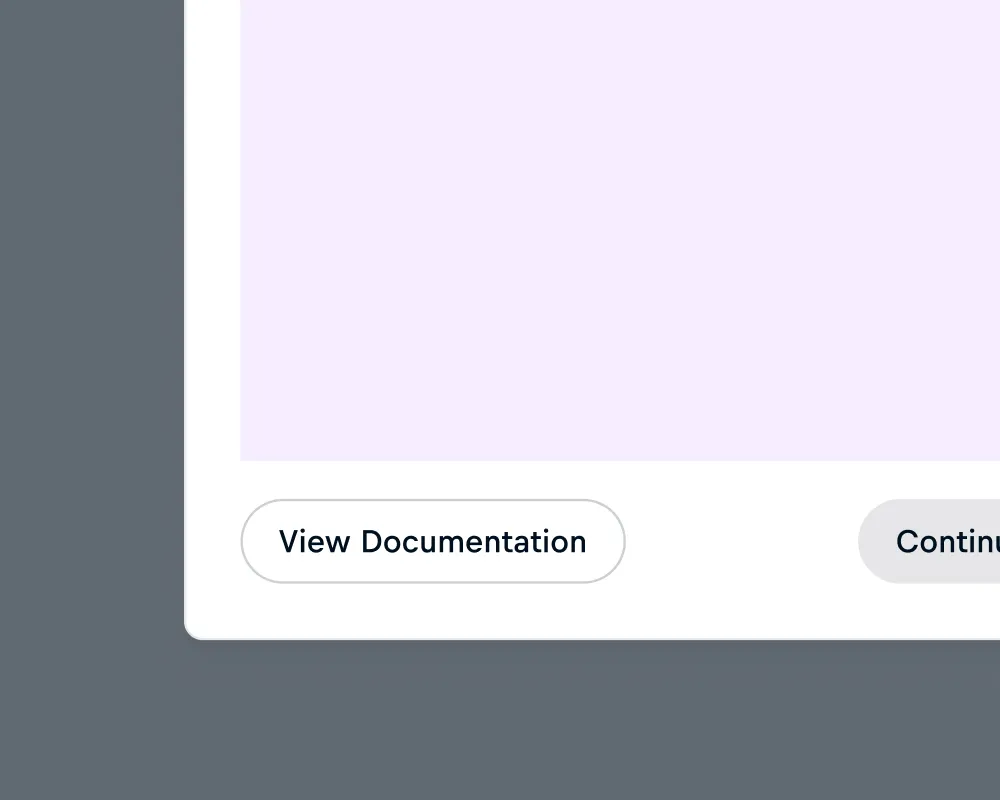
Actions with a unique layout to visually seperate actions.
Layout
Responsive behavior
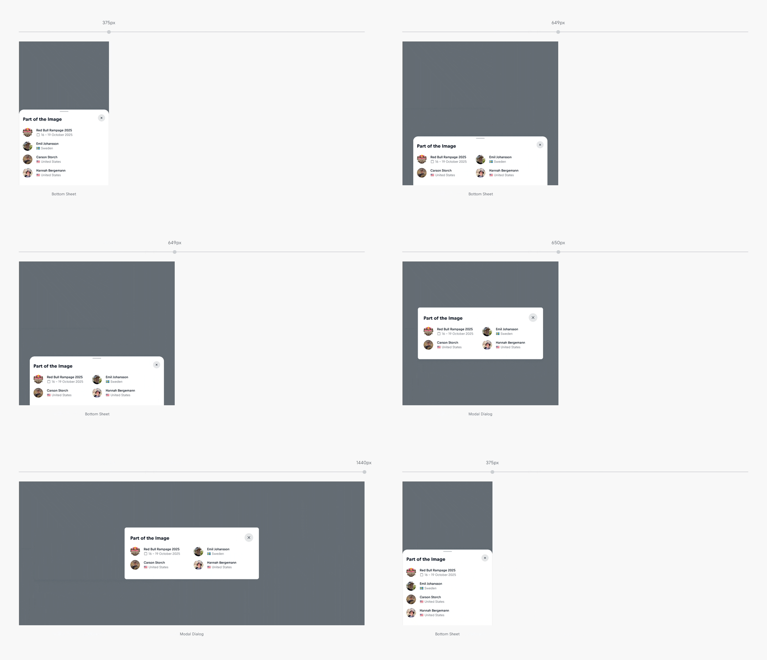
For viewports ≥650px, the component renders as a centered dialog modal. For viewports <650px, it renders as a bottom sheet. In bottom sheet mode, the component spans 100% of the viewport width with a maximum width constraint of 560px.
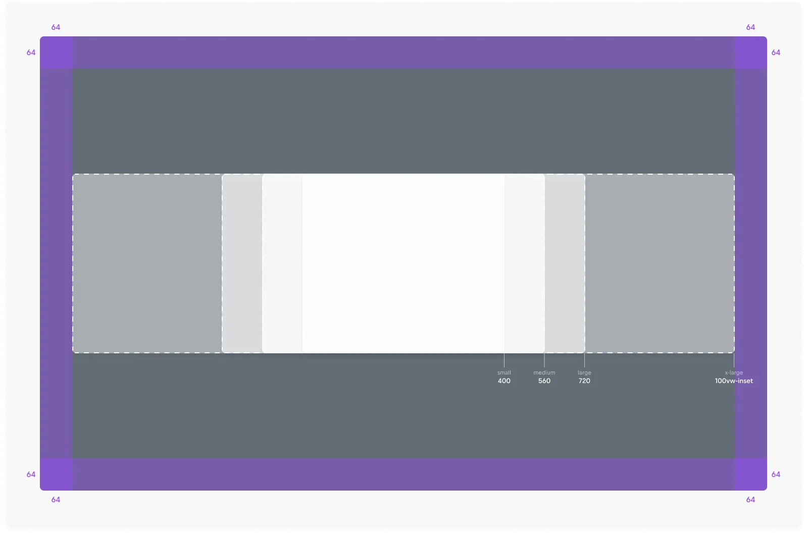
Viewport behavior All modal sizes adapt responsively to the viewport width. They are constrained by a configurable inset (default 64px) to preserve spacing from screen edges. The inset can be adjusted to meet specific design or product needs.
Sizes
Modals Dialogs are available in four predefined sizes:
- Small (400px): For simple confirmations or short forms with minimal content.
- Medium (560px): For moderate content such as multi-step confirmations, short tasks, or compact detail views.
- Large (720px): For complex tasks, larger forms, or content requiring more layout space.
- X-Large (100% width minus inset): For highly content-heavy flows such as document editing, data tables, or immersive previews.
Height
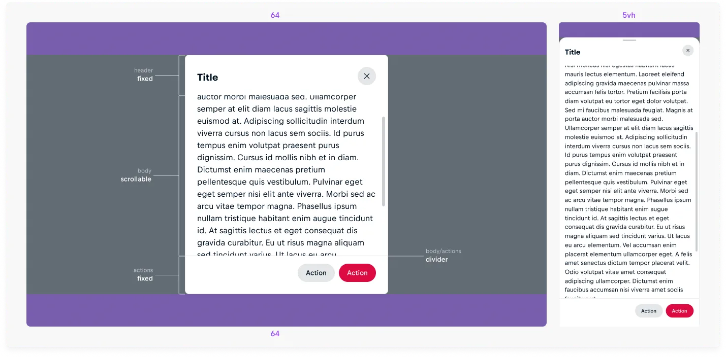
The modal’s body expands to fit its content until reaching the maximum height.

In modal dialog layout, the maximum height is 100vh minus a customizable inset. In bottom sheet layout, it is capped at 95vh. When content exceeds the maximum height, the body becomes scrollable. If the actions container is present, a divider is automatically added between the body and actions to maintain clear separation.
Implementing body overflow in Figma
Body-overflow variants are provided in Figma. Use these when designing scenarios where modal content exceeds the maximum height, ensuring accurate representation in design files.
Accessibility
The component is built on the native HTML <dialog> element, which provides core accessibility features automatically. Understanding what the component handles and what requires your attention ensures all users can interact with modal dialogs effectively.
What the Component Handles
The following accessibility features are provided automatically:
- Layer management: The dialog automatically appears above all other page content using the browser's top layer.
- ARIA attributes: role="dialog" and aria-modal="true" are applied automatically to communicate modal behavior to assistive technologies.
- Inert background: All content outside the dialog becomes non-interactive and cannot receive focus or be clicked.
- Body scroll lock: Page scrolling is prevented while the dialog is open.
- Focus containment: Tab and Shift + Tab cycle through focusable elements within the dialog only, never allowing focus to escape to the background page.
- Keyboard dismissal: When dismissible="true", pressing Esc closes the dialog.
- Motion preferences: Animations respect the prefers-reduced-motion media query, automatically reducing or removing motion for users who have requested it in their system settings.
Accessible Naming
Always provide a clear, visible title in the header slot. This ensures assistive technologies can properly announce the dialog's purpose to users.
Intentional Invocation
Dialogs should open in response to explicit user actions, such as clicking a button or link. Avoid auto-launching modals on page load, as unexpected interruptions disorient users, particularly those using assistive technologies.
Initial Focus
When the modal opens, keyboard focus moves automatically to the first focusable element inside the dialog. Order your interactive elements carefully within the slotted content—typically placing the primary action button or most important control first in the DOM.
For destructive or irreversible actions, place the least destructive control (such as "Cancel") before the destructive one (such as "Delete") in the source order to reduce the risk of accidental confirmation.
Focus Return
When the modal closes, focus should return to the element that originally triggered it using the hide event. This prevents users, including those using screen readers or keyboards, from getting lost in the page flow.
If the triggering element no longer exists or is no longer visible after the modal action completes, focus should move to the next logical control in your workflow instead.
Non-Dismissible Dialogs
When dismissible="false", the actions slot should contain clear, visible buttons that allow users to proceed or cancel. Without ESC key, scrim click, or close button, these action controls become the only way users can exit the dialog.
Gesture Accessibility
For bottom sheet format, drag-to-dismiss gestures are supplemental to button-based and keyboard dismissal. Users who cannot perform drag gestures can still close dismissible dialogs using the close button or ESC key.