Guidelines
Guidelines
A carousel displays horizontally scrollable content within a confined space, with customizable layouts for optimal presentation across different devices and use cases.
Usage
Purpose overview
Carousels are ideal for efficiently using limited space to display secondary, non-critical content, especially when showcasing items of the same category or medium, such as images, products, or articles that benefit from horizontal browsing within a constrained layout.
Best Practices
A carousel should:
- Contain secondary, supportive content rather than primary information.
- Maintain a focused length to ensure usability and engagement.
- Support primary page content, like presenting participating athletes for an event.
- Be used in hero sections or mid-page to showcase contextualy relevant featured content, or at the end of pages to avoid dead ends.
Please consider that carousels tend to have low engagement as users often only interact with the first slide, while subsequent slides are frequently ignored. For critical information, prefer static placements that ensure visibility.
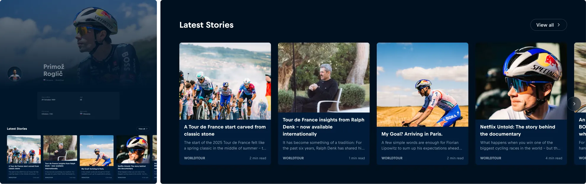
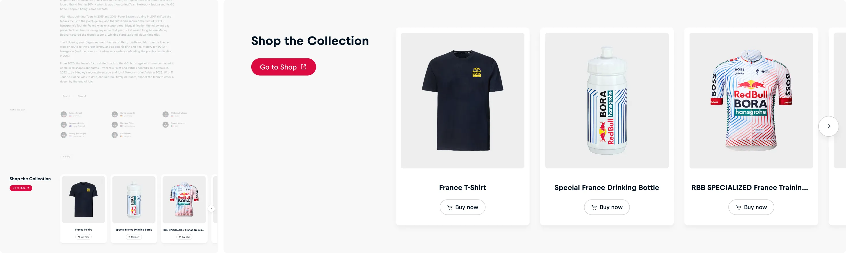
We recommend including a descriptive title to provide context for the carousel, especially when the page lacks clear thematic structure. When appropriate, incorporate a call-to-action that links to overview pages or reveals additional content.
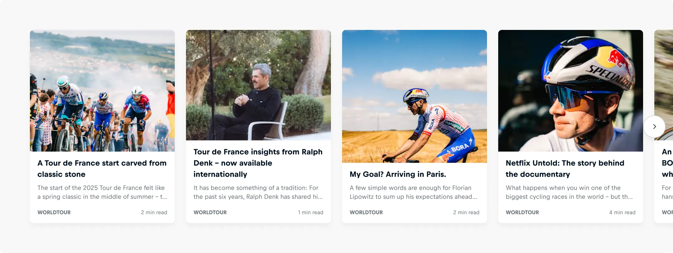
Note that surrounding UI elements are not part of the carousel component, though they can be included within the first slide, as shown in the image above.
Layout
Slides per view
Configure how many slides with equal width are displayed simultaneously at different screen sizes using the slides-per-view property. The carousel automatically adjusts slide width based on your breakpoint settings to maintain optimal viewing across all devices.
A Carousel should:
- Be configured to show the appropriate number of slides simultaneously by considering both screen size and content type.
- Implement responsive breakpoints to optimize slide count across different devices, ensuring usability and visual appeal from mobile to desktop screens.

Spacing
Gaps between Slides
The carousel automatically adjusts gaps between slides based on breakpoints to maintain balanced viewing across all devices.
These gaps can be customized per breakpoint using CSS custom properties. When determining custom gap sizes, please consider the slide content density, using larger gaps for content-heavy slides and smaller gaps for simpler elements.

Offset
The CSS custom properties for the carousel's offset control the offset spacing for the first and last slides. These properties allow carousel slides to align with other content on the page by adding spacing at the beginning and end of the slide sequence.

Offset in Figma
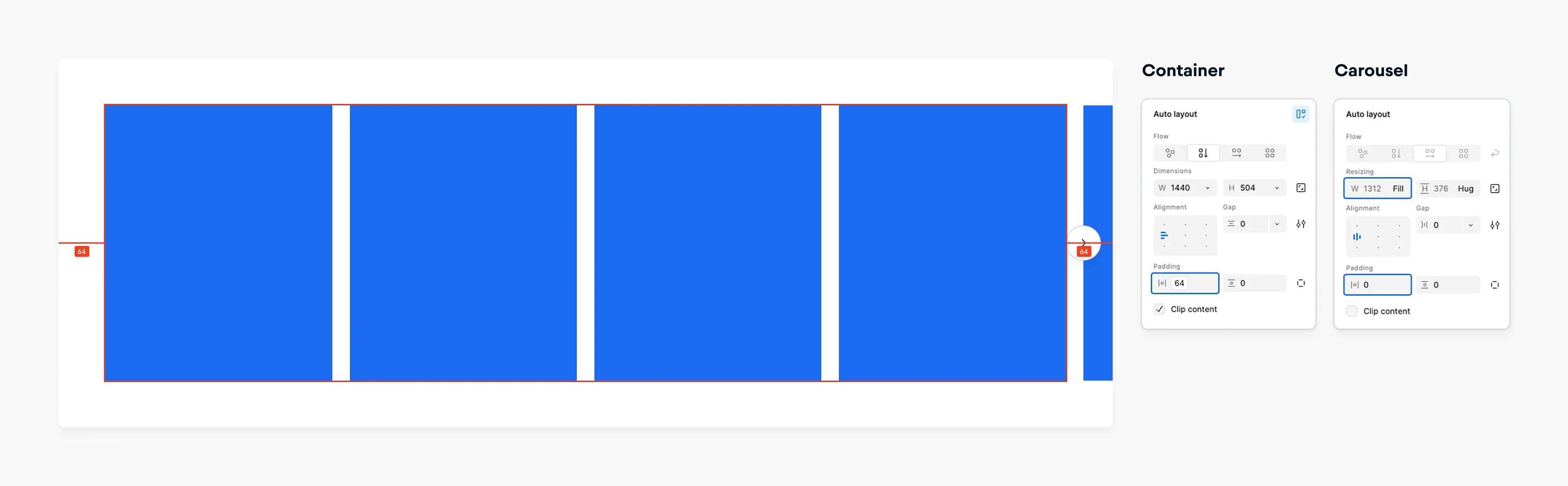
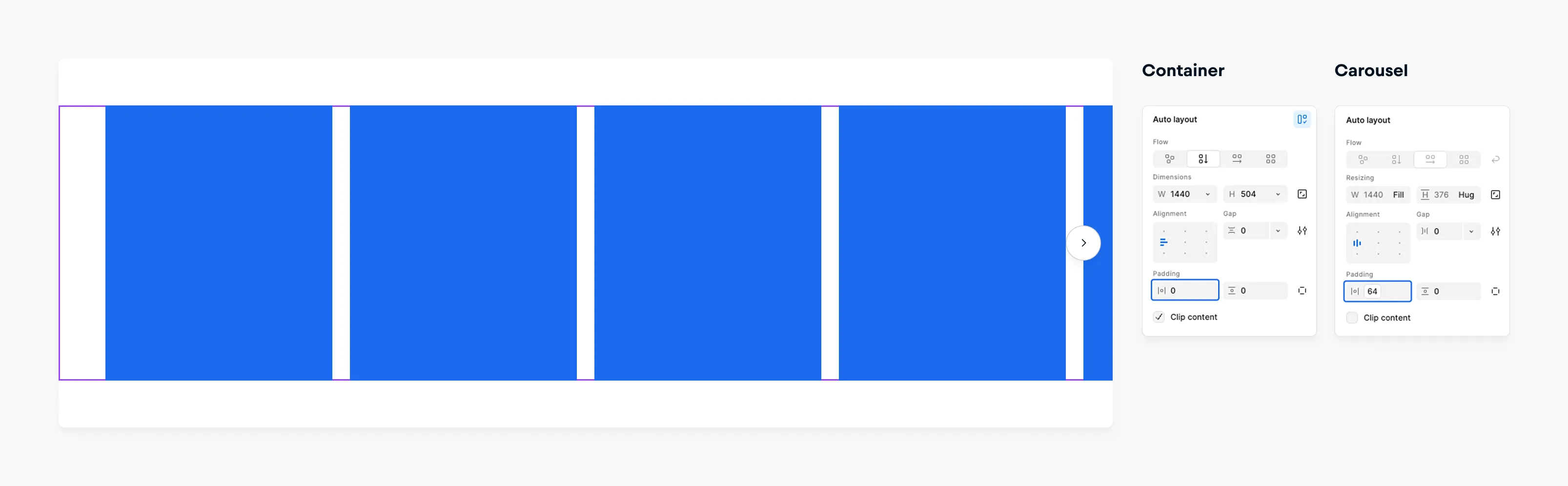
In the Figma Implementation, an offset (padding) is not built into the carousel component by default, as it is highly dependent on the layout and structure of the surrounding container. To ensure proper spacing and visual alignment, follow these guidelines:
Container with padding If the parent container already includes appropriate horizontal padding, do not apply additional inline padding to the carousel. Instead, set the carousel component’s width to fill to align with the container’s boundaries.
Container without padding If the parent container lacks padding and relies on its child elements for spacing, apply inline padding directly to the carousel component.
Recommended horizontal padding values
These values are commonly used and have proven effective across various layout scenarios:
- Desktop: cosmos-spacing-xxx-loose (64px)
- Tablet: cosmos-spacing-xx-loose (40px)
- Mobile: cosmos-spacing-normal (16px)
Overflow
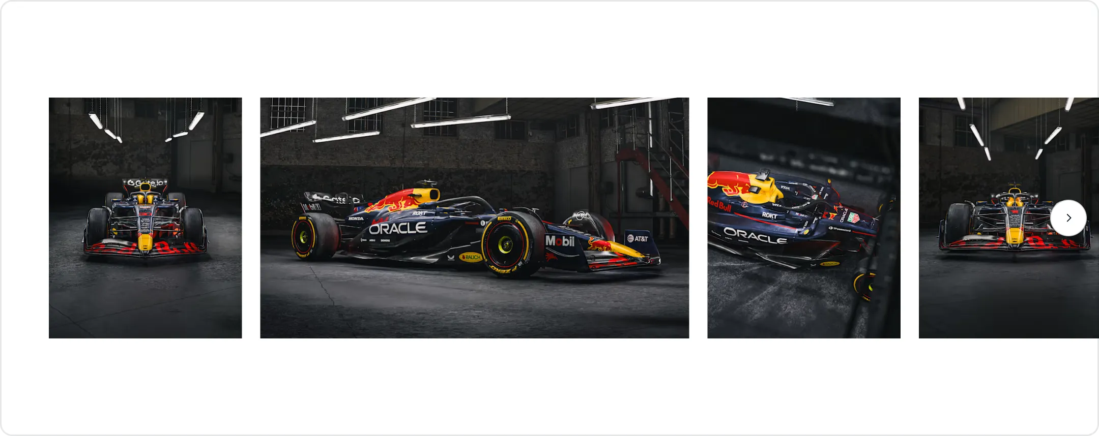
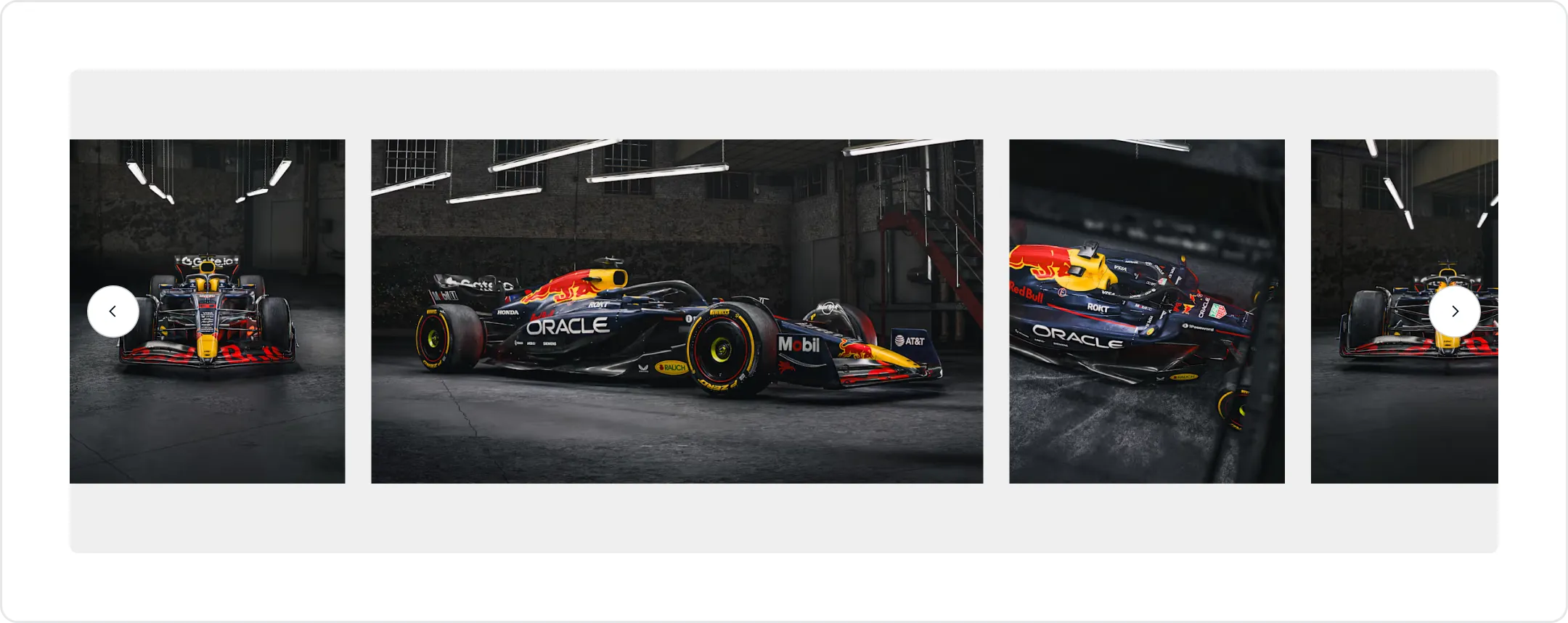
The overflow property determines whether the carousel should display overflow slides that extend beyond the container boundaries.
A carousel should:
- Enable overflow to display slides that extend beyond container boundaries, creating important visual cues that additional content follows and encouraging user interaction.
- Disable overflow when a contained layout is desired.
Content
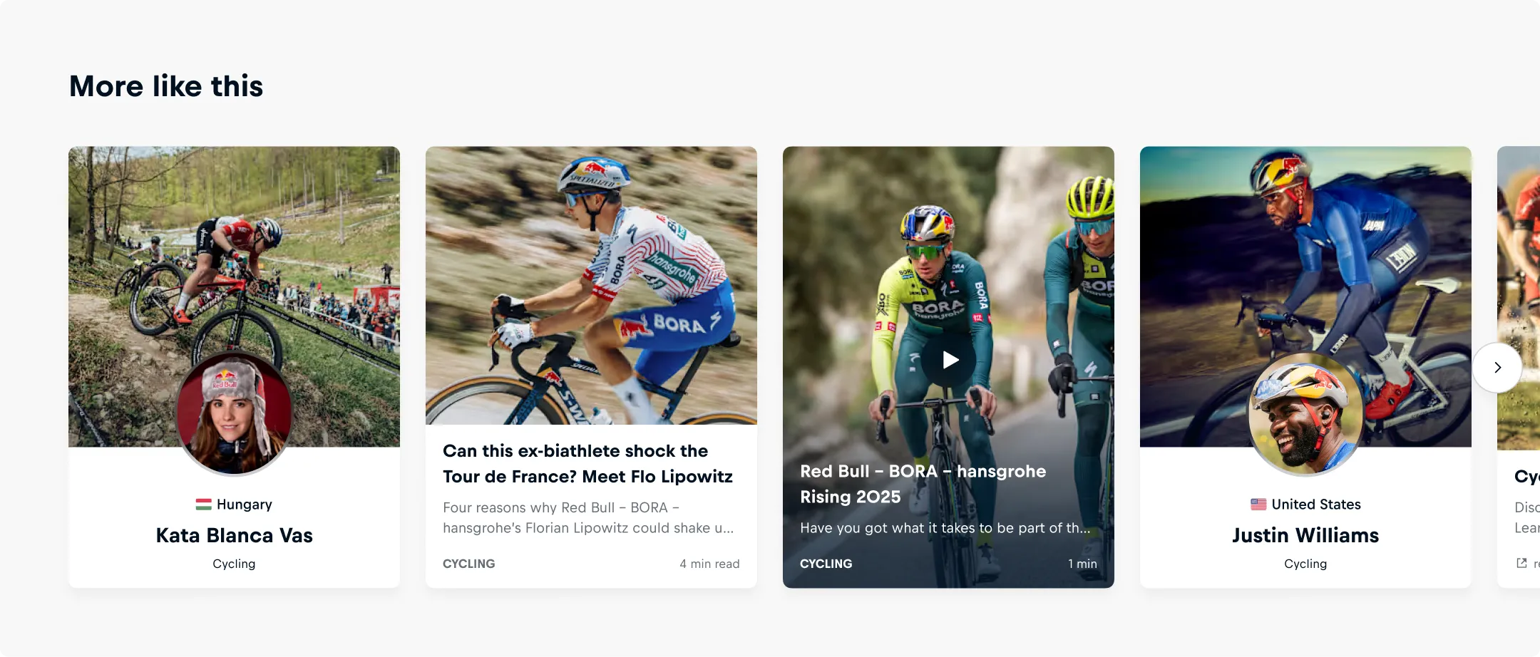
The carousels slides function as flexible content slots, allowing you to mix different content types within the same carousel. On pages focused on specific topics like stories, athletes, or events, carousel slides should ideally relate to the page topic rather than being randomly selected.
Slide Content Formatting
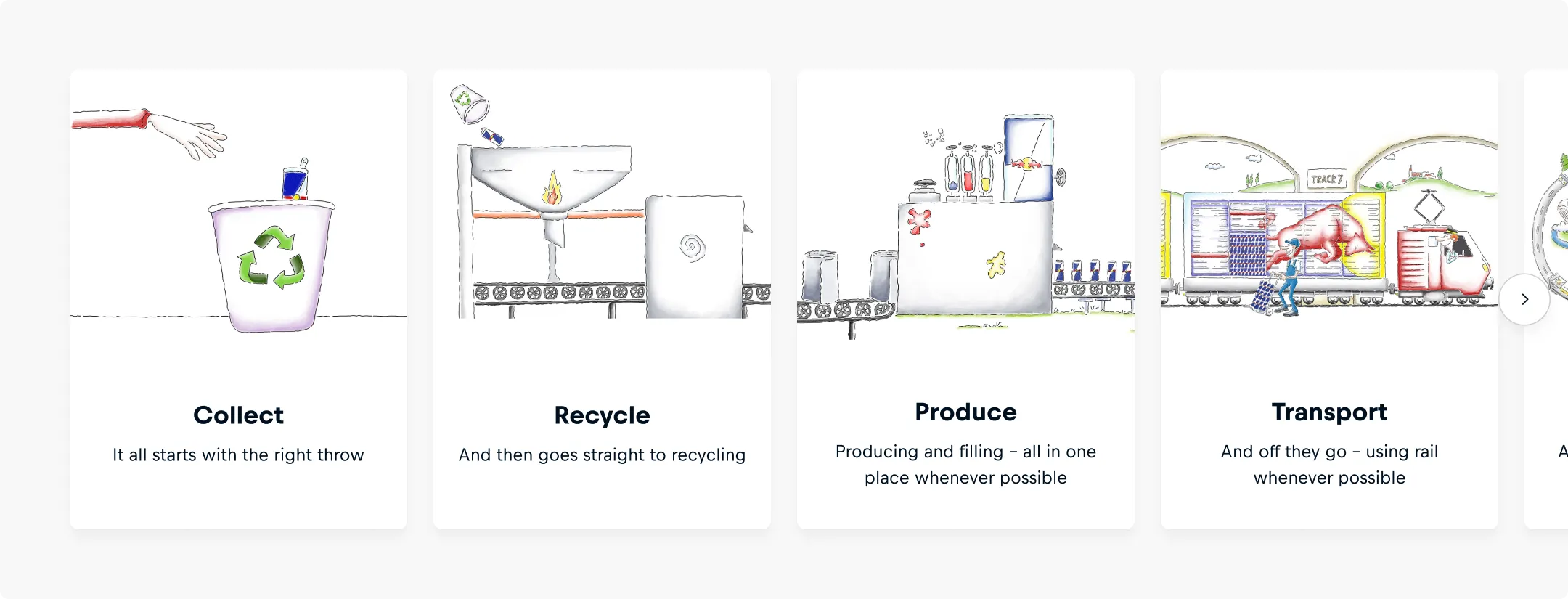
Format carousel slides consistently for maintaining visual coherence, predictable behavior, and ease of use. Discrepancies in slide layout can lead to layout shifts, scanning difficulties, and degraded user experience.
The carousel slides should:
- Maintain the same width and height within each viewport to prevent layout shifts and ensure consistent alignment during navigation.
- Scale responsively across breakpoints while preserving consistent aspect ratios for visual continuity on desktop, tablet, and mobile.
- Use uniform styling across all slides, including consistent internal padding, content alignment, text styles, font sizes, and color usage to create a cohesive experience that allows users to focus on content rather than layout variations.
Appearance
The carousel supports the appearance options dark and light and automatically adapts based on the mode to ensure optimal contrast and visibility:
- Dark appearance is applied in light mode
- Light appearance is applied in dark mode
This setting only affects the visibility of the navigation controls and does not impact the content or styling of the slides within the carousel. Please ensure that slides are visually compatible with the mode in which the carousel is displayed.

Interaction
Navigation Controls
Navigation controls provide users with clear ways to move through carousel content, adapting to different device types.
Desktop Navigation
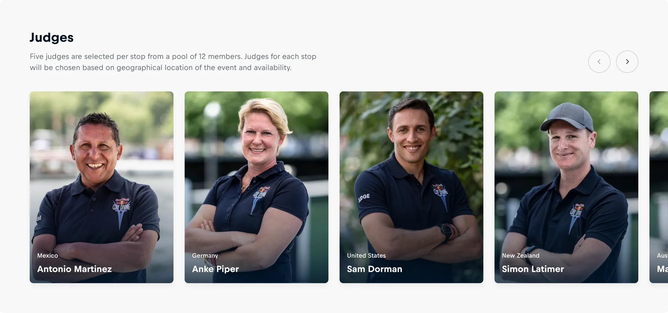
Navigation controls serve as the primary interaction method for desktop users, appearing on hover anywhere over the carousel and fading out when the mouse leaves the component container. The controls show only when navigation in that direction is possible.
Custom Controls
For specific design requirements where default control positioning isn't suitable, the carousel enables implementation of custom navigation solutions. This flexibility is achieved by exposing nextSlide(), previousSlide(), and slideTo() methods, allowing prodcut teams to utilize their own navigational controls.
Custom controls should:
- Maintain consistent position and behavior throughout the product.
- Avoid interference with surrounding UI elements.
- Include clear visual indicators for navigation direction.
- Remain accessible to assistive technologies.
- Include proper ARIA labels and keyboard navigation support.
- Maintain sufficient color contrast and focus indicators.
- Announce slide changes and position to screen readers when using custom controls.
Touch Device Navigation
Horizontal swiping provides the primary navigation method on touch devices, while navigation controls remain hidden to maximize screen real estate for content. The nextSlide(), previousSlide(), and slideTo() methods remain programmatically available for assistive technologies like screen readers, even when controls aren't visually present.
mouseDragging
mouseDragging provides an intuitive navigation method that gives desktop users direct control over their browsing experience. When enabled, users can click and drag within the carousel to navigate at their preferred speed, with slides responding fluidly to mouse movements and snapping to position when released.
Scroll Increment
slidesToScroll determines how many slides will be navigated when scrolling forward or backward using the navigation controls. It defaults to the number of slides visible in the viewport -1, providing visual continuity and context for users as they navigate.
A carousel should:
- Limit scrolling to one slide at a time when content requires focused attention or when users need to process each item individually.
- Ensure the scroll amount feels natural and predictable for users.
- Maintain consistency throughout the product for carousels with similar slide content types.

Accessibility
Carousel accessibility ensures all users can navigate and interact with content effectively, regardless of their abilities or assistive technologies.
A carousel should:
- Ensure slides are focusable when they contain interactive content with clear visual indicators to show which element has focus.
- Provide descriptive skip-link-label that identifies the carousel content, such as "skip featured articles" or "skip products".
- Provide descriptive labels for slides content and navigation controls to clearly identify their purpose and function.