Guidelines
Guidelines
Usage
A Person Card should:
- Be used for leading people to a profile page on the same platform.
- Be grouped with related Cards into vertical feed and horizontal rail interfaces.
- Have appearance be set to 'dark' in light interfaces and 'light' in dark interfaces.
- Use the respective viewport property for the interface. 'desktop' for desktop interface designs and 'mobile' for mobile interfaces.
Layout
A Person Card should:
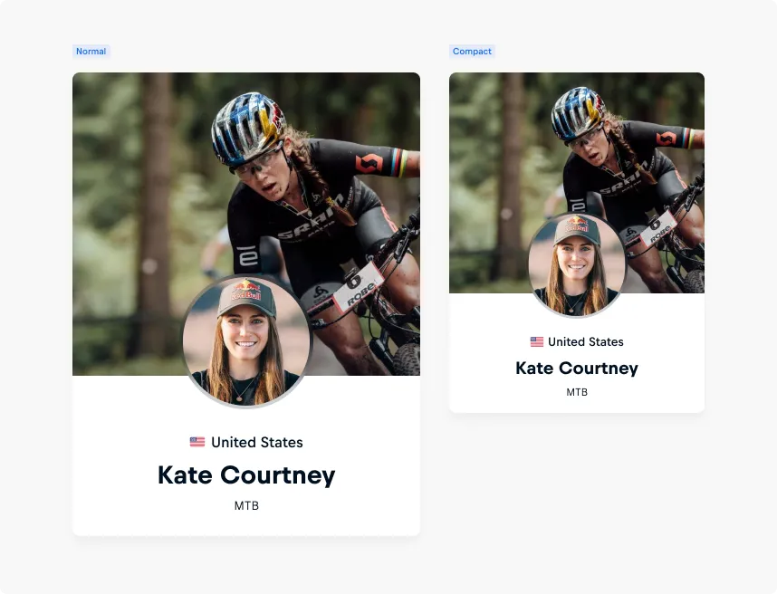
- Have its layout be set to ‘normal’ when the Card is used in feeds, vertical layouts, or featured in a stand-alone context.
- Have its layout be set to ‘compact’ when the Card is being used in rails or in a narrow horizontal interface.
- Always use the same layout value for all Cards in a group.
- Keep its original Elevation and appearance when subject to interactions in design.
- Be resized proportionally when used in layouts without adjusting font metrics manually. This conserves a balanced layout following the Gestalt Principles of Similarity, as the font metrics are implemented with fluid-typography.
Cover
A Person Card should:
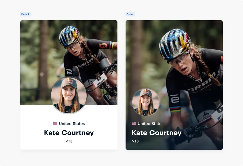
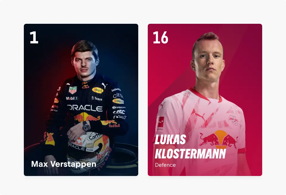
- Use the cover variant when the feature image plays a central role in telling the story, especially for expressive action or torso shots that enhance emotional impact.
- Use the cover variant to strengthen fan connections by allowing image and text content to interact more closely, rather than being visually separated.
- Select visuals with enough clarity and breathing room to support overlapping text. Avoid busy or text-heavy images that compromise readability.
Content
Imagery
The Person Card should:
- Include a strong feature image that sets accurate expectations about the person’s role or identity.
- Use an action shot as the feature image when it helps telling a story about the person’s profession.
- Should use a short video (max. 5 seconds) as the feature image when available and relevant.
- Include a clear portrait-style profile-image showing the person's face without helmets, goggles or sunglasses, especially when the person in the feature image is hard to recognize.
- Avoid overly detailed avatar images and use a calm, uncluttered background to ensure easy recognition.
- Avoid action shots as feature image when no avatar is used — instead, choose a clear portrait or torso image to prioritize recognizability.
- For more information on image preview and performance, check out the Image Guidelines
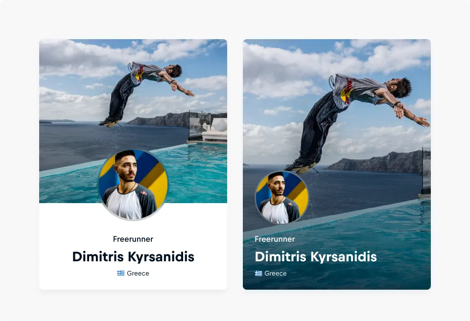
If an avatar is used, it is appropriate to use the feature image to show the person and their profession in action.
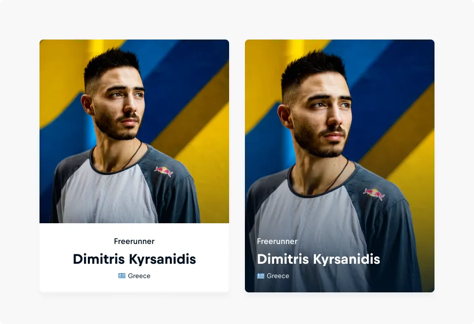
If no avatar is used, it is recommended to use a portrait or torso image of the person for easy recognition.
Textual content
A Person Card should:
- Present the person’s real name clearly, without extra decoration or titles. It can include nicknames or gamer tags when relevant, but always alongside the real name.
- Use the same type of meta information across all cards in a group to ensure visual consistency.
- Include up to three meta information items to add context, such as nationality, role, or affiliation.
- Use the prefix slot in meta information for visual cues like flags, icons, or imagery that support quick scanning and recognition.
- Use meta-text-primary above the name for high-priority or standout details. Its use is not required if meta information is provided — meta-text-secondary and additional information can be used on their own if more appropriate to provide further context.
- Keep all meta information short and scannable, as each item is limited to a single line of text.
- Use meta-text-primary-prefix, meta-text-secondary-prefix and/or additional-info-prefix for visual cues like flags, icons, or imagery that support quick scanning and recognition.
Number
A Person Card should:
- Include the person's jersey or starting number when it serves as a recognizable or essential part of their identity in a given sport.
- Use only official numbers — avoid internal IDs, placeholders, or non-sport-related values.
- Keep numbers short and legible — typically one to two digits — to maintain clarity and impact.
- Only include a number if it adds meaningful value for recognition or context in the current use case.
Favoritable
The favoritable button should:
- Be set to 'true' for users to be able to add it to their list.
- Update its state, with its icon and label, when the user interacts with it.
- Optionally have a label, such as "Follow".
- Include a clear aria-tag for accessibility, especially when no label is included.
Accessibility
A Person Card should:
- Have descriptive image-alt attributes (alternate text) for providing the content in an alternative text-based format and making the images more accessible without repeating other content on the Card.
- Have image-alt attributes, unless it’s for decorative purposes. Including “image of...” or “photo of...” in the alt attribute is not needed, as assistive technologies take care of declaring the media type.