v1 to v2
v1 to v2
Background
As a result of an accessibility review, it was discovered that the Accent colors used for text are not fully accessible to the required levels (WCAG 2.1 AA, 4.5:1 contrast ratio for text) on Red Bull's platforms. The Text Accent colors are going to be deprecated and not available anymore starting Q4 of 2023. The colors remain in Cosmos as basic Accent colors which pass the accessibility requirements for graphics. This ensures that important information is easily discernible for everyone, including those with color blindness. The remaining Accent colors should not be used for text. If the background colors of the content of an experience differ from the Cosmos Surface colors, the contrast of the colors against the new backgrounds should be reviewed. As the Text Accent colors are deprecated their usage is to be migrated, the steps and recommendations are outlined below for Figma.
The remaining Accent colors ('cosmos-color-positive', 'cosmos-color-negative', 'cosmos-color-inform') can be used for graphical elements like icons in containers with outlines or backgrounds as they pass the minimum required level for accessibility on the Cosmos Surface colors (WCAG 2.1 AA, 3:1 contrast ratio).
Extent
The deprecation of the Text Accent colors affects the following Cosmos colors:
- cosmos-color-text-inform
- cosmos-color-text-inform-subtle
- cosmos-color-text-negative
- cosmos-color-text-negative-subtle
- cosmos-color-text-positive
- cosmos-color-text-positive-subtle
These colors will be deprecated and removed from Cosmos.
Migration
It's recommended to migrate before the start of Q4 2023, but if the migration is done later the same approach and steps apply. Here's a list of different situations and how to deal with them when migrating accessibility-compliant implementation.
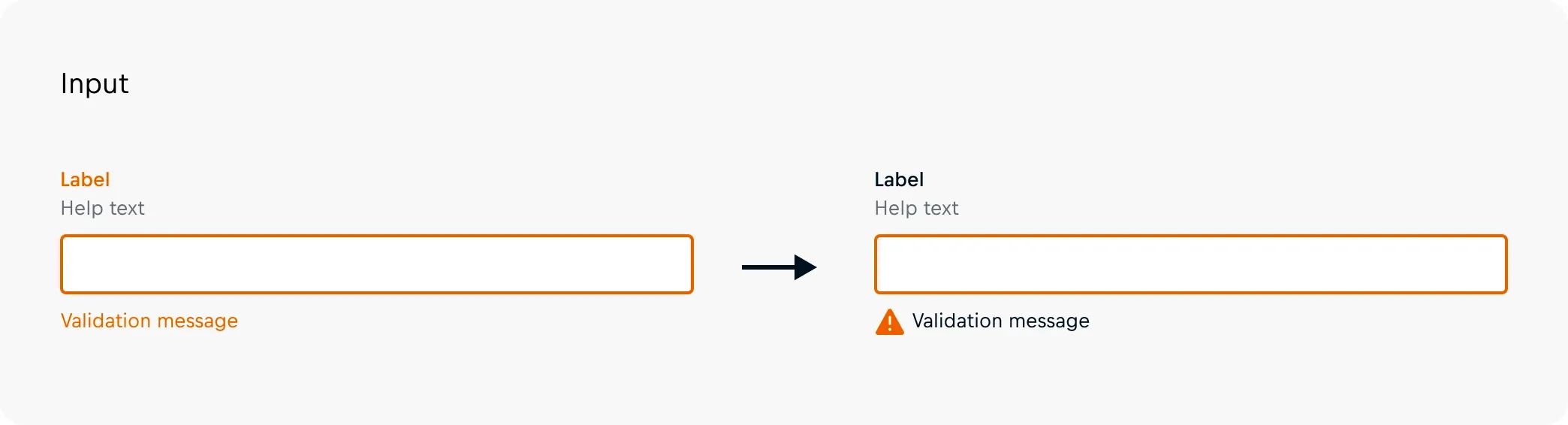
Text in form validation
The text accent colors have traditionally been used to indicate an invalid state of a form component. In these cases, the indication should be updated to include an icon in front of the validation message and make all text default text color. Outlines of the form components and the newly added icon can be colored with the `cosmos-color-inform` color to draw attention to the invalid form component as graphics can include accent colors and pass the accessibility requirements (WCAG 2.1 AA, 3:1 contrast ratio).
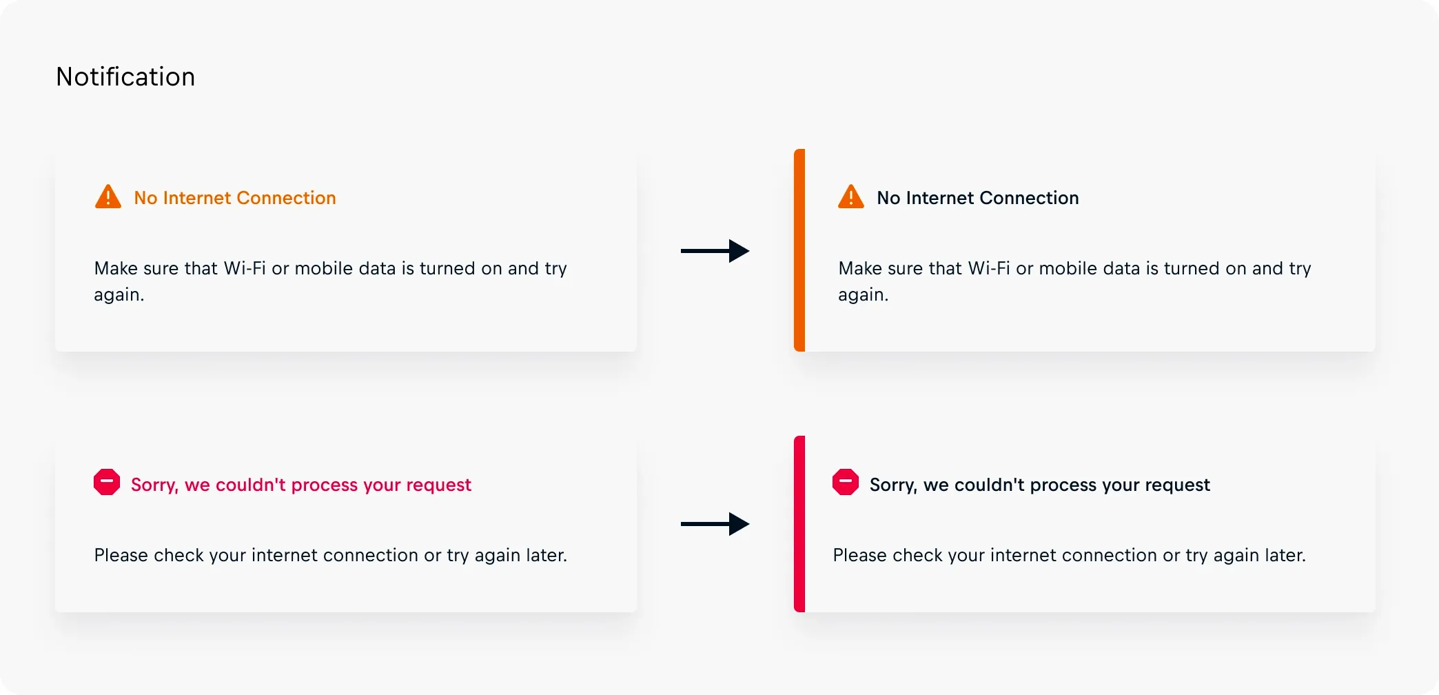
Highlight important information
When vital information is wanted to be highlighted it should be considered to be made accessible. Switching all text to the default text color and introducing graphical elements to catch consumers' eye.
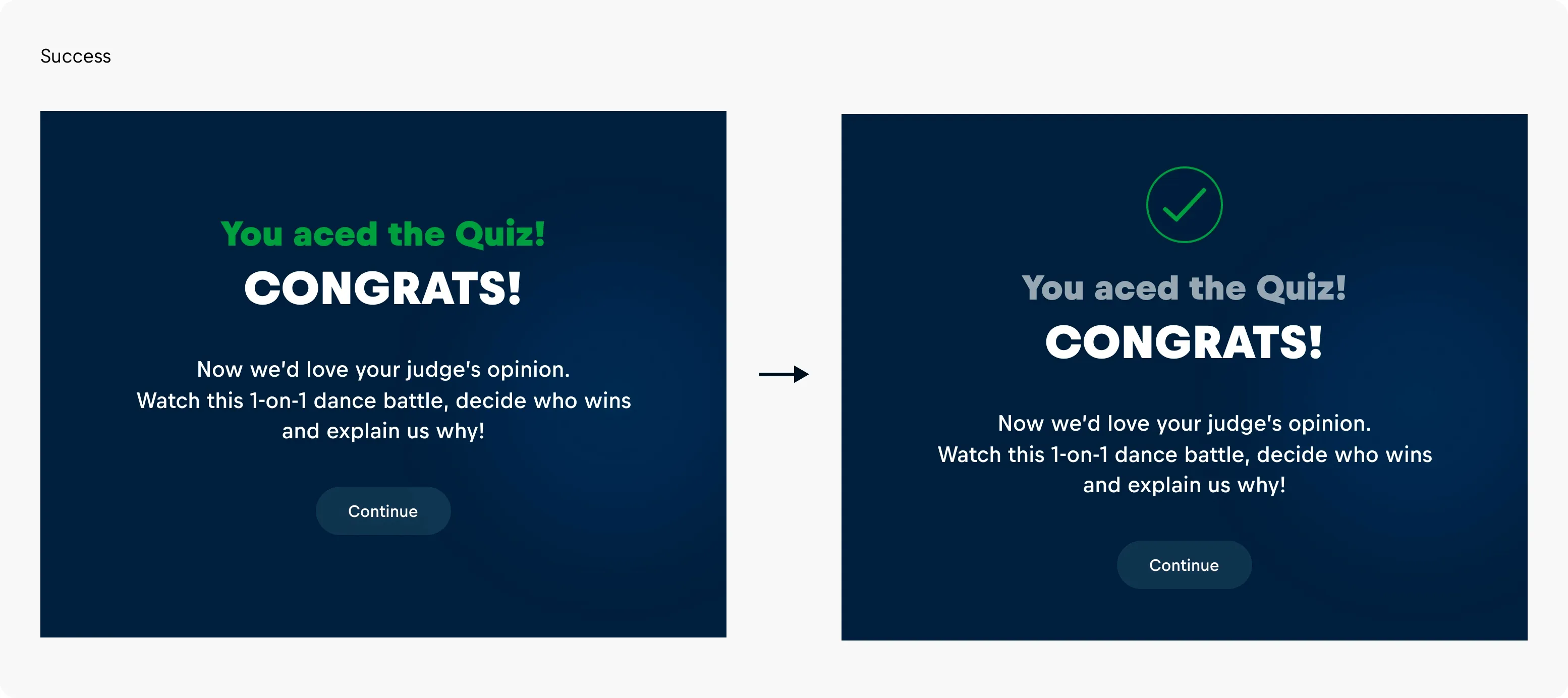
Success messages
In Cosmos, a cosmos-color-success is available to indicate that an action has been successful and provide a contrasting color to the cosmos-color-negative . Rather than coloring the text, it is best practice to include a graphical element, which can be colored.